
6步实现python炫酷柱状图
↑↑↑关注后"星标"简说Python 人人都可以简单入门Python、爬虫、数据分析 简说Python推荐 来源/python数据分析之禅 作者/小dull鸟
前一段时间给大家介绍了pygal可视化库,很受读者喜欢,今天我想深挖一下pygal的柱状图用法,一起感受pygal的魅力
文末可获取本文所有相关数据和代码。
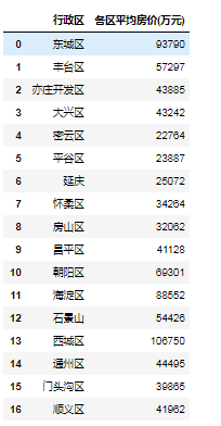
以北京二手房数据为例,计算各区平均房价:
import pandas as pd
data=pd.read_excel('各区平均房价.xlsx')
data['各区平均房价(万元)']=[int(i) for i in data['各区平均房价(万元)'].values.tolist()]
data
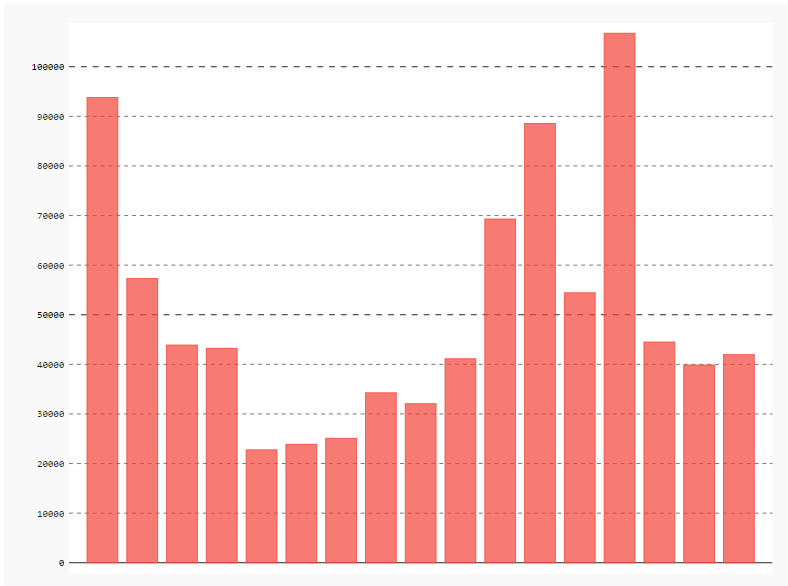
画出各区平均房价基本柱状图
import pygal
#设置pygal与jupyter notebook交互
from IPython.display import display, HTML
base_html = """
<!DOCTYPE html>
<html>
  <head>
  <script type="text/javascript" src="http://kozea.github.com/pygal.js/javascripts/svg.jquery.js"></script>
  <script type="text/javascript" src="https://kozea.github.io/pygal.js/2.0.x/pygal-tooltips.min.js""></script>
  </head>
  <body>
    <figure>
      {rendered_chart}
    </figure>
  </body>
</html>
"""
import pygal
from pygal.style import *
bar_chart = pygal.Bar(show_legend=False)  #show_legend=False不显示图例
bar_chart.add('',data['各区平均房价(万元)'].values.tolist())
HTML(base_html.format(rendered_chart=bar_chart.render(is_unicode=True)))#图片渲染
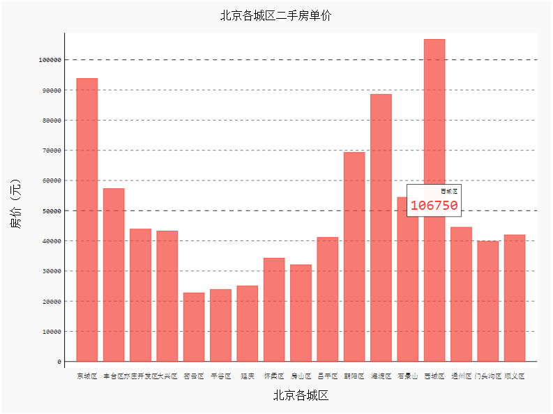
添加标题、横坐标及X、Y轴坐标名称
import pygal
from pygal.style import *
bar_chart = pygal.Bar(
    show_legend=False,     #show_legend=False不显示图例
    x_title='北京各城区',
    y_title='房价(元)',
)
bar_chart.title='北京各城区二手房单价'
bar_chart.x_labels=data['行政区'].values.tolist()  #以列表的形式添加
bar_chart.add('',data['各区平均房价(万元)'].values.tolist())
HTML(base_html.format(rendered_chart=bar_chart.render(is_unicode=True)))#图片渲染
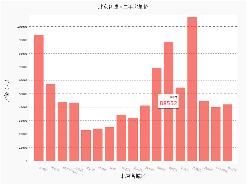
设置横坐标样式(旋转角度)
import pygal
from pygal.style import *
bar_chart = pygal.Bar(
    show_legend=False,        #show_legend=False不显示图例
    x_label_rotation=20,        #旋转横坐标角度
    x_title='北京各城区',
    y_title='房价(元)',
)
bar_chart.title='北京各城区二手房单价'
bar_chart.x_labels=data['行政区'].values.tolist()
bar_chart.add('',data['各区平均房价(万元)'].values.tolist())
HTML(base_html.format(rendered_chart=bar_chart.render(is_unicode=True)))#图片渲染
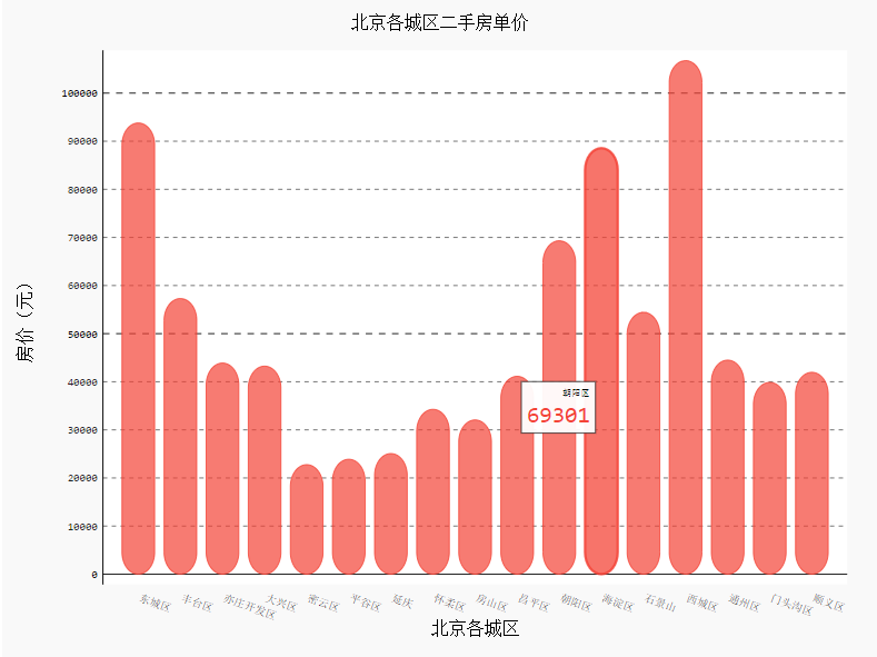
给条形图增加一个效果
import pygal
from pygal.style import *
bar_chart = pygal.Bar(
    show_legend=False,        #show_legend=False不显示图例
    x_label_rotation=20,        #旋转横坐标角度
    rounded_bars=20,
    x_title='北京各城区',
    y_title='房价(元)',

)
bar_chart.title='北京各城区二手房单价'
bar_chart.x_labels=data['行政区'].values.tolist()
bar_chart.add('',data['各区平均房价(万元)'].values.tolist())
HTML(base_html.format(rendered_chart=bar_chart.render(is_unicode=True)))#图片渲染
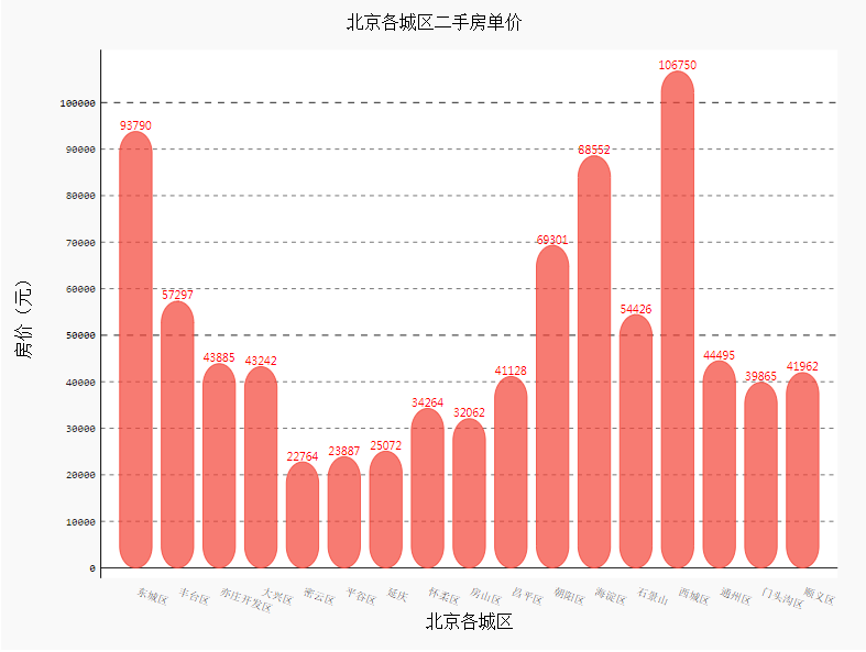
添加数值并设置样式
import pygal
from pygal.style import *
bar_chart = pygal.Bar(
    show_legend=False,        #show_legend=False不显示图例
    x_label_rotation=20,        #旋转横坐标角度
    rounded_bars=20,
    x_title='北京各城区',
    y_title='房价(元)',
    print_values=True,         #是否添加数值
    print_values_position='top', #数值位置
    style=DefaultStyle(
          value_font_family='googlefont:Raleway', #设置字体
          value_font_size=10,                     #设置大小
          value_colors=('red',))                  #设置颜色
)
bar_chart.title='北京各城区二手房单价'
bar_chart.x_labels=data['行政区'].values.tolist()
bar_chart.add('',data['各区平均房价(万元)'].values.tolist())
HTML(base_html.format(rendered_chart=bar_chart.render(is_unicode=True)))#图片渲染
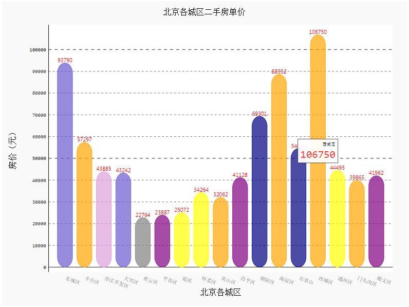
设置柱形图颜色
import pygal
from pygal.style import *
import random
colors = ['red','yellow','green','blue','gray','purple','orange','plum','Indigo','SlateBlue','Navy']
bar_chart = pygal.Bar(
    show_legend=False,        #show_legend=False不显示图例
    x_label_rotation=20,        #旋转横坐标角度
    x_title='北京各城区',
    y_title='房价(元)',
    rounded_bars=20,
    print_values=True,         #是否添加数值
    print_values_position='top', #数值位置
    style=DefaultStyle(
          value_font_family='googlefont:Raleway', #设置字体
          value_font_size=10,                     #设置大小
          value_colors=('red',))                  #设置颜色
)
bar_chart.title='北京各城区二手房单价'
bar_chart.x_labels=data['行政区'].values.tolist()
list_values=[]
for i in data['各区平均房价(万元)'].values.tolist():
    list_values.append({'value':i,'color':random.choice(colors)})
bar_chart.add('',list_values)
HTML(base_html.format(rendered_chart=bar_chart.render(is_unicode=True)))#图片渲染
除了上面这种,pygal还有一种更加简单漂亮的画法,代码如下:
from pygal.style import *
bar_chart = pygal.Bar(
    width=1000,   #宽度
    height=800,   #高度
    print_values=True,  #是否显示数值
    print_labels_position='bottom',
    x_title='北京各城区',
    y_title='房价(元)',
    print_values_position='top',  #数值位置
    legend_at_bottom=True,       #是否显示图例
    style=DefaultStyle)
bar_chart.title = '北京各城区二手房单价柱状图'
for i,j in zip(data['行政区'].values.tolist(),data['各区平均房价(万元)'].values.tolist()):
    bar_chart.add(
        i,j,rounded_bars=10)
HTML(base_html.format(rendered_chart=bar_chart.render(is_unicode=True)))#图片渲染
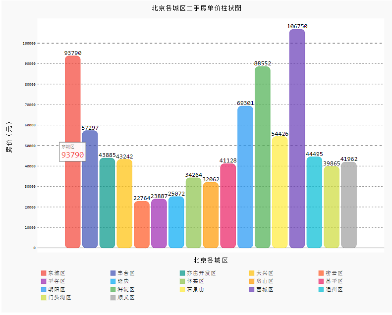
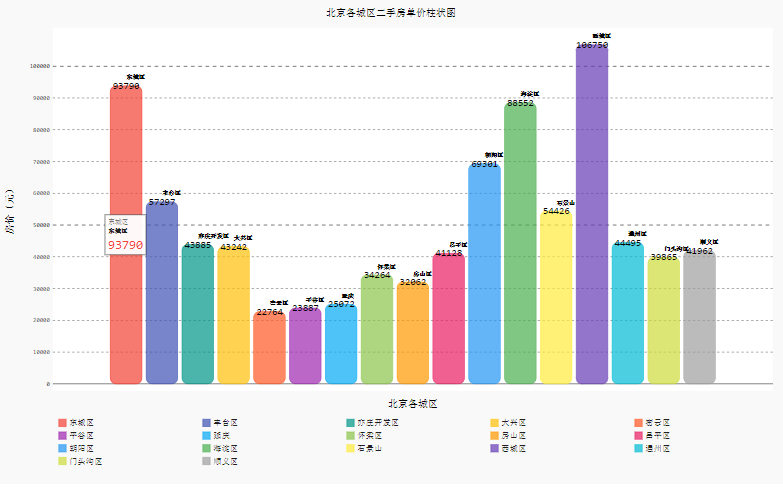
这种画法相当于将所有数值画到同一个横坐标中,所以不能添加横坐标,只能靠图例辨别,不过可以在图形上添加图例文本来弥补:
from pygal.style import *
bar_chart = pygal.Bar(
    width=1300,   #宽度
    height=800,   #高度
    print_values=True,
    print_labels=True,
    print_values_position='top',
    print_labels_position='bottom',
    x_title='北京各城区',
    y_title='房价(元)',
    legend_at_bottom=True,       #是否显示图例
    style=DefaultStyle)
bar_chart.title = '北京各城区二手房单价柱状图'
for i,j in zip(data['行政区'].values.tolist(),data['各区平均房价(万元)'].values.tolist()):
    bar_chart.add(
        i,[{'value': int(j), 'label': i}],rounded_bars=10)
HTML(base_html.format(rendered_chart=bar_chart.render(is_unicode=True)))#图片渲染
你更喜欢哪种呢?
本文数据集和代码获取:
扫码回复:2021
获取最新学习资源
▲点击上方卡片,一起学Python
学习更多: 整理了我开始分享学习笔记到现在超过250篇优质文章,涵盖数据分析、爬虫、机器学习等方面,别再说不知道该从哪开始,实战哪里找了
“点赞”传统美德不能丢 
评论