
Python数据可视化工具怎么选?深度评测5款实用工具

导读:相信很多读者学习Python就是希望作出各种酷炫的可视化图表,当然你一定会听说过Matplotlib、Pyecharts、seaborn、Plotly、Bokeh这五大工具,本文就将通过真实绘图来深度评测这五个Python数据可视化的库,看看到底这几种工具各有什么优缺点,在制作图表时该如何选择。
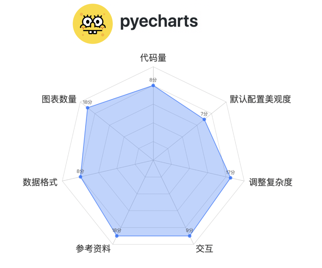
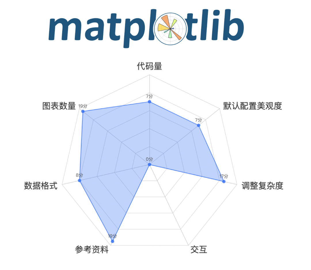
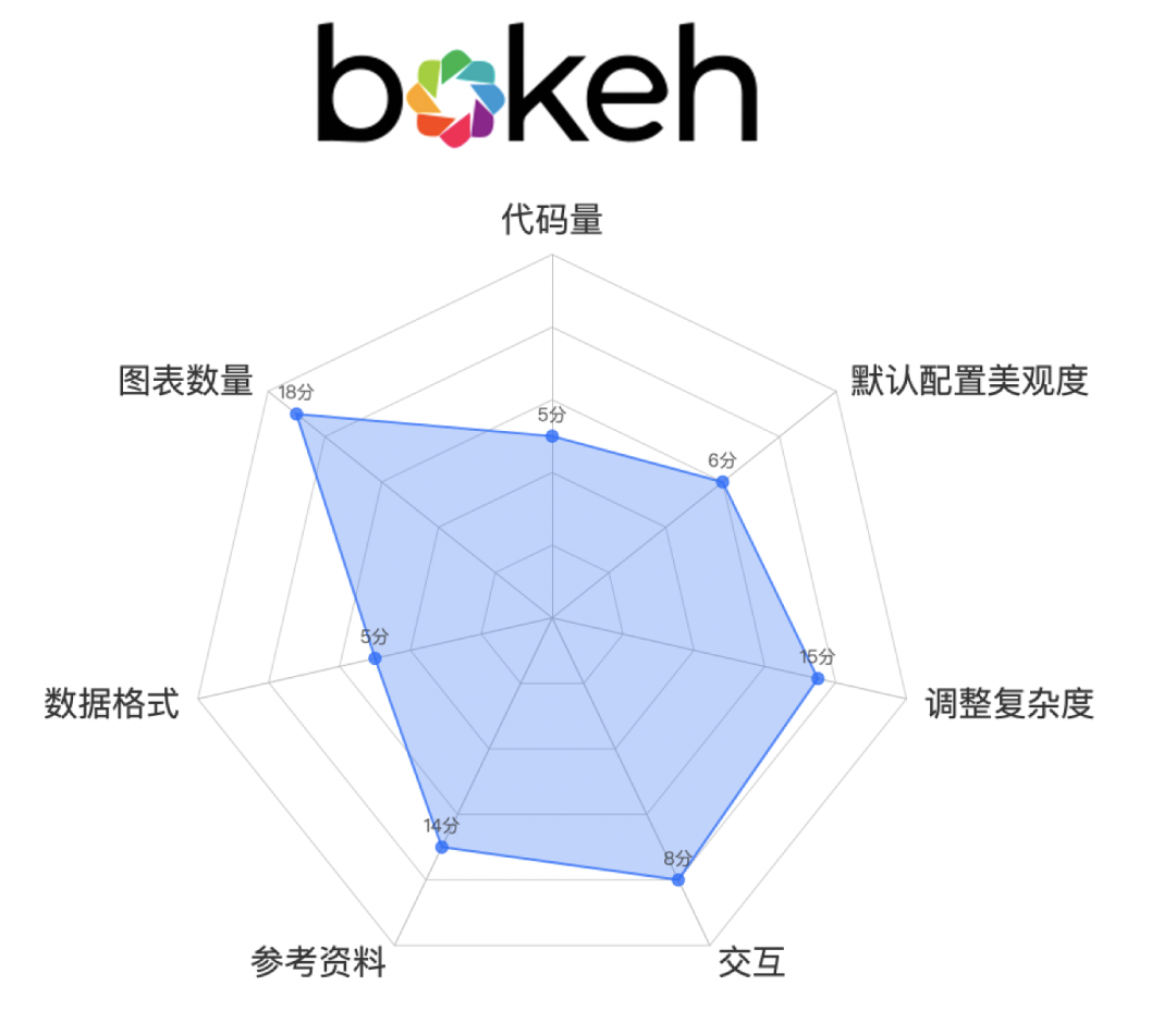
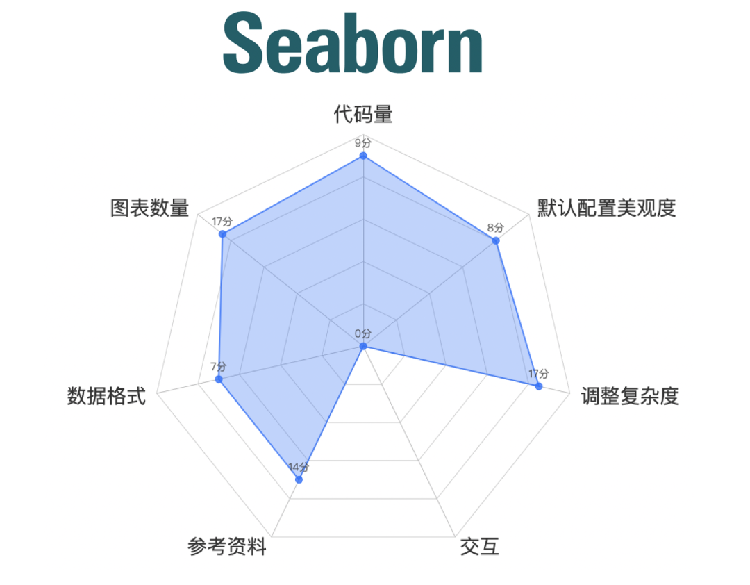
指标说明

数据说明
from pyecharts.faker import Faker
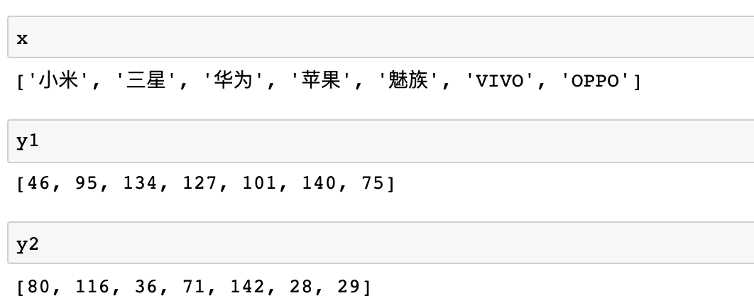
x = Faker.choose()
y1 = Faker.values()
y2 = Faker.values()
from pyecharts import options as opts
from pyecharts.charts import Bar
c = (
    Bar()
    .add_xaxis(x)
    .add_yaxis("商家A", y1)
    .add_yaxis("商家B", y2)
    .set_global_opts(title_opts=opts.TitleOpts(title="Pyecharts—柱状图", subtitle=""))
).render_notebook()
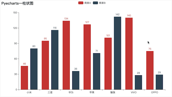
主观评分:85分
import matplotlib.pyplot as plt
import numpy as np
plt.rcParams['font.sans-serif'] = ['SimHei'] width = 0.35
x1 = np.arange(len(x))
fig, ax = plt.subplots()
rects1 = ax.bar(x1 - width/2, y1, width, label='商家A')
rects2 = ax.bar(x1 + width/2, y2, width, label='商家B')
ax.set_title('Matplotlib—柱状图')
ax.set_xticks(x1)
ax.set_xticklabels(x)
ax.legend()
plt.show()
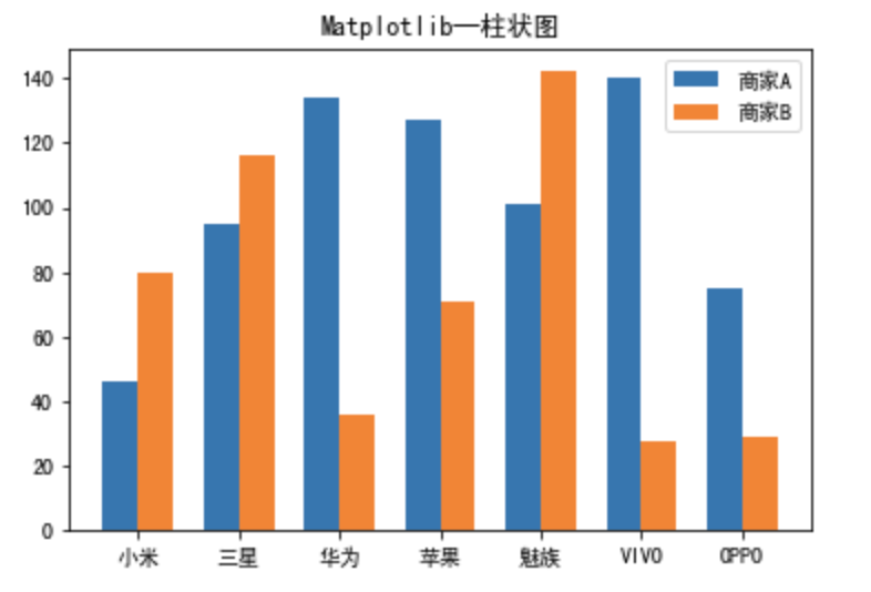
主观评分:77分
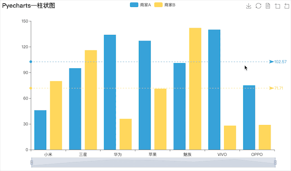
import plotly
import plotly.offline as py
import plotly.graph_objs as go
plotly.offline.init_notebook_mode(connected=True)
trace0 = go.Bar(
    x = x,
    y = y1,
    name = '商家A',
)
trace1 = go.Bar(
    x = x,
    y = y2,
    name = '商家B',
)
data = [trace0,trace1]
layout = go.Layout(
        title={
        'text': "Plotly-柱状图",
        'y':0.9,
        'x':0.5,
        'xanchor': 'center',
        'yanchor': 'top'})
fig = go.Figure(data=data, layout=layout)
py.iplot(fig)
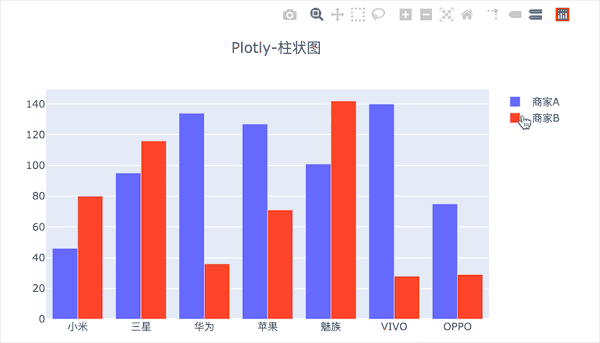
主观评分:76分
from bokeh.transform import dodge
import pandas as pd
from bokeh.core.properties import value
import numpy as np
import matplotlib.pyplot as plt
%matplotlib inline
from bokeh.io import output_notebook
output_notebook() # 导入notebook绘图模块
from bokeh.plotting import figure,show
from bokeh.models import ColumnDataSource# 导入图表绘制、图标展示模块 # 导入ColumnDataSource模块 # 导入dodge、value模块
df = pd.DataFrame({'商家A':y1,'商家B':y2},
                 index = x_)
_x = ['商家A','商家B']    # 系列名
data = {'index':x_}
for i in _x:
    data[i] = df[i].tolist()# 生成数据,数据格式为dict
source = ColumnDataSource(data=data)# 将数据转化为ColumnDataSource对象

p = figure(x_range=x_, y_range=(0, 150), plot_height=350, title="boken-柱状图",tools="crosshair,pan,wheel_zoom,box_zoom,reset,box_select,lasso_select")

p.vbar(x=dodge('index', -0.1, range=p.x_range), top='商家A', width=0.2, source=source,color="#718dbf", legend=value("商家A"))
p.vbar(x=dodge('index',  0.1, range=p.x_range), top='商家B', width=0.2, source=source,color="#e84d60", legend=value("商家B"))# dodge(field_name, value, range=None) → 转换成一个可分组的对象,value为元素的位置(配合width设置)
p.xgrid.grid_line_color = None
p.legend.location = "top_left"
p.legend.orientation = "horizontal" # 其他参数设置
show(p)
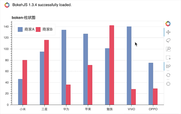
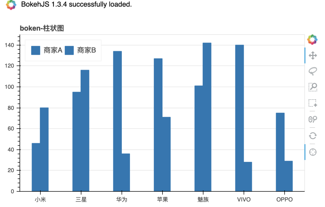
主观评分:71分
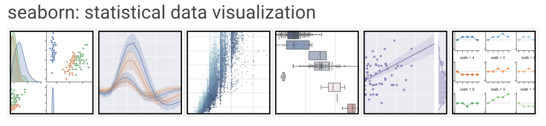
import seaborn as sns
import matplotlib.pyplot as plt
plt.rcParams['font.sans-serif'] = ['SimHei']
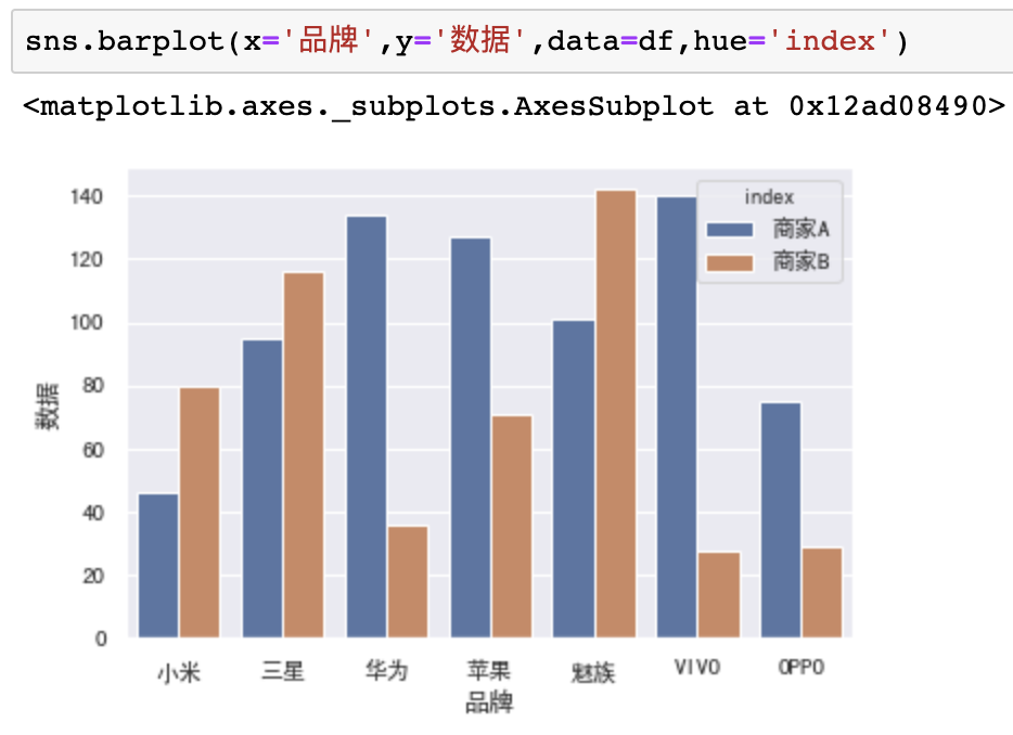
主观评分:72分
小结


评论