
【动画消消乐 |CSS】一个小清新类型的全局网页过渡动画
海轰Pro
共 8799字,需浏览 18分钟
·
2021-07-17 08:51
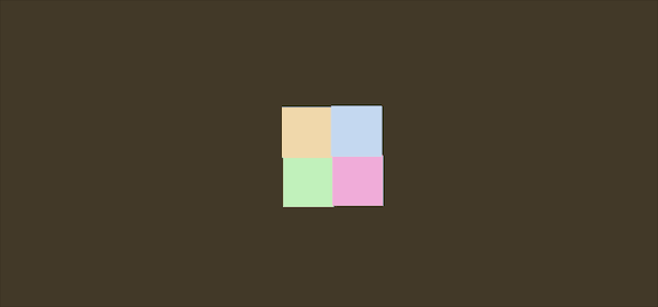
效果展示
Demo代码
HTML
<!DOCTYPE html>
<html lang="en">

    <head>
        <meta charset="UTF-8">
        <meta http-equiv="X-UA-Compatible" content="IE=edge">
        <meta name="viewport" content="width=device-width, initial-scale=1.0">
        <link rel="stylesheet" href="style.css">
        <title>Document</title>
    </head>

    <body>
        <section>
            <div class="box">
                <div></div>
                <div></div>
                <div></div>
                <div></div>
            </div>
        </section>
    </body>

</html>
CSS
html, body {
 margin: 0;
 height: 100%;
}

body {
 display: flex;
 justify-content: center;
 align-items: center;
 background-color: #5e825a;
 animation: backColor 4s infinite;
}

section {
 width: 650px;
 height: 300px;
 padding: 10px;
 position: relative;
 display: flex;
 align-items: center;
 justify-content: center;
 border: 2px solid white;
}

.box {
 width: 100px;
 height: 100px;
 display: flex;
 flex-wrap: wrap;
}

.box>div:nth-child(1) {
 width: 50px;
 height: 50px;
 background-color: #c0f0b9;
 animation: load1 4s infinite;
}

.box>div:nth-child(2) {
 width: 50px;
 height: 50px;
 background-color: #f0d8ad;
 animation: load2 4s infinite;
}

.box>div:nth-child(3) {
 width: 50px;
 height: 50px;
 background-color: #f0addb;
 animation: load3 4s infinite;
}

.box>div:nth-child(4) {
 width: 50px;
 height: 50px;
 background-color: #c4d8f0;
 animation: load4 4s infinite;
}

@keyframes load1 {
 from {
  transform: translate(0);
 }
 25% {
  transform: translate(100%);
 }
 50% {
  transform: translate(100%, 100%);
 }
 75% {
  transform: translate(0, 100%);
 }
}

@keyframes load2 {
 from {
  transform: translate(0);
 }
 25% {
  transform: translate(0, 100%);
 }
 50% {
  transform: translate(-100%, 100%);
 }
 75% {
  transform: translate(-100%, 0);
 }
}

@keyframes load3 {
 from {
  transform: translate(0);
 }
 25% {
  transform: translate(0, -100%);
 }
 50% {
  transform: translate(100%, -100%);
 }
 75% {
  transform: translate(100%);
 }
}

@keyframes load4 {
 from {
  transform: translate(0);
 }
 25% {
  transform: translate(-100%, 0);
 }
 50% {
  transform: translate(-100%, -100%);
 }
 75% {
  transform: translate(0, -100%);
 }
}

@keyframes backColor {
 from {
  background-color: #5e825a;
 }
 25% {
  background-color: #82466e;
 }
 50% {
  background-color: #425e82;
 }
 75% {
  background-color: #423827;
 }
}
原理详解
步骤1
使用一个div作为包含四个小方块的大容器
其中每个小方块也是用一个div表示
            <div class="box">
                <div></div>
                <div></div>
                <div></div>
                <div></div>
            </div>
设置为
宽度、高度均为100px flex布局 背景色:蓝色
.box {
 width: 100px;
 height: 100px;
 display: flex;
 flex-wrap: wrap;// 换行
 background-color: blue;
}
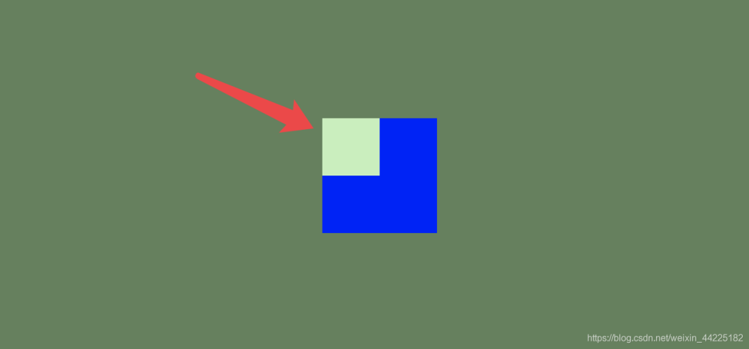
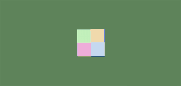
效果图如下

步骤2
分别设置四个小方块 均匀分布
宽度、高度均为50px 颜色为四种(自定义)
.box>div:nth-child(1) {
 width: 50px;
 height: 50px;
 background-color: #c0f0b9;
}

.box>div:nth-child(2) {
 width: 50px;
 height: 50px;
 background-color: #f0d8ad;
}

.box>div:nth-child(3) {
 width: 50px;
 height: 50px;
 background-color: #f0addb;
}

.box>div:nth-child(4) {
 width: 50px;
 height: 50px;
 background-color: #c4d8f0;
}
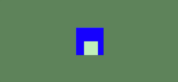
效果图如下
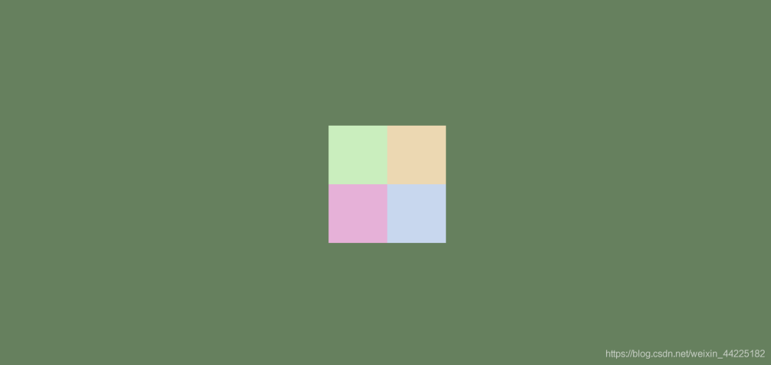
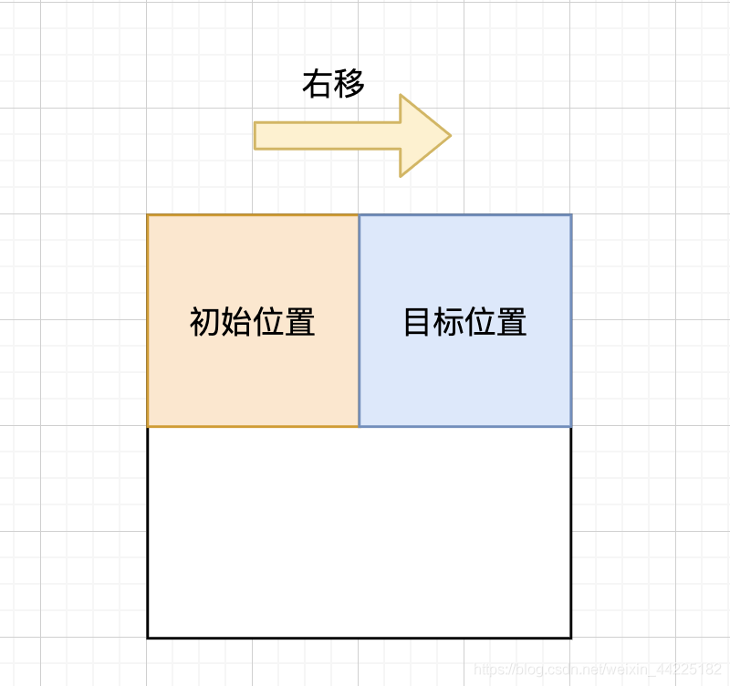
步骤3
为每个小方块添加动画
这里以一个方块为例
动画简化为关键四个步骤
右移 再下移 再左移 最后上移
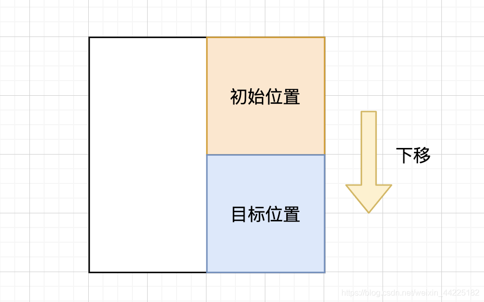
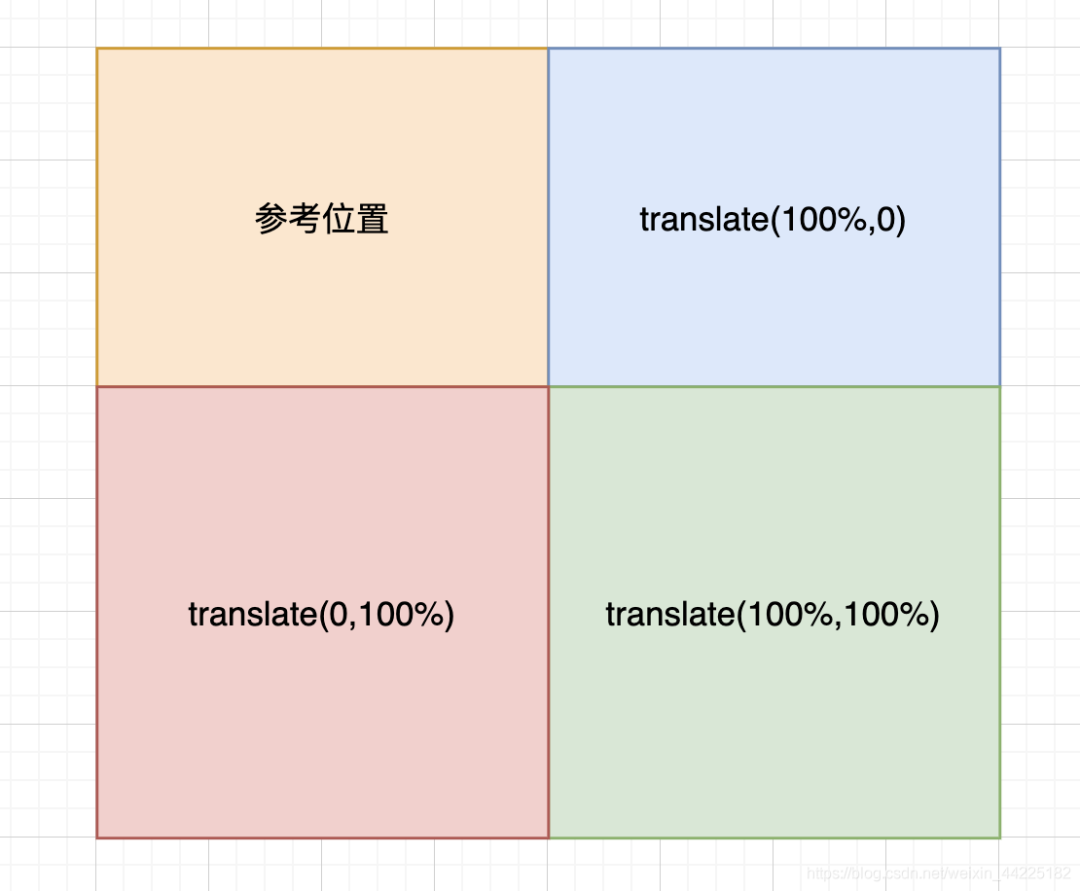
右移说明:
下移说明:
左移说明: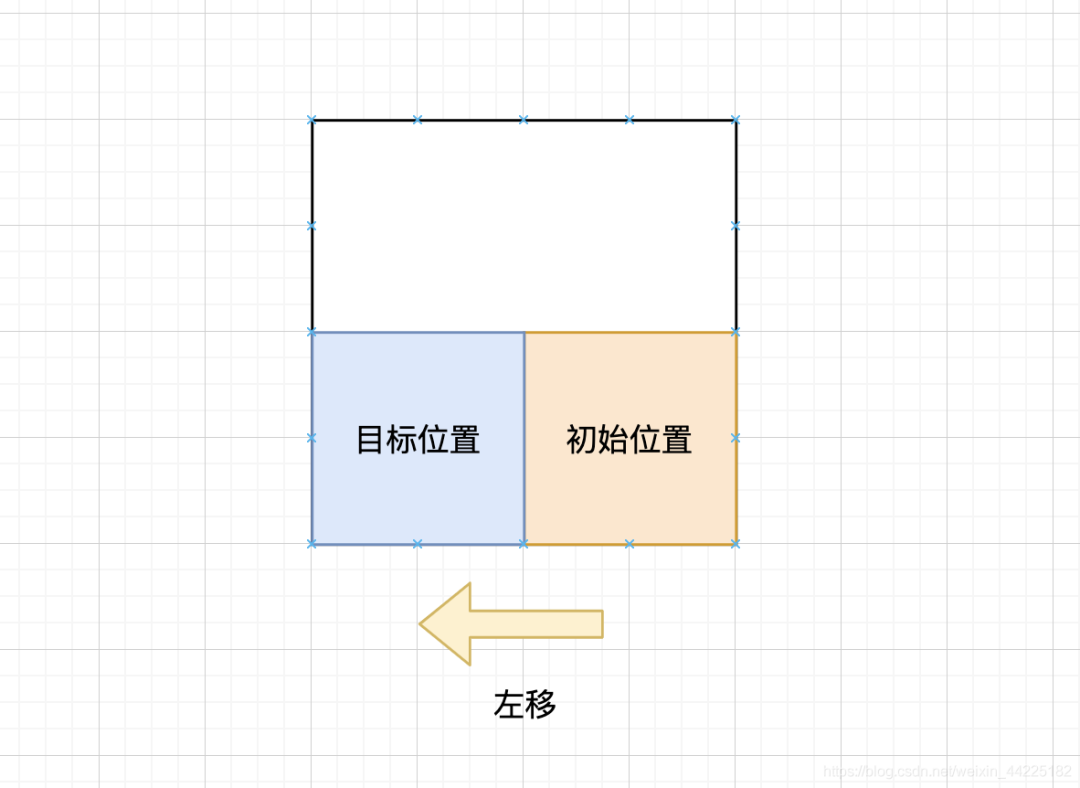
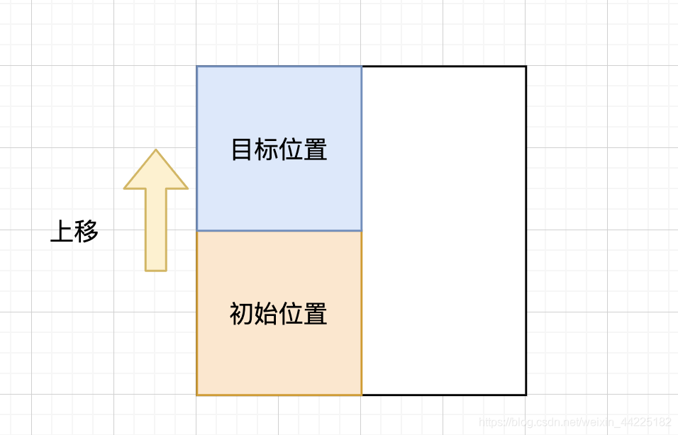
上移说明:
主要借助transform属性进行方块的移动
.box>div:nth-child(1) {
 animation: load1 4s infinite;
}

@keyframes load1 {
 from {
  transform: translate(0);
 }
 25% {
  transform: translate(100%);
 }
 50% {
  transform: translate(100%, 100%);
 }
 75% {
  transform: translate(0, 100%);
 }
}
方块的移动效果如下
注意:translate(x, y)是以最开始的位置作为参考点的
步骤4
其他方块的动画原理也是一样的
不同的就是起始位置不同
编写动画效果的时候注意下需要移动方向的顺序即可(一共就4个移动方向 顺序可以组合)
.box>div:nth-child(1) {
 animation: load1 4s infinite;
}

.box>div:nth-child(2) {
 animation: load2 4s infinite;
}

.box>div:nth-child(3) {
 animation: load3 4s infinite;
}

.box>div:nth-child(4) {
 animation: load4 4s infinite;
}

@keyframes load1 {
 from {
  transform: translate(0);
 }
 25% {
  transform: translate(100%);
 }
 50% {
  transform: translate(100%, 100%);
 }
 75% {
  transform: translate(0, 100%);
 }
}

@keyframes load2 {
 from {
  transform: translate(0);
 }
 25% {
  transform: translate(0, 100%);
 }
 50% {
  transform: translate(-100%, 100%);
 }
 75% {
  transform: translate(-100%, 0);
 }
}

@keyframes load3 {
 from {
  transform: translate(0);
 }
 25% {
  transform: translate(0, -100%);
 }
 50% {
  transform: translate(100%, -100%);
 }
 75% {
  transform: translate(100%);
 }
}

@keyframes load4 {
 from {
  transform: translate(0);
 }
 25% {
  transform: translate(-100%, 0);
 }
 50% {
  transform: translate(-100%, -100%);
 }
 75% {
  transform: translate(0, -100%);
 }
}
效果图如下
步骤5
注释掉box的背景色
.box {
 width: 100px;
 height: 100px;
 display: flex;
 flex-wrap: wrap;
 /* background-color: blue; */
}
步骤6
在全局背景设置中添加动画
使得全局背景颜色随着方块的移动而随着变色
body {
 animation: backColor 4s infinite;
}

@keyframes backColor {
 from {
  background-color: #5e825a;
 }
 25% {
  background-color: #82466e;
 }
 50% {
  background-color: #425e82;
 }
 75% {
  background-color: #423827;
 }
}
得到最终效果图
结语
希望对您有所帮助
如有错误欢迎小伙伴指正~
我是 海轰ଘ(੭ˊᵕˋ)੭
如果您觉得写得可以的话
请点个赞吧
谢谢支持 ❤️

评论