
【机器学习】快速入门简单线性回归 (SLR)
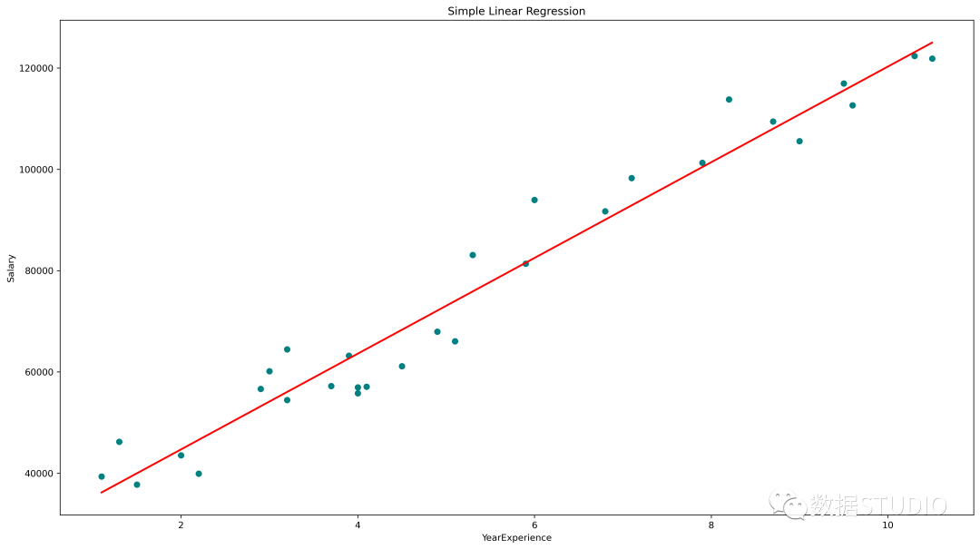
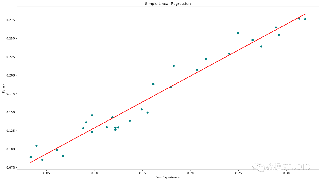
简单线性回归图(青色散点为实际值,红线为预测值)
statsmodels.api、statsmodels.formula.api 和 scikit-learn 的 Python 中的 SLR
今天云朵君将和大家一起学习回归算法的基础知识。并取一个样本数据集,进行探索性数据分析(EDA)并使用 statsmodels.api、statsmodels.formula.api 和 scikit-learn 实现 简单线性回归(SLR)。
什么是回归算法
回归是一种用于预测连续特征的"监督机器学习"算法。
线性回归是最简单的回归算法,它试图通过将线性方程/最佳拟合线拟合到观察数据,来模拟因变量与一个或多个自变量之间的关系。
根据输入特征的数量,线性回归可以有两种类型:
简单线性回归 (SLR) 多元线性回归 (MLR)
在简单线性回归 (SLR) 中,根据单一的输入变量预测输出变量。在多元线性回归 (MLR) 中,根据多个输入变量预测输出。
输入变量也可以称为独立/预测变量,输出变量称为因变量。
SLR 的方程为,其中, 是因变量, 是预测变量, 是模型的系数/参数,Epsilon(ϵ) 是一个称为误差项的随机变量。
普通最小二乘法(OLS)和梯度下降是两种常见的算法,用于为最小平方误差总和找到正确的系数。
如何实现回归算法
目标:建立一个简单的线性回归模型,使用多年的经验来预测加薪。
首先导入必要的库
这里必要的库是 Pandas、用于处理数据框的 NumPy、用于可视化的 matplotlib、seaborn,以及用于构建回归模型的 sklearn、statsmodels。
import pandas as pd
import numpy as np
import matplotlib.pyplot as plt
%matplotlib inline
import seaborn as sns
from scipy import stats
from scipy.stats import probplot
import statsmodels.api as sm
import statsmodels.formula.api as smf
from sklearn import preprocessing
from sklearn.linear_model import LinearRegression
from sklearn.model_selection import train_test_split
from sklearn.metrics import mean_squared_error, r2_score
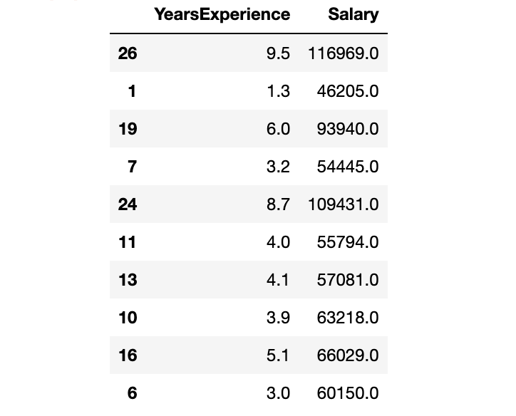
从 CSV 文件创建 Pandas 数据框。数据获取:在公众号『数据STUDIO』后台联系云朵君获取!
df = pd.read_csv("Salary_Data.csv")
探索性数据分析(EDA)
EDA的基本步骤
了解数据集
确定数据集的大小 确定特征的数量 识别特征及特征的数据类型 检查数据集是否有缺失值、异常值 通过特征的缺失值、异常值的数量
处理缺失值和异常值 编码分类变量 图形单变量分析,双变量 规范化和缩放
df.info()
RangeIndex: 30 entries, 0 to 29
Data columns (total 2 columns):
 #   Column           Non-Null Count  Dtype
---  ------           --------------  -----
 0   YearsExperience  30 non-null     float64
 1   Salary           30 non-null     float64
dtypes: float64(2)
memory usage: 608.0 bytes
len(df.columns) # 确定特征的数量
df.columns # 识别特征

df.shape # 确定数据集的大小
df.dtypes # 确定特性的数据类型
df.isnull().values.any() # 检查数据集是否有缺失值
df.isnull().sum() # 检查数据集是否有缺失值
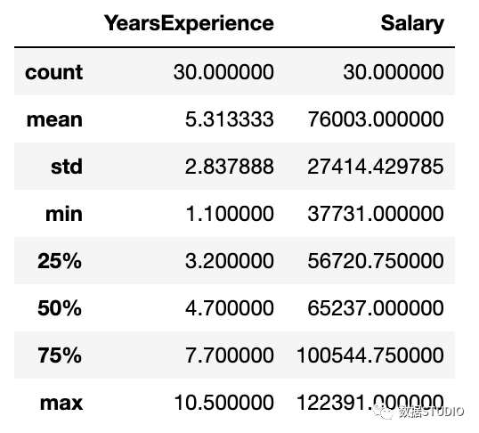
数据集有两列:YearsExperience、Salary。并且两者都是浮点数据类型。数据集中有 30 条记录,没有空值或异常值。
描述性统计包括那些总结数据集分布的集中趋势、分散和形状的统计,不包括NaN值
df.describe()
图形单变量分析
对于单变量分析,可以使用直方图、密度图、箱线图或小提琴图,以及正态 QQ 图来帮助我们了解数据点的分布和异常值的存在。
小提琴图是一种绘制数字数据的方法。它类似于箱线图,但在每一侧都添加了一个旋转的核密度图。
Python代码:
# Histogram
# We can use either plt.hist or sns.histplot
plt.figure(figsize=(20,10))
plt.subplot(2,4,1)
plt.hist(df['YearsExperience'], density=False)
plt.title("Histogram of 'YearsExperience'")
plt.subplot(2,4,5)
plt.hist(df['Salary'], density=False)
plt.title("Histogram of 'Salary'")

# Density plot
plt.subplot(2,4,2)
sns.distplot(df['YearsExperience'], kde=True)
plt.title("Density distribution of 'YearsExperience'")
plt.subplot(2,4,6)
sns.distplot(df['Salary'], kde=True)
plt.title("Density distribution of 'Salary'")

# boxplot or violin plot
# 小提琴图是一种绘制数字数据的方法。
# 它类似于箱形图,在每一边添加了一个旋转的核密度图
plt.subplot(2,4,3)
# plt.boxplot(df['YearsExperience'])
sns.violinplot(df['YearsExperience'])
# plt.title("Boxlpot of 'YearsExperience'")
plt.title("Violin plot of 'YearsExperience'")
plt.subplot(2,4,7)
# plt.boxplot(df['Salary'])
sns.violinplot(df['Salary'])
# plt.title("Boxlpot of 'Salary'")
plt.title("Violin plot of 'Salary'")

# Normal Q-Q plot
plt.subplot(2,4,4)
probplot(df['YearsExperience'], plot=plt)
plt.title("Q-Q plot of 'YearsExperience'")
plt.subplot(2,4,8)
probplot(df['Salary'], plot=plt)
plt.title("Q-Q plot of 'Salary'")
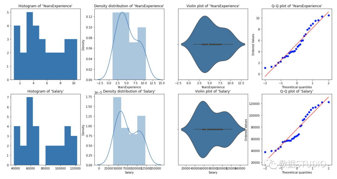
从上面的图形表示,我们可以说我们的数据中没有异常值,并且 YearsExperience looks like normally distributed, and Salary doesn't look normal。我们可以使用Shapiro Test。
Python代码:
# 定义一个函数进行 Shapiro test

# 定义零备择假设
Ho = 'Data is Normal'
Ha = 'Data is not Normal'

# 定义重要度值
alpha = 0.05
def normality_check(df):
    for columnName, columnData in df.iteritems():
        print("Shapiro test for {columnName}".format(columnName=columnName))
        res = stats.shapiro(columnData)
    # print(res)
        pValue = round(res[1], 2)

        # Writing condition
        if pValue > alpha:
            print("pvalue = {pValue} > {alpha}. 不能拒绝零假设. {Ho}".format(pValue=pValue, alpha=alpha, Ho=Ho))
        else:
            print("pvalue = {pValue} <= {alpha}. 拒绝零假设. {Ha}".format(pValue=pValue, alpha=alpha, Ha=Ha))

# Drive code
normality_check(df)
Shapiro test for YearsExperience
pvalue = 0.1 > 0.05.
不能拒绝零假设. Data is Normal
Shapiro test for Salary
pvalue = 0.02 <= 0.05.
拒绝零假设. Data is not Normal
YearsExperience 是正态分布的,Salary 不是正态分布的。
双变量可视化
对于数值与数值数据,我们绘制:散点图、线图、相关性热图、联合图来进行数据探索。
Python 代码:
# Scatterplot & Line plots
plt.figure(figsize=(20,10))
plt.subplot(1,3,1)
sns.scatterplot(data=df, x="YearsExperience",
                y="Salary", hue="YearsExperience",
                alpha=0.6)
plt.title("Scatter plot")
plt.subplot(1,3,2)
sns.lineplot(data=df, x="YearsExperience", y="Salary")
plt.title("Line plot of YearsExperience, Salary")
plt.subplot(1,3,3)
sns.lineplot(data=df)
plt.title('Line Plot')
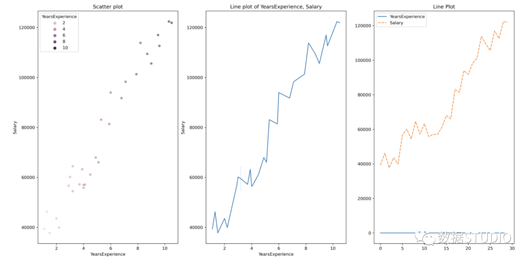
散点图和线图
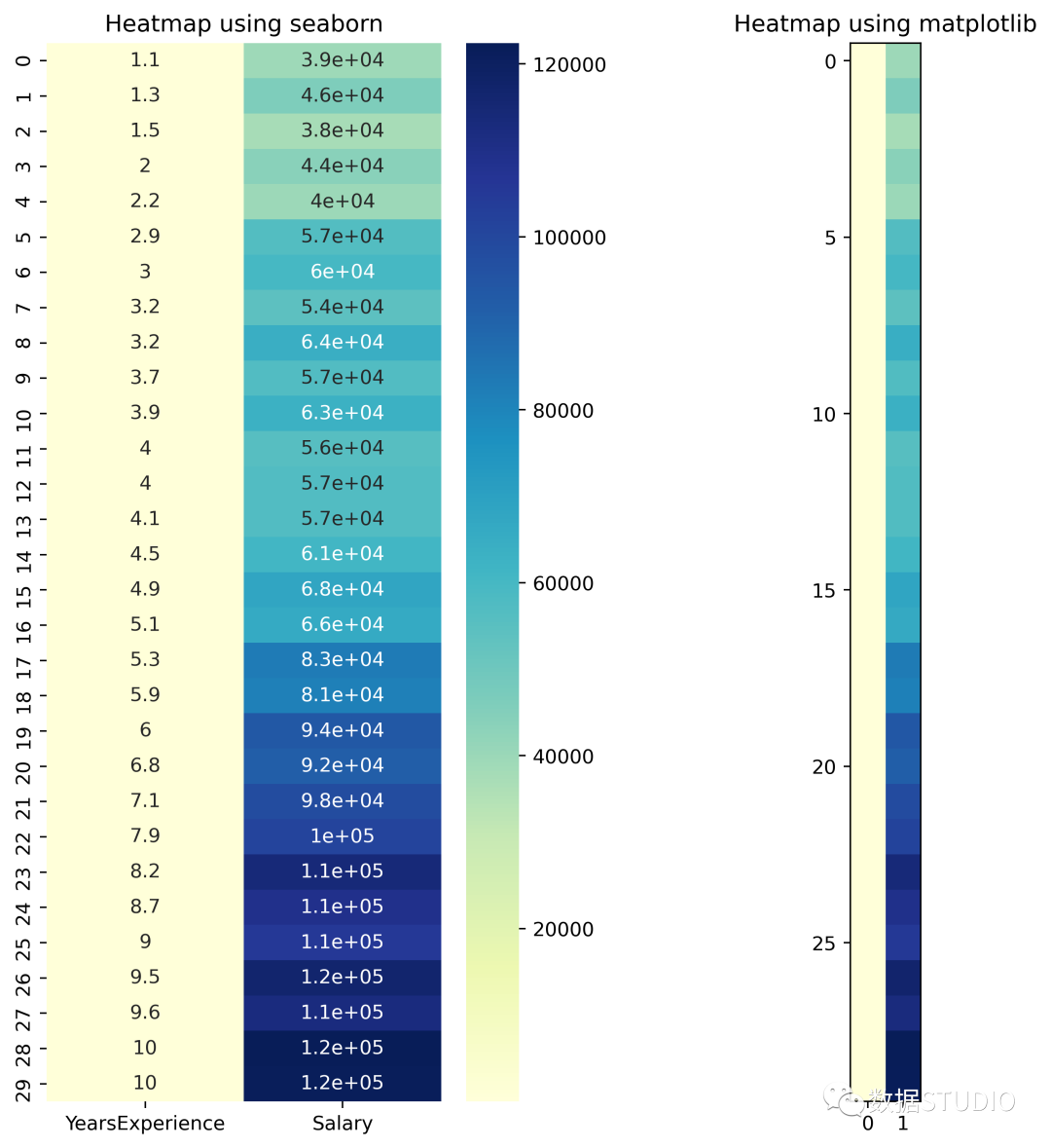
# heatmap
plt.figure(figsize=(10, 10))
plt.subplot(1, 2, 1)
sns.heatmap(data=df, cmap="YlGnBu", annot = True)
plt.title("Heatmap using seaborn")
plt.subplot(1, 2, 2)
plt.imshow(df, cmap ="YlGnBu")
plt.title("Heatmap using matplotlib")
# Joint plot
sns.jointplot(x = "YearsExperience", y = "Salary", kind = "reg", data = df)
plt.title("Joint plot using sns")
# 类型可以是hex, kde, scatter, reg, hist。当kind='reg'时,它显示最佳拟合线。
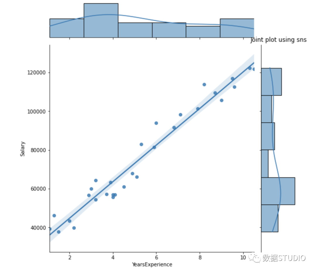
使用 df.corr() 检查变量之间是否存在相关性。
print("Correlation: "+ 'n', df.corr())
# 0.978,高度正相关
# 绘制相关矩阵的热图
plt.subplot(1,1,1)
sns.heatmap(df.corr(), annot=True)
Correlation:
                  YearsExperience    Salary
YearsExperience         1.000000  0.978242
Salary                  0.978242  1.000000

相关性=0.98,这是一个高正相关性。这意味着因变量随着自变量的增加而增加。
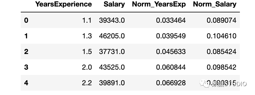
数据标准化
YearsExperience 和 Salary 列的值之间存在巨大差异。可以使用Normalization更改数据集中数字列的值以使用通用比例,而不会扭曲值范围的差异或丢失信息。
我们使用sklearn.preprocessing.Normalize用来规范化我们的数据。它返回 0 到 1 之间的值。
# 创建新列来存储规范化值
df['Norm_YearsExp'] = preprocessing.normalize(df[['YearsExperience']], axis=0)
df['Norm_Salary'] = preprocessing.normalize(df[['Salary']], axis=0)
df.head()
使用 sklearn 进行线性回归
LinearRegression() 拟合一个系数为的线性模型,以最小化数据集中观察到的目标与线性近似预测的目标之间的残差平方和。
def regression(df):
  # 定义独立和依赖的特性
    x = df.iloc[:, 1:2]
    y = df.iloc[:, 0:1]
    # print(x,y)

    # 实例化线性回归对象
    regressor = LinearRegression()

    # 训练模型
    regressor.fit(x,y)

    # 检查每个预测模型的系数
    print('n'+"Coeff of the predictor: ",regressor.coef_)

    # 检查截距项
    print("Intercept: ",regressor.intercept_)

    # 预测输出值
    y_pred = regressor.predict(x)
#     print(y_pred)

    # 检查 MSE
    print("Mean squared error(MSE): %.2f" % mean_squared_error(y, y_pred))
    # Checking the R2 value
    print("Coefficient of determination: %.3f" % r2_score(y, y_pred))
  # 评估模型的性能,表示大部分数据点落在最佳拟合线上

    # 可视化结果
    plt.figure(figsize=(18, 10))
    # 输入和输出值的散点图
    plt.scatter(x, y, color='teal')
    # 输入和预测输出值的绘图
    plt.plot(x, regressor.predict(x), color='Red', linewidth=2 )
    plt.title('Simple Linear Regression')
    plt.xlabel('YearExperience')
    plt.ylabel('Salary')

# Driver code
regression(df[['Salary', 'YearsExperience']]) # 0.957 accuracy
regression(df[['Norm_Salary', 'Norm_YearsExp']]) # 0.957 accuracy
Coeff of the predictor:  [[9449.96232146]]
Intercept:  [25792.20019867]
Mean squared error(MSE): 31270951.72
Coefficient of determination: 0.957
Coeff of the predictor:  [[0.70327706]]
Intercept:  [0.05839456]
Mean squared error(MSE): 0.00
Coefficient of determination: 0.957
使用 scikit-learn 中线性回归模型实现了 95.7% 的准确率,但在深入了解该模型中特征的相关性方面并没有太多空间。接下来使用 statsmodels.api, statsmodels.formula.api 构建一个模型。
使用 smf 的线性回归
statsmodels.formula.api 中的预测变量必须单独枚举。该方法中,一个常量会自动添加到数据中。
def smf_ols(df):
# 定义独立和依赖的特性
x = df.iloc[:, 1:2]
y = df.iloc[:, 0:1]
# print(x)
# 训练模型
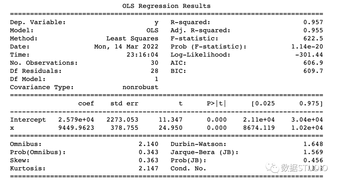
model = smf.ols('y~x', data=df).fit()
# print model summary
print(model.summary())
# 预测 y
y_pred = model.predict(x)
# print(type(y), type(y_pred))
# print(y, y_pred)
y_lst = y.Salary.values.tolist()
# y_lst = y.iloc[:, -1:].values.tolist()
y_pred_lst = y_pred.tolist()
# print(y_lst)
data = [y_lst, y_pred_lst]
# print(data)
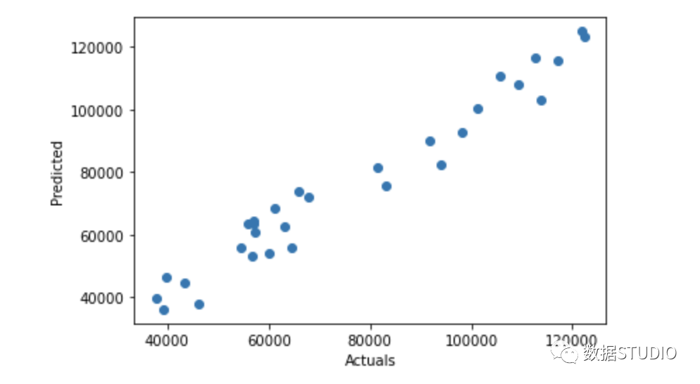
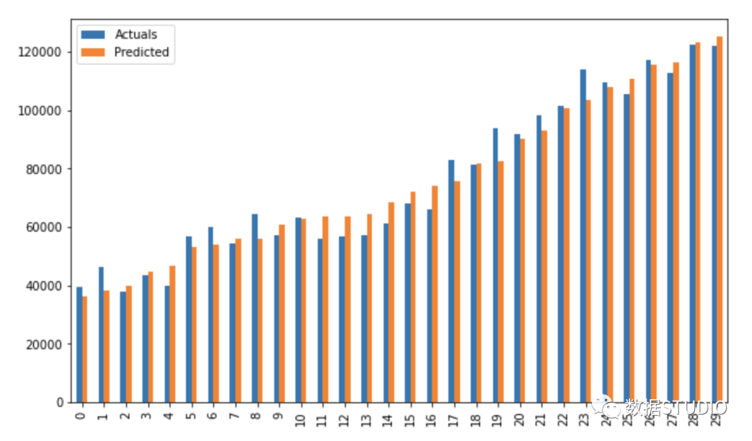
res = pd.DataFrame({'Actuals':data[0], 'Predicted':data[1]})
# print(res)
plt.scatter(x=res['Actuals'], y=res['Predicted'])
plt.ylabel('Predicted')
plt.xlabel('Actuals')
res.plot(kind='bar',figsize=(10,6))
# Driver code
smf_ols(df[['Salary', 'YearsExperience']]) # 0.957 accuracy
# smf_ols(df[['Norm_Salary', 'Norm_YearsExp']]) # 0.957 accuracy
使用 statsmodels.api 进行回归
不再需要单独枚举预测变量。
statsmodels.regression.linear_model.OLS(endog, exog)
endog是因变量exog是自变量。默认情况下不包含截距项,应由用户使用 add_constant添加。
# 创建一个辅助函数
def OLS_model(df):
# 定义自变量和因变量
x = df.iloc[:, 1:2]
y = df.iloc[:, 0:1]
# 添加一个常数项
x = sm.add_constant(x)
# print(x)
model = sm.OLS(y, x)
# 训练模型
results = model.fit()
# print('n'+"Confidence interval:"+'n', results.conf_int(alpha=0.05, cols=None))
# 返回拟合参数的置信区间。默认alpha=0.05返回一个95%的置信区间。
print('n'"Model parameters:"+'n',results.params)
# 打印model summary
print(results.summary())
# Driver code
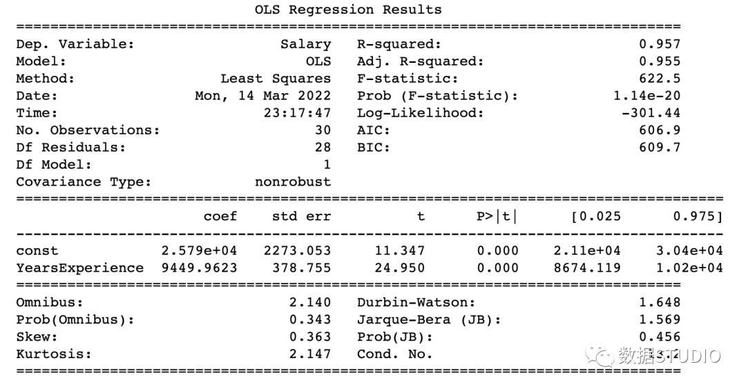
OLS_model(df[['Salary', 'YearsExperience']]) # 0.957 accuracy
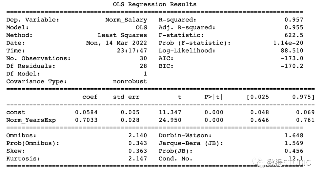
OLS_model(df[['Norm_Salary', 'Norm_YearsExp']]) # 0.957 accuracy
Model parameters:
 const              25792.200199
YearsExperience     9449.962321
dtype: float64
Model parameters:
 const            0.058395
Norm_YearsExp    0.703277
dtype: float64
该模型达到了 95.7% 的准确率,这是相当不错的。
如何读懂 model summary
理解回归模型model summary表中的某些术语总是很重要的,这样我们才能了解模型的性能和输入变量的相关性。
应考虑的一些重要参数是 Adj. R-squared。R-squared,F-statistic,Prob(F-statistic),Intercept和输入变量的coef,P>|t|。
R-Squared是决定系数。一种统计方法,它表示有很大百分比的数据点落在最佳拟合线上。为使模型拟合良好,r²值接近1是预期的。Adj. R-squared如果我们不断添加对模型预测没有贡献的新特征,R-squared 会惩罚 R-squared 值。如果Adj. R-squaredF-statistic或者F-test帮助我们接受或拒绝零假设。它将仅截取模型与我们的具有特征的模型进行比较。零假设是"所有回归系数都等于 0,这意味着两个模型都相等"。替代假设是“拦截唯一比我们的模型差的模型,这意味着我们添加的系数提高了模型性能。如果 prob(F-statistic) < 0.05 并且 F-statistic 是一个高值,我们拒绝零假设。它表示输入变量和输出变量之间存在良好的关系。coef系数表示相应输入特征的估计系数T-test单独讨论输出与每个输入变量之间的关系。零假设是“输入特征的系数为 0”。替代假设是“输入特征的系数不为 0”。如果 pvalue < 0.05,我们拒绝原假设,这表明输入变量和输出变量之间存在良好的关系。我们可以消除 pvalue > 0.05 的变量。
到这里,我们应该知道如何从model summary表中得出重要的推论了,那么现在看看模型参数并评估我们的模型。
在本例子中
R-Squared(0.957) 接近Adj. R-squared(0.955) 是输入特征对预测模型有贡献的好兆头。F-statistic是一个很大的数字,P(F-statistic)几乎为 0,这意味着我们的模型比唯一的截距模型要好。输入变量 t-test的pvalue小于0.05,所以输入变量和输出变量有很好的关系。
因此,我们得出结论说该模型效果良好!
到这里,本文就结束啦。今天和作者一起学习了简单线性回归 (SLR) 的基础知识,使用不同的 Python 库构建线性模型,并从 OLS statsmodels 的model summary表中得出重要推论。
往期精彩回顾
适合初学者入门人工智能的路线及资料下载 (图文+视频)机器学习入门系列下载 中国大学慕课《机器学习》(黄海广主讲) 机器学习及深度学习笔记等资料打印 《统计学习方法》的代码复现专辑 AI基础下载 机器学习交流qq群955171419,加入微信群请扫码: