
请务必收下这10+个加载特效
前端迷
共 15799字,需浏览 32分钟
·
2021-12-19 02:35
☀️ 前言
相信大家经常会使用到加载动画,但是大部分组件库的加载样式都太简洁了👻。
这次给前端工友们收集了10+个高逼格加载动画效果!!复制就能直接用!!😎
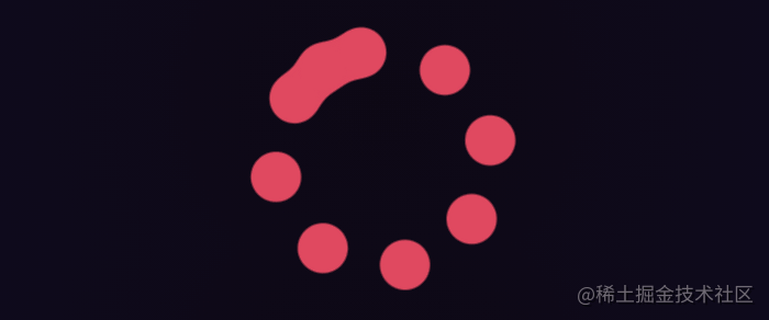
⛷️ 来吧展示
1、一个"滚动"加载
跳动旋转的的方块再加上渐变的影子简单的构成了一个物体滚动的画面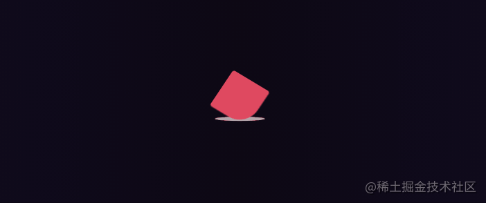
<div class="boxLoading">div>
/* loading.css */
.boxLoading {
  width: 50px;
  height: 50px;
  margin: auto;
  position: absolute;
  left: 0;
  right: 0;
  top: 0;
  bottom: 0;
}
.boxLoading:before {
  content: '';
  width: 50px;
  height: 5px;
  background: #fff;
  opacity: 0.7;
  position: absolute;
  top: 59px;
  left: 0;
  border-radius: 50%;
  animation: shadow .5s linear infinite;
}
.boxLoading:after {
  content: '';
  width: 50px;
  height: 50px;
  background: #e04960;
  animation: animate .5s linear infinite;
  position: absolute;
  top: 0;
  left: 0;
  border-radius: 3px;
}
@keyframes animate {
  17% {
    border-bottom-right-radius: 3px;
  }
  25% {
    transform: translateY(9px) rotate(22.5deg);
  }
  50% {
    transform: translateY(18px) scale(1, .9) rotate(45deg);
    border-bottom-right-radius: 40px;
  }
  75% {
    transform: translateY(9px) rotate(67.5deg);
  }
  100% {
    transform: translateY(0) rotate(90deg);
  }
}
@keyframes shadow {
  0%, 100% {
    transform: scale(1, 1);
  }
  50% {
    transform: scale(1.2, 1);
  }
}
Author:Dicson
2、一个"方块消失术"加载
当每个消失的方块集成一起再设置不同的消失时间会发生什么事情呢?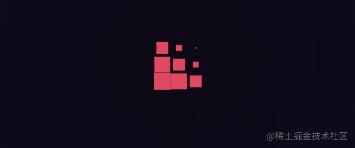
<div class="sk-cube-grid">
    <div class="sk-cube sk-cube-1">div>
    <div class="sk-cube sk-cube-2">div>
    <div class="sk-cube sk-cube-3">div>
    <div class="sk-cube sk-cube-4">div>
    <div class="sk-cube sk-cube-5">div>
    <div class="sk-cube sk-cube-6">div>
    <div class="sk-cube sk-cube-7">div>
    <div class="sk-cube sk-cube-8">div>
    <div class="sk-cube sk-cube-9">div>
  div>
/* loading.css */
.sk-cube-grid {
  width: 4em;
  height: 4em;
  margin: auto;
}
.sk-cube {
  width: 33%;
  height: 33%;
  background-color: #e04960;
  float: left;
  animation: sk-cube-grid-scale-delay 1.3s infinite ease-in-out;
}
.sk-cube-1 {
  animation-delay: 0.2s;
}
.sk-cube-2 {
  animation-delay: 0.3s;
}
.sk-cube-3 {
  animation-delay: 0.4s;
}
.sk-cube-4 {
  animation-delay: 0.1s;
}
.sk-cube-5 {
  animation-delay: 0.2s;
}
.sk-cube-6 {
  animation-delay: 0.3s;
}
.sk-cube-7 {
  animation-delay: 0s;
}
.sk-cube-8 {
  animation-delay: 0.1s;
}
.sk-cube-9 {
  animation-delay: 0.2s;
}
@keyframes sk-cube-grid-scale-delay {
  0%, 70%, 100% {
    transform: scale3D(1,1,1);
  }
  35%           {
    transform: scale3D(0,0,1);
  }
}
Author:Nicola Pressi
3、一个"无敌风火镰"加载
四个镰刀来回劈斩会形成一个什么现象呢?
<div class="spinner">
  <div class="outer">
    <div class="inner tl">div>
    <div class="inner tr">div>
    <div class="inner br">div>
    <div class="inner bl">div>
  div>
div>
/* loading.css */
.spinner {
  position: absolute;
  width: 128px;
  height: 128px;
  top: calc(50% - 64px);
  left: calc(50% - 64px);
  transform: perspective(206px) rotateX(45deg);
}

.outer {
  box-sizing: border-box;
  animation: spin 3s linear infinite;
  height: 100%;
}

.inner {
  position: absolute;
  border-radius: 50%;
  width: 64px;
  height: 64px;
  animation: spin 1.8s ease-in-out infinite;
}
.inner.tl {
  top: 0;
  left: 0;
  border-top: 2px solid #531430;
  border-left: 4px solid #531430;
}
.inner.tr {
  top: 0;
  right: 0;
  border-top: 2px solid #e04960;
  border-right: 4px solid #e04960;
}
.inner.br {
  bottom: 0;
  right: 0;
  border-bottom: 2px solid #531430;
  border-right: 4px solid #531430;
}
.inner.bl {
  bottom: 0;
  left: 0;
  border-bottom: 2px solid #e04960;
  border-left: 4px solid #e04960;
}
@keyframes spin {
  0% {
    transform: rotate(0deg);
  }
  100% {
    transform: rotate(360deg);
  }
}
Author:Martin van Driel
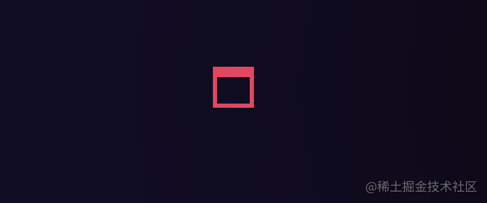
4、一个"填充"加载
简单的正方形旋转再加上内部的高度控制即可实现填充效果喔~
<span class="loading">
  <span class="loading-inner">span>
span>
/* loading.css */
.loading {
  display: inline-block;
  width: 30px;
  height: 30px;
  position: relative;
  border: 4px solid #e04960;
  animation: loader 4s infinite ease;
}
.loading-inner {
  vertical-align: top;
  display: inline-block;
  width: 100%;
  background-color: #e04960;
  animation: loader-inner 4s infinite ease-in;
}
@keyframes loader {
  0% {
    transform: rotate(0deg);
  }
  25% {
    transform: rotate(180deg);
  }
  50% {
    transform: rotate(180deg);
  }
  75% {
    transform: rotate(360deg);
  }
  100% {
    transform: rotate(360deg);
  }
}
@keyframes loader-inner {
  0% {
    height: 0%;
  }
  25% {
    height: 0%;
  }
  50% {
    height: 100%;
  }
  75% {
    height: 100%;
  }
  100% {
    height: 0%;
  }
}
Author:Josh
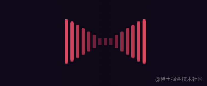
5、一个"音浪"加载
1个元素缩放很简陋,那15个会发生什么?
<div class="loader">
  <span>span>
  <span>span>
  <span>span>
  <span>span>
  <span>span>
  <span>span>
  <span>span>
  <span>span>
  <span>span>
  <span>span>
  <span>span>
  <span>span>
  <span>span>
  <span>span>
  <span>span>
div>
/* loading.css */
.loader {
  position: absolute;
  top: 0px;
  bottom: 0px;
  left: 0px;
  right: 0px;
  margin: auto;
  width: 175px;
  height: 100px;
}
.loader span {
  display: block;
  background: #e04960;
  width: 7px;
  height: 100%;
  border-radius: 14px;
  margin-right: 5px;
  float: left;
}
.loader span:last-child {
  margin-right: 0px;
}
.loader span:nth-child(1) {
  animation: load 2.5s 1.4s infinite linear;
}
.loader span:nth-child(2) {
  animation: load 2.5s 1.2s infinite linear;
}
.loader span:nth-child(3) {
  animation: load 2.5s 1s infinite linear;
}
.loader span:nth-child(4) {
  animation: load 2.5s 0.8s infinite linear;
}
.loader span:nth-child(5) {
  animation: load 2.5s 0.6s infinite linear;
}
.loader span:nth-child(6) {
  animation: load 2.5s 0.4s infinite linear;
}
.loader span:nth-child(7) {
  animation: load 2.5s 0.2s infinite linear;
}
.loader span:nth-child(8) {
  animation: load 2.5s 0s infinite linear;
}
.loader span:nth-child(9) {
  animation: load 2.5s 0.2s infinite linear;
}
.loader span:nth-child(10) {
  animation: load 2.5s 0.4s infinite linear;
}
.loader span:nth-child(11) {
  animation: load 2.5s 0.6s infinite linear;
}
.loader span:nth-child(12) {
  animation: load 2.5s 0.8s infinite linear;
}
.loader span:nth-child(13) {
  animation: load 2.5s 1s infinite linear;
}
.loader span:nth-child(14) {
  animation: load 2.5s 1.2s infinite linear;
}
.loader span:nth-child(15) {
  animation: load 2.5s 1.4s infinite linear;
}
@keyframes load {
  0% {
    background: #531430;
    transform: scaleY(0.08);
  }
  50% {
    background: #e04960;

   transform: scaleY(1);
  }
  100% {
    background: #531430;
    transform: scaleY(0.08);
  }
}
Author:Dicson
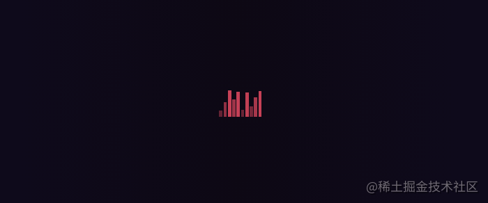
6、一个"声浪"加载
元素透明度与高度的配合也能做别具一格的效果
<div class="bars">
  <div class="bar">div>
  <div class="bar">div>
  <div class="bar">div>
  <div class="bar">div>
  <div class="bar">div>
  <div class="bar">div>
  <div class="bar">div>
  <div class="bar">div>
  <div class="bar">div>
  <div class="bar">div>
div>
/* loading.css */
.bars {
  height: 30px;
  left: 50%;
  margin: -30px 0 0 -20px;
  position: absolute;
  top: 60%;
  width: 40px;
}
.bar {
 background: #e04960;
  bottom: 1px;
  height: 3px;
  position: absolute;
  width: 3px;
  animation: sound 0ms -800ms linear infinite alternate;
}
@keyframes sound {
  0% {
     opacity: .35;
      height: 3px;
  }
  100% {
      opacity: 1;
      height: 28px;
  }
}
.bar:nth-child(1)  { left: 1px; animation-duration: 474ms; }
.bar:nth-child(2)  { left: 5px; animation-duration: 433ms; }
.bar:nth-child(3)  { left: 9px; animation-duration: 407ms; }
.bar:nth-child(4)  { left: 13px; animation-duration: 458ms; }
.bar:nth-child(5)  { left: 17px; animation-duration: 400ms; }
.bar:nth-child(6)  { left: 21px; animation-duration: 427ms; }
.bar:nth-child(7)  { left: 25px; animation-duration: 441ms; }
.bar:nth-child(8)  { left: 29px; animation-duration: 419ms; }
.bar:nth-child(9)  { left: 33px; animation-duration: 487ms; }
.bar:nth-child(10) { left: 37px; animation-duration: 442ms; }
Author:El Alemaño
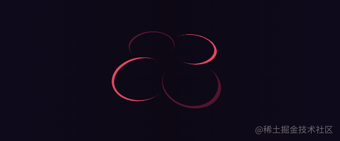
7、一个"无敌风火圆"加载
4个圆居然能做出相对排斥的效果?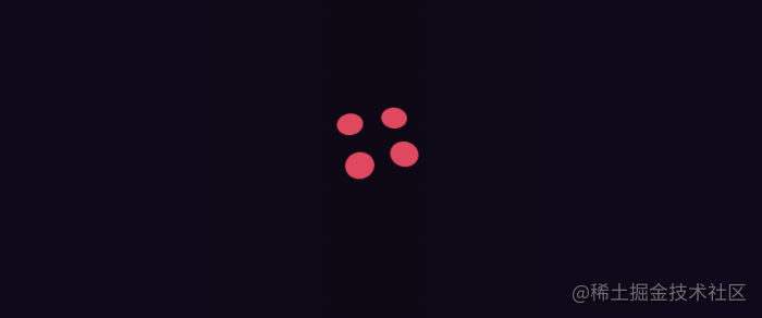
<div class="loading">
  <div class="inner one">div>
  <div class="inner two">div>
  <div class="inner three">div>
  <div class="inner four">div>
div>
/* loading.css */
.loading {
  position: absolute;
  top: calc(50% - 24px);
  left: calc(50% - 24px);
  width: 48px;
  height: 48px;
  border-radius: 50%;
  transform: perspective( 128px ) rotateX( 30deg );
}
.inner {
  position: absolute;
  box-sizing: border-box;
  width: 16px;
  height: 16px;
  background-color: #e04960;
  border-radius: 50%;
}
.inner.one {
  left: 0%;
  top: 0%;
  animation: move-right 1s ease-out infinite;
}
.inner.two {
  right: 0%;
  top: 0%;
  animation: move-down 1s ease-in-out infinite;
}
.inner.three {
  right: 0%;
  bottom: 0%;
  animation: move-left 1s ease-in-out infinite;
}
.inner.four {
  left: 0%;
  bottom: 0%;
  animation: move-up 1s ease-out infinite;
}
@keyframes move-right {
  0% {
    transform: translateX(0);
  }
  100% {
    transform: translateX(32px);
  }
}
@keyframes move-down {
  0% {
    transform: translateY();
  }
  100% {
    transform: translateY(32px);
  }
}
@keyframes move-left {
  0% {
    transform: translateX(0);
  }
  100% {
    transform: translateX(-32px);
  }
}
@keyframes move-up {
  0% {
    transform: translateY(0);
  }
  100% {
    transform: translateY(-32px);
  }
}
Author:Martin van Driel
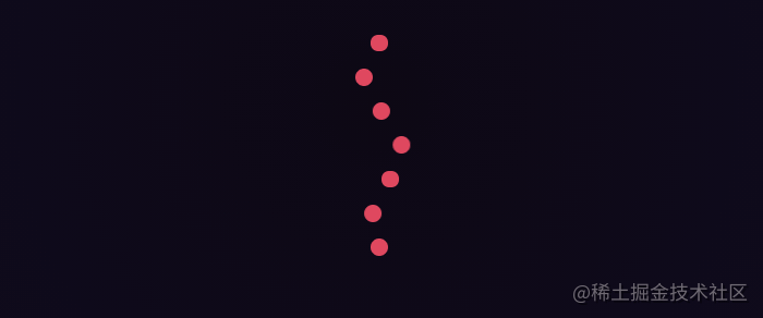
8、一个"弹珠"加载
一个个的小弹珠来回移动居然也能描绘出如此美妙的画面
<div class="container">
  <div class="ball">div>
  <div class="ball">div>
  <div class="ball">div>
  <div class="ball">div>
  <div class="ball">div>
  <div class="ball">div>
  <div class="ball">div>
div>
/* loading.css */
.container {
    width: 200px;
    height: 100px;
    margin: 0 auto;
}
.ball {
    width: 10px;
    height: 10px;
    margin: 10px auto;
    border-radius: 50px;
}
.ball:nth-child(1) {
    background: #e04960;
    -webkit-animation: right 1s infinite ease-in-out;
    -moz-animation: right 1s infinite ease-in-out;
    animation: right 1s infinite ease-in-out;
}
.ball:nth-child(2) {
    background: #e04960;
    -webkit-animation: left 1.1s infinite ease-in-out;
    -moz-animation: left 1.1s infinite ease-in-out;
    animation: left 1.1s infinite ease-in-out;
}
.ball:nth-child(3) {
    background: #e04960;
    -webkit-animation: right 1.05s infinite ease-in-out;
    -moz-animation: right 1.05s infinite ease-in-out;
    animation: right 1.05s infinite ease-in-out;
}
.ball:nth-child(4) {
    background: #e04960;
    -webkit-animation: left 1.15s infinite ease-in-out;
    -moz-animation: left 1.15s infinite ease-in-out;
    animation: left 1.15s infinite ease-in-out;
}
.ball:nth-child(5) {
    background: #e04960;
    -webkit-animation: right 1.1s infinite ease-in-out;
    -moz-animation: right 1.1s infinite ease-in-out;
    animation: right 1.1s infinite ease-in-out;
}
.ball:nth-child(6) {
    background: #e04960;
    -webkit-animation: left 1.05s infinite ease-in-out;
    -moz-animation: left 1.05s infinite ease-in-out;
    animation: left 1.05s infinite ease-in-out;
}
.ball:nth-child(7) {
    background: #e04960;
    -webkit-animation: right 1s infinite ease-in-out;
    -moz-animation: right 1s infinite ease-in-out;
    animation: right 1s infinite ease-in-out;
}
@-webkit-keyframes right {
    0% {
            -webkit-transform: translate(-15px);
    }
    50% {
            -webkit-transform: translate(15px);
    }
    100% {
            -webkit-transform: translate(-15px);
    }
}
@-webkit-keyframes left {
    0% {
            -webkit-transform: translate(15px);
    }
    50% {
            -webkit-transform: translate(-15px);
    }
    100% {
            -webkit-transform: translate(15px);
    }
}
@-moz-keyframes right {
    0% {
            -moz-transform: translate(-15px);
    }
    50% {
            -moz-transform: translate(15px);
    }
    100% {
            -moz-transform: translate(-15px);
    }
}
@-moz-keyframes left {
    0% {
            -moz-transform: translate(15px);
    }
    50% {
            -moz-transform: translate(-15px);
    }
    100% {
            -moz-transform: translate(15px);
    }
}
@keyframes right {
    0% {
            transform: translate(-15px);
    }
    50% {
            transform: translate(15px);
    }
    100% {
            transform: translate(-15px);
    }
}
@keyframes left {
    0% {
            transform: translate(15px);
    }
    50% {
            transform: translate(-15px);
    }
    100% {
            transform: translate(15px);
    }
}
Author:Richie
9、一个"胶粘"加载
每个圆进行粘合拆分形成了一个胶粘效果
<div class="loading">
div>
<svg xmlns="http://www.w3.org/2000/svg" version="1.1">
  <defs>
    <filter id="goo">
      <feGaussianBlur in="SourceGraphic" stdDeviation="6.3" result="blur" />
      <feColorMatrix in="blur" mode="matrix" values="1 0 0 0 0  0 1 0 0 0  0 0 1 0 0  0 0 0 14 -4" result="goo" />
      <feBlend in="SourceGraphic" in2="goo" />
    filter>
  defs>
svg>
/* loading.css */
.loading {
  width: 166px;
  height: 166px;
  position: absolute;
  left: 50%;
  top: 50%;
  transform: translate(-50%, -50%);
  -webkit-filter: url("#goo");
  filter: url("#goo");
}
.loading span {
  width: 100%;
  text-align: center;
  color: #e04960;
  font-weight: bold;
  text-transform: uppercase;
  font-size: 15px;
  letter-spacing: 1px;
  position: absolute;
  left: 1px;
  top: 46%;
}
.loading:before, .loading:after {
  content: '';
  border-radius: 50%;
  background-color: #e04960;
  width: 26px;
  height: 26px;
  position: absolute;
  left: 72px;
  top: 8px;
  animation: rotate 6s linear;
  animation-iteration-count: infinite;
  transform-origin: 12px 76px;
}
.loading:before {
  box-shadow: 45px 19px 0px 0px #e04960, 62px 63px 0px 0px #e04960, 45px 107px 0px 0px #e04960, 0px 126px 0px 0px #e04960, -46px 107px 0px 0px #e04960, -63px 63px 0px 0px #e04960, -46px 19px 0px 0px #e04960;
}
.loading:after {
  animation-direction: reverse;
}
@keyframes rotate {
 0% { transform: rotate(0deg); }
 100% { transform: rotate(-360deg); }
}
Author:Dicson
10、一个"方块对对碰"加载
巧妙的运用位移也能做出碰撞挤出的效果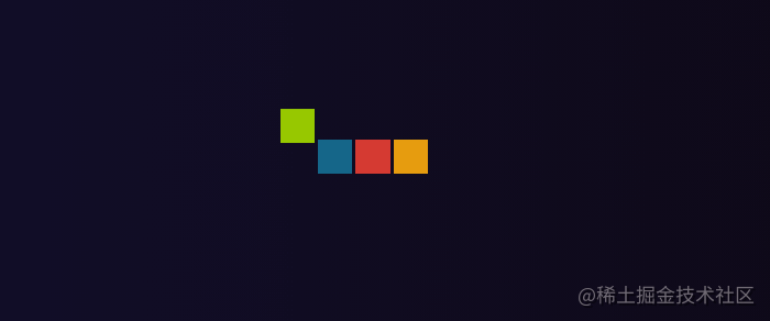
<div class="loading">
  <div class="loading-square">div>
  <div class="loading-square">div>
  <div class="loading-square">div>
  <div class="loading-square">div>
div>
/* loading.css */
.loader {
  display: block;
  position: relative;
  height: 20px;
  width: 86px;
}
.loading-square {
  position: absolute;
  height: 20px;
  width: 20px;
  top: 0;
}
.loading-square:nth-child(1) {
  left: 0;
  animation: square1 1.5s linear forwards infinite;
}
.loading-square:nth-child(2) {
  left: 22px;
  animation: square2 1.5s linear forwards infinite;
}
.loading-square:nth-child(3) {
  left: 44px;
  animation: square3 1.5s linear forwards infinite;
}
.loading-square:nth-child(4) {
  left: 66px;
  animation: square4 1.5s linear forwards infinite;
}
@keyframes square1 {
  0% {
    background-color: #97c900;
    transform: translate(0, 0);
  }
  9.09091% {
    transform: translate(0, calc(-100% - 2px));
    background-color: #97c900;
  }
  18.18182% {
    transform: translate(calc(100% + 2px), calc(-100% - 2px));
    background-color: #15668a;
  }
  27.27273% {
    transform: translate(calc(100% + 2px), 0);
  }
  100% {
    background-color: #15668a;
    transform: translate(calc(100% + 2px), 0);
  }
}
@keyframes square2 {
  0% {
    background-color: #15668a;
    transform: translate(0, 0);
  }
  18.18182% {
    transform: translate(0, 0);
  }
  27.27273% {
    transform: translate(0, calc(100% + 2px));
    background-color: #15668a;
  }
  36.36364% {
    transform: translate(calc(100% + 2px), calc(100% + 2px));
    background-color: #D53A33;
  }
  45.45455% {
    transform: translate(calc(100% + 2px), 0);
  }
  100% {
    background-color: #D53A33;
    transform: translate(calc(100% + 2px), 0);
  }
}
@keyframes square3 {
  0% {
    background-color: #D53A33;
    transform: translate(0, 0);
  }
  36.36364% {
    transform: translate(0, 0);
  }
  45.45455% {
    transform: translate(0, calc(-100% - 2px));
    background-color: #D53A33;
  }
  54.54545% {
    transform: translate(calc(100% + 2px), calc(-100% - 2px));
    background-color: #E79C10;
  }
  63.63636% {
    transform: translate(calc(100% + 2px), 0);
  }
  100% {
    background-color: #E79C10;
    transform: translate(calc(100% + 2px), 0);
  }
}
@keyframes square4 {
  0% {
    transform: translate(0, 0);
    background-color: #E79C10;
  }
  54.54545% {
    transform: translate(0, 0);
  }
  63.63636% {
    transform: translate(0, calc(100% + 2px));
    background-color: #E79C10;
  }
  72.72727% {
    background-color: #D53A33;
  }
  81.81818% {
    background-color: #15668a;
  }
  90.90909% {
    transform: translate(calc(-300% - 6px), calc(100% + 2px));
    background-color: #97c900;
  }
  100% {
    transform: translate(calc(-300% - 6px), 0);
    background-color: #97c900;
  }
}
Author:Paul Grant
11、一个"Switch"加载
有Switch的同学应该很熟悉了,这就是eshop里面的加载
<div class="load">
  <div class="loading">
    <div class="loader__bar">div>
    <div class="loader__bar loader__bar--delay-1">div>
    <div class="loader__bar loader__bar--delay-2">div>
    <div class="loader__bar loader__bar--delay-3">div>
    <div class="loader__bar loader__bar--delay-4">div>
    <div class="loader__bar loader__bar--delay-5">div>
    <div>
  div>
div>
/* loading.css */
.load{
  width: 400px;
  height: 170px;
}
@keyframes loader {
  0%{
    background: #FF8919;
    width:0%;
  }20%{
    width:100%;
  }39%{
    background: #FF8919;
  }40%{
    background: #FFA54F;
    width: 0%
  }60%{
    width: 100%;
  }80%{
    width:0%;
  }100%{
    background: #FFA54F;
    width: 0%;
  }
}
@keyframes loaderAlt {
  0%{
    background: #FF7C00;
    width:100%;
  }19%{
    background: #FF7C00;
  }20%{
    background: #FF9834;
    width: 0%;
  }40%{
    width: 100%;
  }59%{
    background: #FF9834;
  }60%{
    background: #FF7C00;
    width: 0;
  }80%{
    width: 100%;
  }100%{
    background: #FF7C00;
    width: 100%
  }
}
.loading{
  display: flex;
  flex-direction: column;
  height: 100%;
  position: relative;
  width: 100%;
}
.loader__bar{
  display: flex;
  flex: 1;
  position: relative;
  width: 100%;
}
.loader__bar:before{
  animation: loader ease 8s infinite;
  animation-delay: 100ms;
  background: #FF7C00;
  background-size: 200% 200%;
  content: "";
  height:100%;
  width: 0%;
}
.loader__bar:after{
  animation: loaderAlt ease 8s infinite;
  animation-delay: 100ms;
  background: #FF7C00;
  background-size: 200% 200%;
  content: "";
  height: 100%;
  width: 100%;
}
.loader__bar--delay-1:before,
.loader__bar--delay-1:after{
  animation-delay: 200ms;
}
.loader__bar--delay-2:before,
.loader__bar--delay-2:after{
  animation-delay: 300ms;
}
.loader__bar--delay-3:before,
.loader__bar--delay-3:after{
  animation-delay: 400ms;
}
.loader__bar--delay-4:before,
.loader__bar--delay-4:after{
  animation-delay: 500ms;
}
.loader__bar--delay-5:before,
.loader__bar--delay-5:after{
  animation-delay: 600ms;
}
Author:Steve Meredith
评论