
如何在科研论文中画出漂亮的插图?
点击上方“视学算法”,选择加"星标"或“置顶”
重磅干货,第一时间送达
仅做学术分享,如有侵权,联系删除
转载于 :极市平台,知乎
方法一
作者|冯昱尧
https://www.zhihu.com/question/21664179/answer/18928725
(以下图片均引用自 Thumbnail gallery )
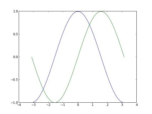
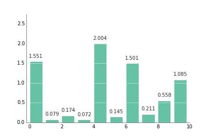
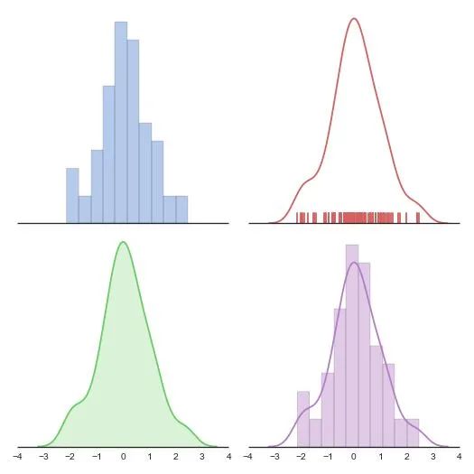
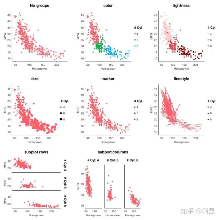
像这种普通的函数图象:
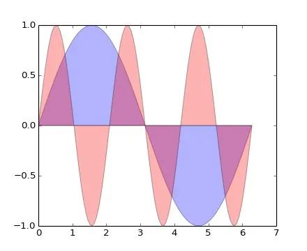
plt.fill(x, y1, 'b', x, y2, 'r', alpha=0.3)
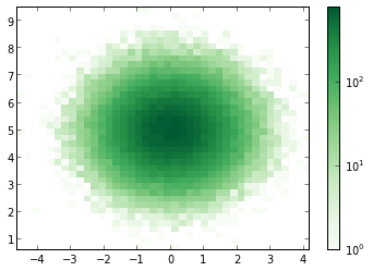
以及这种 Scatter 图(中文不知道该怎么说…):
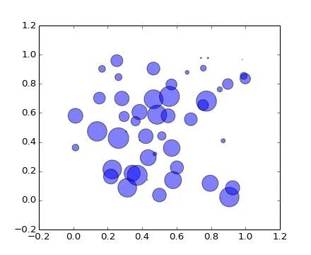
plt.scatter(x, y, s=area, alpha=0.5)精致的曲线,半透明的配色。都显出你那高贵冷艳的X格,最重要的是只需一行代码就能搞定。从此以后再也不用忍受 Matlab以及GNUPlot 中那蛋疼的配色了。
想画 3D 数据?没有问题 (不过用 mayavi 可能更方便一些):
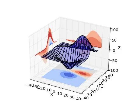
ax.plot_surface(X, Y, Z, rstride=8, cstride=8, alpha=0.3)cset = ax.contourf(X, Y, Z, zdir='z', offset=-100, cmap=cm.coolwarm)cset = ax.contourf(X, Y, Z, zdir='x', offset=-40, cmap=cm.coolwarm)cset = ax.contourf(X, Y, Z, zdir='y', offset=40, cmap=cm.coolwarm)
四行代码你就能拥有(后三行是画坐标平面上的等高线,严格的额说还是一行)。
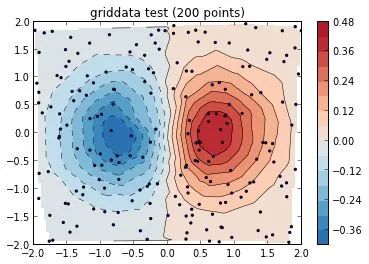
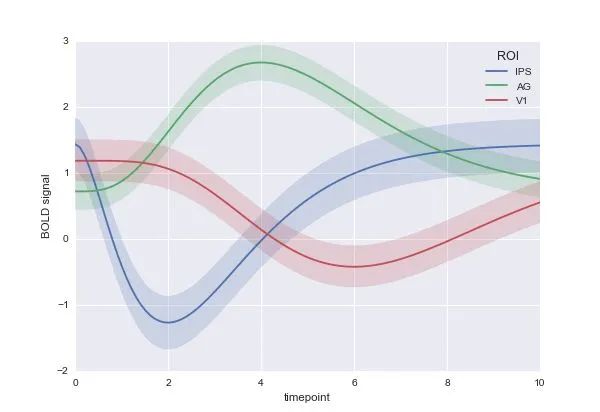
除此以外,不过你是矢量场,网络还是什么奇葩的需求都能够搞定:
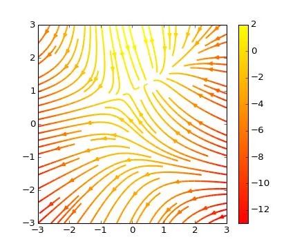
plt.streamplot(X, Y, U, V, color=U, linewidth=2, cmap=plt.cm.autumn)plt.colorbar()
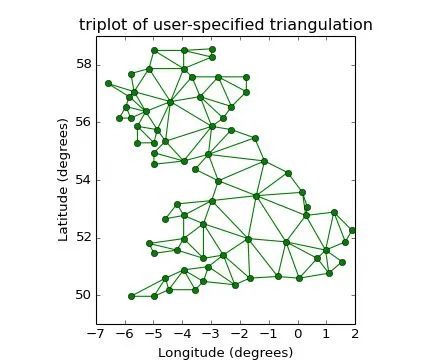
plt.triplot(x, y, triangles, 'go-')plt.title('triplot of user-specified triangulation')plt.xlabel('Longitude (degrees)')plt.ylabel('Latitude (degrees)')
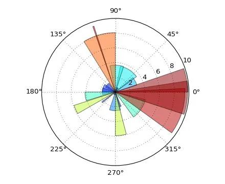
ax = plt.subplot(111, polar=True)bars = ax.bar(theta, radii, width=width, bottom=0.0)
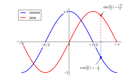
这还没完,Matplotlib 还支持Latex公式的插入,当别人画的图还是这个样子的时候(以下图片引用自Matplotlib Tutorial(译))
你能够把它变成这个样子:
如果再搭配上 IPython 作为运行终端(这张图是自己的~):
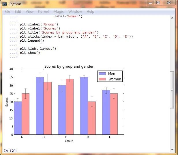
简直就是神器啊,有木有!
心动不如行动,还等什么?
经@许铖同学提醒,再补充一句,matplotlib 还可以话 xkcd 风格的图呦~
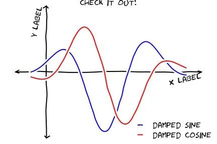
(图片引用自网络)
此外结合 IPython Notebook 后更多精彩内容,请看http://nbviewer.ipython.org/
如果嫌安装麻烦并且恰好在 Windows 系统下的话可以尝试Python的一个发行版winpython - Portable Scientific Python 2/3 32/64bit Distribution for Windows。
鉴于@van li同学质疑 matplotlib 是否能画出题目中所示的图像,我在这里将题目中的图像用 matplotlib 画出来如下:
代码在此处:
https://gist.github.com/coldfog/c479124328fc6bb8b789
代码在此处:
https://gist.github.com/coldfog/5da63a6958fc0a949b52
看到楼下有人说配色和好看,唉....那我也贴几个吧...只不过当初限于篇幅没有写而已。
首先,python 有一个专门的配色包jiffyclub/brewer2mpl 路 GitHub,提供了从美术角度来讲的精美配色(戳这里感受ColorBrewer: Color Advice for Maps)。
此外还有一些致力于美化绘图的库,用起来也都非常方便,比如olgabot/prettyplotlib 路 GitHub。
废话不多说,上图就是王道。
(一下图片来源网络)
有人可能会说需要复杂的设置,其实也不用。比如上边这幅图,只需要多加一个参数就好:
cmap=brewer2mpl.get_map('RdBu', 'diverging', 8, reverse=True).mpl_colormap,
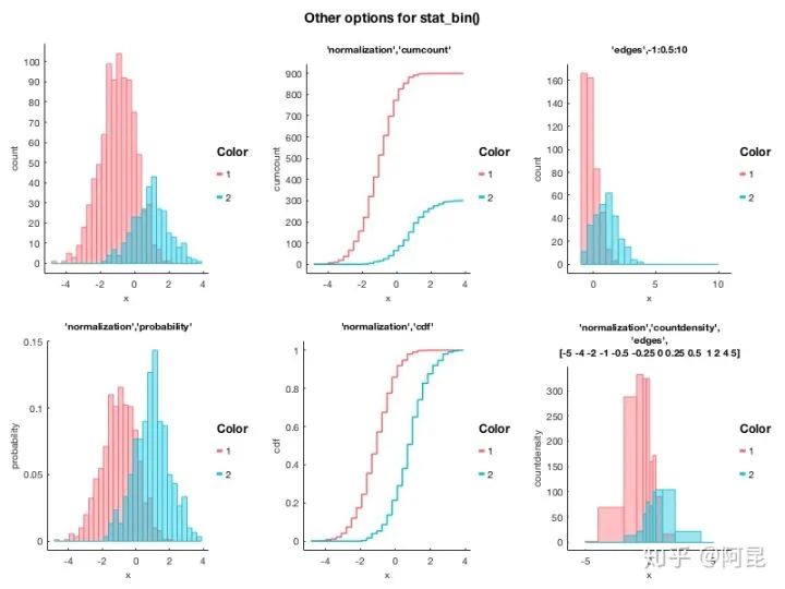
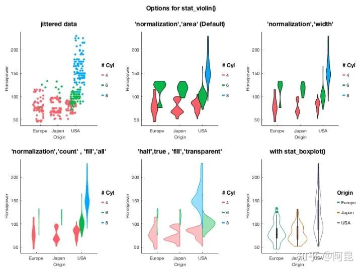
楼下说到统计绘图。嘛 seaborn (https://github.com/mwaskom/seaborn) 是一个调用 matplotlib 的统计绘图库,上图:
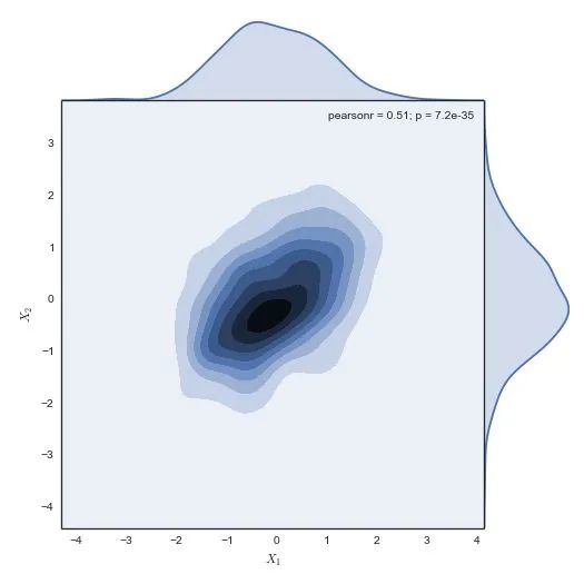
代码一行,后边的几乎都是一行,没做其他设置,默认就这样。我就不贴其他的代码了:
g = sns.jointplot(x1, x2, kind="kde", size=7, space=0)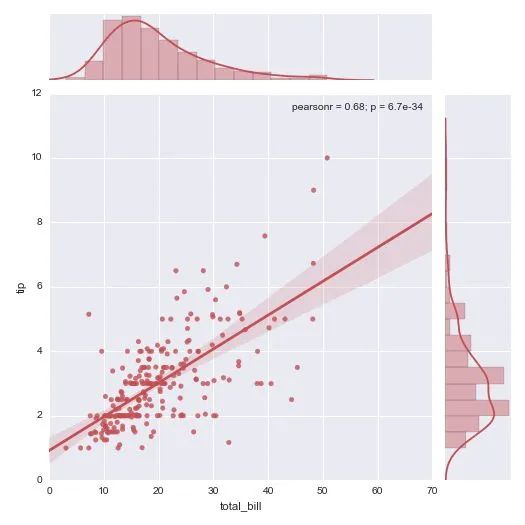
这还有个更炫酷的可交互式的绘图,大家自己戳开看吧:
http://nbviewer.ipython.org/github/plotly/python-user-guidechaocc/blob/master/s0_getting-started/s0_getting-started.ipynb
哼哼,完爆了吧~~~~\(≧▽≦)/~
---
遇到安装问题的请尝试Anaconda这个Python发行版。下载安装后直接使用即可,它几乎预装了所有要用到的科学计算及可视化的库。
有盆友在评论里说希望能有完整的教程,确实就这个答案来说,离实际使用还有很大的距离,网上相关的中文资料也不多。不过真要写起来这个答案也装不下,况且写在这个问题下也不是很恰当。等到那天我有专栏了再说吧,到时候也许会写一个关于可视化的系列教程。
方法二
作者|阿昆
https://www.zhihu.com/question/21664179/answer/1182984311
翻遍这个问题下的所有回答,发现凡是提到Matlab的,其评价中常有‘锯齿’,‘菜鸟’,‘难看’,‘不忍直视’等标签。
然而,2020年了,技术提升了,观念进步了,当一些基本问题解决后,Matlab还那么‘不堪’吗?

观察Mathematica、Origin、Python/matplotlib、R/ggplot2等软件绘制的数据、结果图,其与Matlab图的差异主要体现在点、线、面等对象属性(位置、尺寸、颜色等)的不同上。
既然只是属性的不同,那是不是只要修改一下这些信息,就可以实现各种软件绘图风格之间的转换了呢?
答案是肯定的。
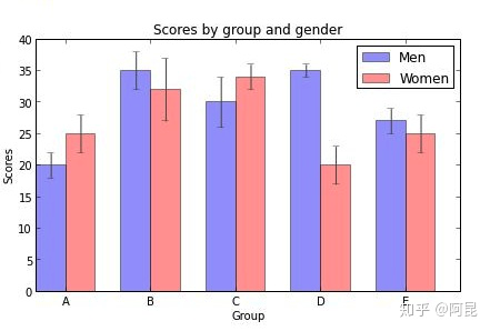
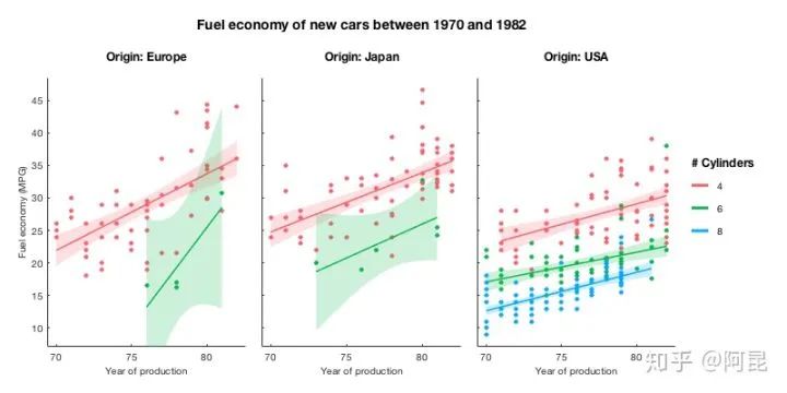
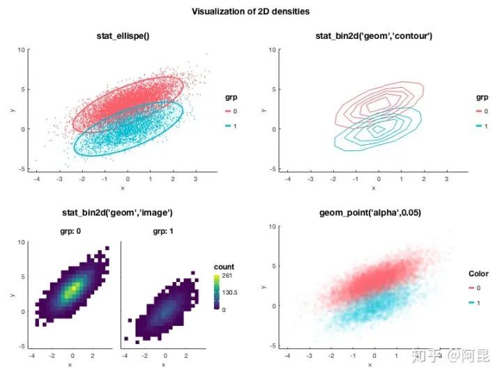
比如,这是高赞回答 @冯昱尧用Python/matplotlib绘制的一幅图:
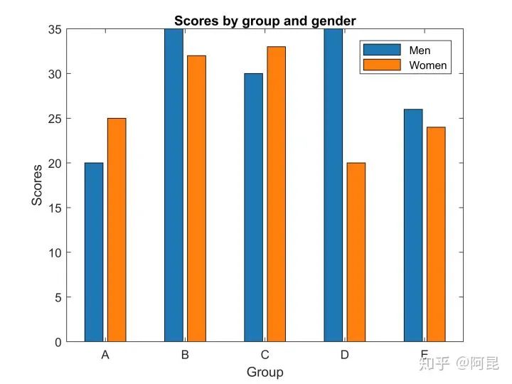
我们用Matlab默认属性来绘制,效果是这样的(没加误差棒):
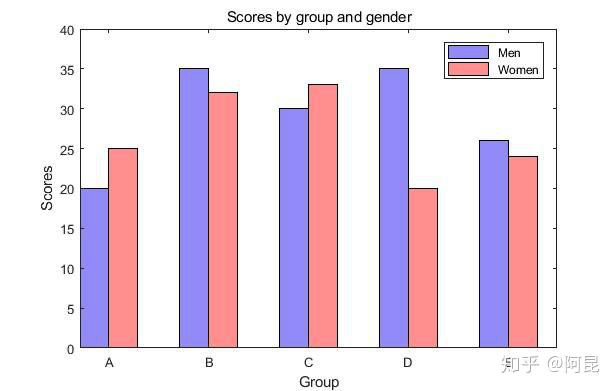
然后,只需再修改一下位置、尺寸、颜色等信息,就可以得到风格差不多的图(没加误差棒):
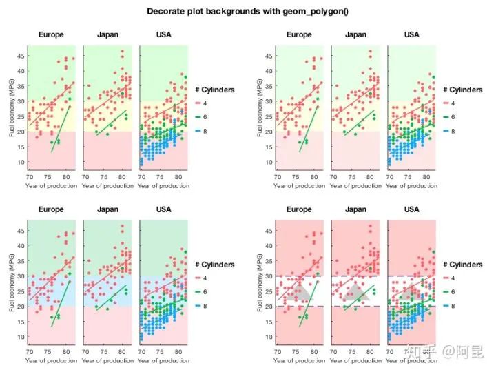
当我们用这一思想来思考该如何绘制插图时,就很容易实现自己的小想法,仿造甚至创造出理想的插图。
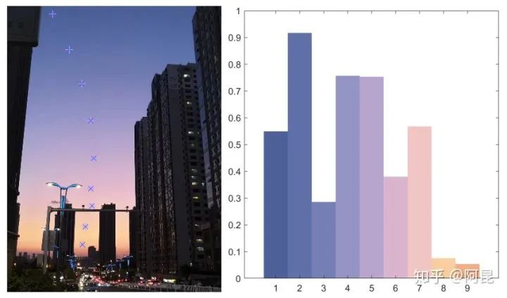
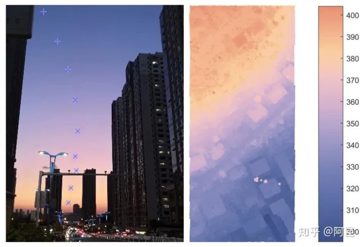
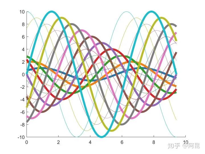
比如,某一天,发现傍晚的天空颜色很美,心想:为什么不能把它画到论文插图里呢?(见:Matlab论文插图配色2——自然渐变)
于是,
再比如,某一天,看到女朋友的照片,觉得很美,心想:为什么不能把她画到论文插图里呢?(见:Matlab论文插图配色1——是女朋友的颜色)
于是,

这时,有朋友就要说了:“哎呀答主,你整这些个花里花哨的东西,还不是得一行代码一行代码的敲出来啊,太麻烦了吧。”
此言差矣。
就像R有ggplot2,Python有matplotlib,Matlab其实也有很多现成的绘图工具包,并不需要你自己开发。
比如,
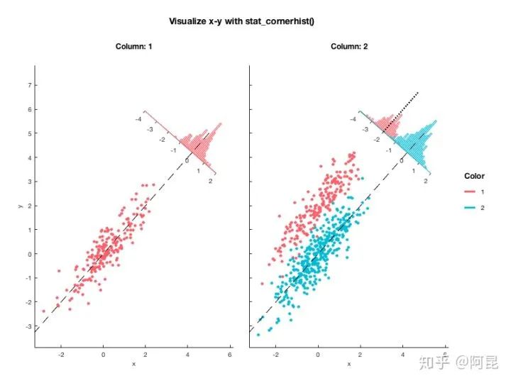
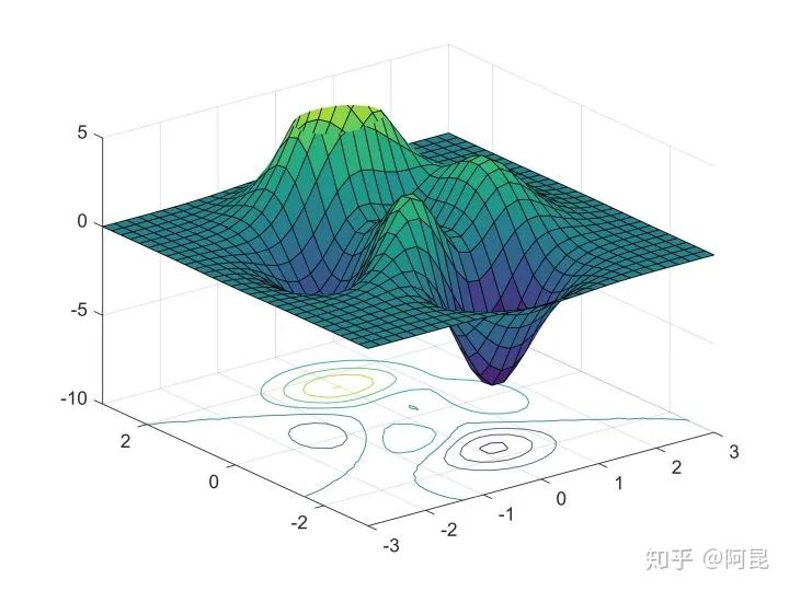
Pierre Morel [1] 结合ggplot2,开发了gramm工具,用于绘制复杂图形。
Inspired by ggplot2 (Wickham 2009), the R implementation of “grammar of graphics” principles (Wilkinson 1999), gramm improves Matlab’s plotting functionality, allowing to generate complex figures using high-level object-oriented code.
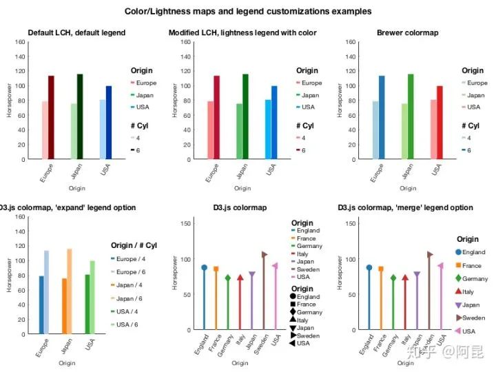
示例效果如下:
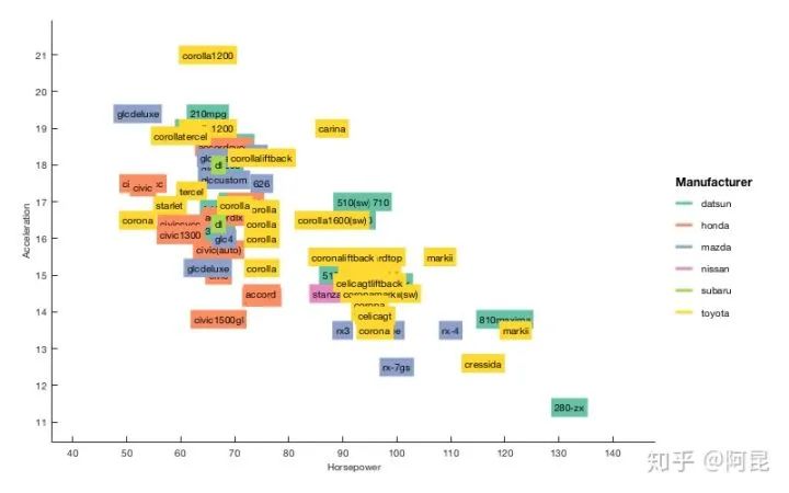
类似的,Stephen Cobeldick [2] 将matplotlib配色方案移植到了Matlab。
也就是说,在Matlab中就可以直接用matplotlib的配色方案了,就不必总是‘jet’了。
The MatPlotLib 2.0 default colormaps ported to MATLAB. This submission also includes the Line ColorOrder colormaps!
示例效果如下:
还有很多专门针对论文插图的工具包,这里就不一一介绍了。
总的来说,工具只是工具,它们并没有高低贵贱之分。
若想画出好看的插图,关键还是在于使用工具的人。
集中一点,登峰造极。
参考:
Morel P . Gramm: grammar of graphics plotting in Matlab.
Cobeldick S . MatPlotLib Perceptually Uniform Colormaps.
---------♥---------
声明:本内容来源网络,版权属于原作者
图片来源网络,不代表本公众号立场。如有侵权,联系删除

点个在看 paper不断!