
如何用纯 CSS 创作一把剪刀
问:如何用纯 CSS 创作一把剪刀
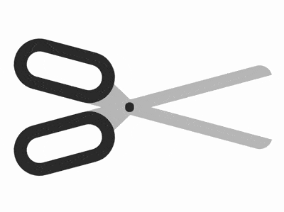
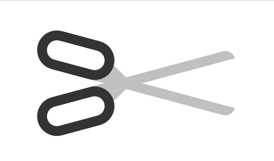
动态效果预览
复制跳转下方连接可以去查看动态效果
https://codepen.io/comehope/pen/GXyGpZ
源代码下载
https://github.com/comehope/front-end-daily-challenges
代码解读
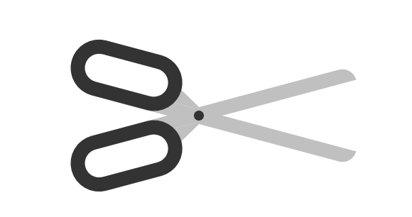
定义 dom,容器中包含 2 个 .half 元素,各表示剪刀的半边,它的子元素 handle 表示刀柄,blade 表示刀,最后的 .joint 表示连接左右两部分铆钉:
<figure class="scissors">
    <div class="half">
        <span class="handle"></span>
        <span class="blade"></span>
    </div>
    <div class="half">
        <span class="blade"></span>
        <span class="handle"></span>
    </div>
    <div class="joint"></div>
</figure>
居中显示:
body {
    margin: 0;
    height: 100vh;
    display: flex;
    align-items: center;
    justify-content: center;
}
定义容器尺寸,其中 outline 是辅助线:
.scissors {
    width: 21em;
    height: 7em;
    outline: 1px dashed;
}
定义半边剪刀的尺寸,其中 outline 是辅助线:
.scissors {
    position: relative;
}

.half {
    position: absolute;
    width: inherit;
    height: 4em;
    outline: 1px dashed red;
}
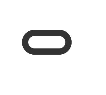
画出刀柄:
.handle {
    position: absolute;
    box-sizing: border-box;
    width: 8em;
    height: inherit;
    border: 1em solid #333;
    border-radius: 2em;
}
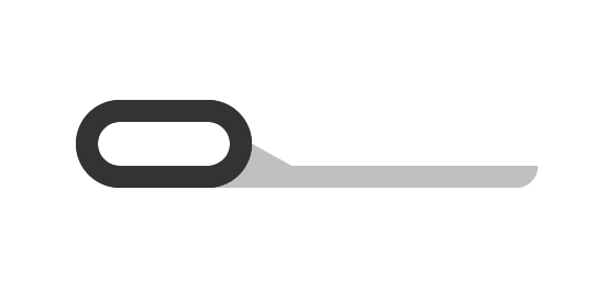
画出刀,用圆角属性画出了顶部的刀尖:
.blade {
    position: absolute;
    width: 15em;
    height: 1em;
    background-color: silver;
    top: 3em;
    left: 6em;
    border-radius: 0 0 1em 0;
    z-index: -1;
}
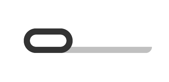
用伪元素在刀的底部画一个三角形,使刀与刀柄连接得更牢固:
.blade::before {
    content: '';
    position: absolute;
    border-style: solid;
    border-width: 0 1.8em 1em 1.8em;
    border-color: transparent transparent silver transparent;
    top: -1em;
    left: 0.2em;
}
使半边刀倾斜:
.half {
    transform-origin: 45% bottom;
    transform: rotate(15deg);
}
利用 scale() 函数画出剪刀的另一半:
.half {
    transform-origin: 45% bottom;
    transform: rotate(calc(15deg * var(--direction))) scaleY(var(--direction));
}

.half:nth-child(1) {
    --direction: 1;
    top: 0;
}

.half:nth-child(2) {
    --direction: -1;
    top: -1em;
}
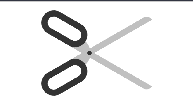
画出连接左右半边的铆钉:
.joint {
    position: absolute;
    width: 0.7em;
    height: 0.7em;
    background-color: #333;
    border-radius: 50%;
    top: calc(50% - 0.7em / 2);
    left: 45%;
}
增加动画鼠标悬停时的动画效果:
.scissors:hover .half {
    animation: cut 2s ease-out;
}

@keyframes cut {
    20%, 60% {
        transform: rotate(calc(30deg * var(--direction))) scaleY(var(--direction));
    }

    40%, 80% {
        transform: rotate(calc(5deg * var(--direction))) scaleY(var(--direction));
    }
}
最后,别忘了删掉辅助线。
原文出处:https://segmentfault.com/a/1190000016331561
CSS真是神秘~
针对这个题目,你的解决方案又是什么呢?
不妨在下面的留言给出,学习共勉下~
码字不易,走过路过可否点个 在看,点个赞👍先谢谢了!
ε=ε=ε=┏(゜ロ゜;)┛
最后
❝有疑问的同学 欢迎 评论区讨论,也欢迎大家加入我的前端技术交流群 来讨论。搜索《前端阳光》公众号,回复加群吧!
评论