
探索性数据分析,这8个流行的 Python可视化工具就够了

Matplotlib、Seaborn 和 Pandas
ggplot(2)
Bokeh
Plotly
Pygal
Networkx
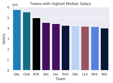
import seaborn as sns
import matplotlib.pyplot as plt

color_order = ['xkcd:cerulean', 'xkcd:ocean',
                'xkcd:black','xkcd:royal purple',
                'xkcd:royal purple', 'xkcd:navy blue',
                'xkcd:powder blue', 'xkcd:light maroon',
                'xkcd:lightish blue','xkcd:navy']

sns.barplot(x=top10.Team,
            y=top10.Salary,
            palette=color_order).set_title('Teams with Highest Median Salary')

plt.ticklabel_format(style='sci', axis='y', scilimits=(0,0))
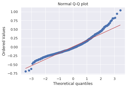
import matplotlib.pyplot as plt
import scipy.stats as stats

#model2 is a regression model
log_resid = model2.predict(X_test)-y_test
stats.probplot(log_resid, dist="norm", plot=plt)
plt.title("Normal Q-Q plot")
plt.show()
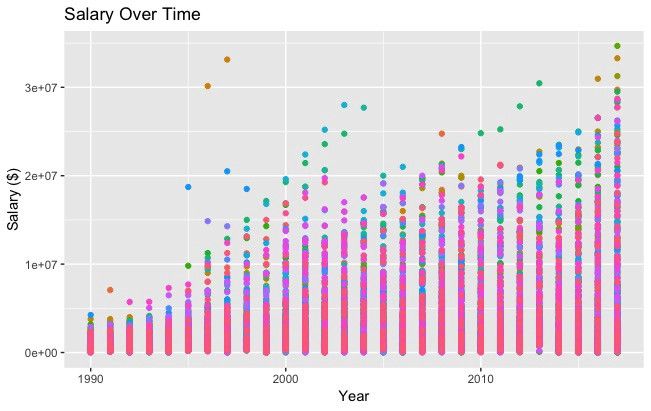
#All Salaries
ggplot(data=df, aes(x=season_start, y=salary, colour=team)) +
  geom_point() +
  theme(legend.position="none") +
  labs(title = 'Salary Over Time', x='Year', y='Salary ($)')
import pandas as pd
from bokeh.plotting import figure
from bokeh.io import show

# is_masc is a one-hot encoded dataframe of responses to the question:
# "Do you identify as masculine?"

#Dataframe Prep
counts = is_masc.sum()
resps = is_masc.columns

#Bokeh
p2 = figure(title='Do You View Yourself As Masculine?',
          x_axis_label='Response',
          y_axis_label='Count',
          x_range=list(resps))
p2.vbar(x=resps, top=counts, width=0.6, fill_color='red', line_color='black')
show(p2)

#Pandas
counts.plot(kind='bar')
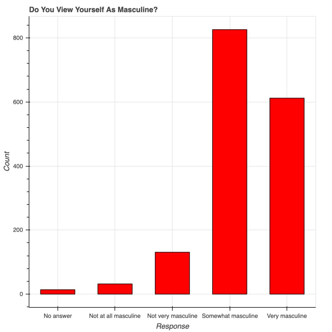 用 Bokeh 表示调查结果
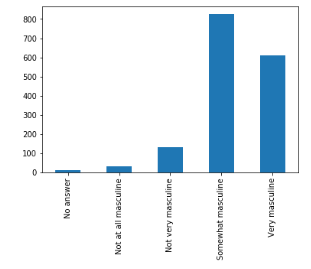
安装时要有 API 秘钥,还要注册,不是只用 pip 安装就可以;
Plotly 所绘制的数据和布局对象是独一无二的,但并不直观;
图片布局对我来说没有用(40 行代码毫无意义!)
你可以在 Plotly 网站和 Python 环境中编辑图片;
支持交互式图片和商业报表;
Plotly 与 Mapbox 合作,可以自定义地图;
很有潜力绘制优秀图形。
#plot 1 - barplot
# **note** - the layout lines do nothing and trip no errors
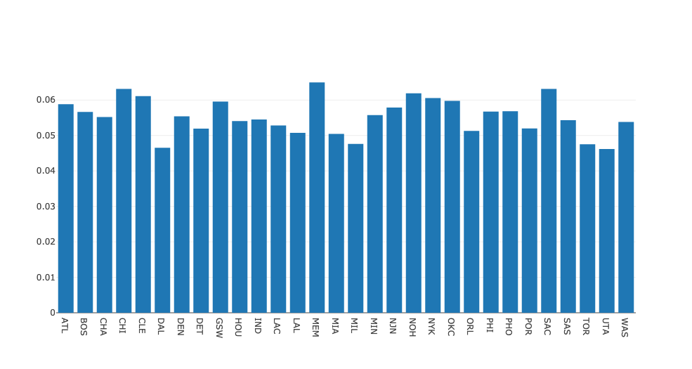
data = [go.Bar(x=team_ave_df.team,
y=team_ave_df.turnovers_per_mp)]
layout = go.Layout(
title=go.layout.Title(
text='Turnovers per Minute by Team',
xref='paper',
x=0
),
xaxis=go.layout.XAxis(
title = go.layout.xaxis.Title(
text='Team',
font=dict(
family='Courier New, monospace',
size=18,
color='#7f7f7f'
)
)
),
yaxis=go.layout.YAxis(
title = go.layout.yaxis.Title(
text='Average Turnovers/Minute',
font=dict(
family='Courier New, monospace',
size=18,
color='#7f7f7f'
)
)
),
autosize=True,
hovermode='closest')
py.iplot(figure_or_data=data, layout=layout, filename='jupyter-plot', sharing='public', fileopt='overwrite')
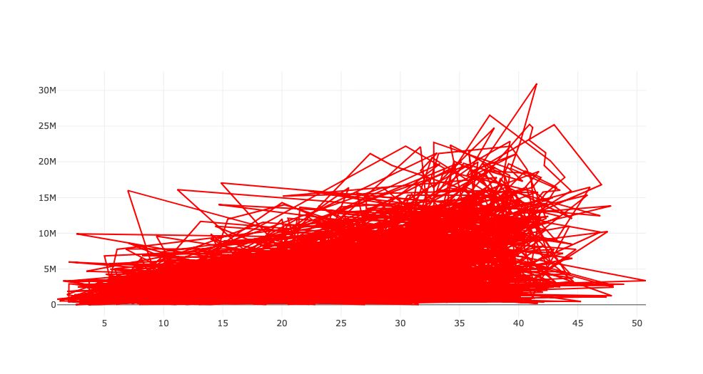
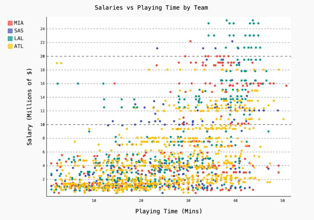
#plot 2 - attempt at a scatterplot
data = [go.Scatter(x=player_year.minutes_played,
y=player_year.salary,
marker=go.scatter.Marker(color='red',
size=3))]
layout = go.Layout(title="test",
xaxis=dict(title='why'),
yaxis=dict(title='plotly'))
py.iplot(figure_or_data=data, layout=layout, filename='jupyter-plot2', sharing='public')
实例化图片;
用图片目标属性格式化;
用 figure.add() 将数据添加到图片中。
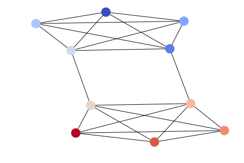
options = {
    'node_color' : range(len(G)),
    'node_size' : 300,
    'width' : 1,
    'with_labels' : False,
    'cmap' : plt.cm.coolwarm
}
nx.draw(G, **options)
import itertools
import networkx as nx
import matplotlib.pyplot as plt
f = open('data/facebook/1684.circles', 'r')
circles = [line.split() for line in f]
f.close()
network = []
for circ in circles:
cleaned = [int(val) for val in circ[1:]]
network.append(cleaned)
G = nx.Graph()
for v in network:
G.add_nodes_from(v)
edges = [itertools.combinations(net,2) for net in network]
for edge_group in edges:
G.add_edges_from(edge_group)
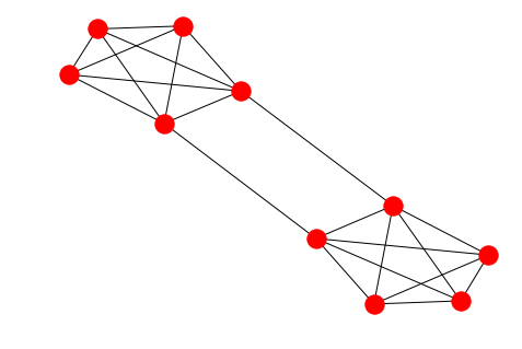
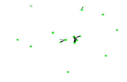
options = {
'node_color' : 'lime',
'node_size' : 3,
'width' : 1,
'with_labels' : False,
}
nx.draw(G, **options)
-END- 往期精彩推荐 -- -- 1、在线代码编辑器,可以分享给任何人 -- 2、Python 造假数据,用Faker就够了 -- 3、在Python中玩转Json数据 -- 留下你的“在看”呗!

评论