
Dialog 使用详解
共 27227字,需浏览 55分钟
·
2020-11-24 11:26

和你一起终身学习,这里是程序员Android
经典好文推荐,通过阅读本文,您将收获以下知识点:
一、Dialog 简介
二、Dialog 基本样式解析
三、简单对话框的实现
四、多选按钮对话框
五、单选按钮对话框
六、列表对话框
七、水平进度条对话框
八、圆形进度条对话框
九、自定义图文对话框
十、自定义输入对话框
十一、自定义样式对话框
十二、自定义Loading样式对话框
十三、继承 DialogFragment 实现对话框
十四、Activity形式的 对话框
十五、倒计时 30s Dialog实现
一、Dialog 简介
在学习Dialog 之前,我们先了解一下Dialog的基础关系。
Dialog的继承关系如下:
java.lang.Object
   ↳    android.app.Dialog
Dialog 是Android 常用控件之一,主要以弹出框的形式与用户进行交互。对话框是提示用户作出决定或输入额外信息的小窗口。对话框不会填充屏幕,通常用于需要用户采取行动才能继续执行的模式事件。
二、 Dialog 基本样式解析
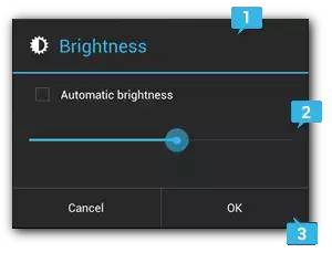
Dialog 基本样式
1.标题
这是可选项,只应在内容区域被详细消息、列表或自定义布局占据时使用。如需陈述的是一条简单消息或问题(如图 上图中的对话框),则不需要标题。
2.内容区域
它可以显示消息、列表或其他自定义布局。
3.操作按钮
对话框中的操作按钮不应超过三个。
三、简单对话框的实现
1.实现效果:
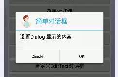
简单对话框
2.实现代码如下:
    /**
     * 简单对话框
     */
    public void SimpleDialog(View view) {

        AlertDialog.Builder builder = new AlertDialog.Builder(this);
        builder.setIcon(R.drawable.gril).setTitle("简单对话框")
                .setMessage("设置Dialog 显示的内容")
                .setPositiveButton("OK", new DialogInterface.OnClickListener() {

                    @Override
                    public void onClick(DialogInterface dialog, int which) {

                        Toast.makeText(DiaLogMethods.this, "点击了确定按钮",
                                Toast.LENGTH_SHORT).show();
                    }
                }).setNegativeButton("Cancle", null).create().show();

    }
四、多选按钮对话框
1.实现效果:
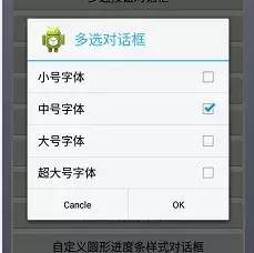
多选按钮对话框
2.实现代码:
/**
     * 多选按钮对话框
     * */
    public void MultiChoiceDialog(View view) {
        final String font[] = { "小号字体", "中号字体", "大号字体", "超大号字体" };
        final boolean[] MultiChoice = new boolean[] { false, true, false, false };
        AlertDialog.Builder builder = new AlertDialog.Builder(this);
        builder.setTitle("多选对话框")
                .setIcon(R.drawable.ic_launcher)
                .setMultiChoiceItems(font, MultiChoice,
                        new DialogInterface.OnMultiChoiceClickListener() {
                            @Override
                            public void onClick(DialogInterface dialog,
                                    int which, boolean isChecked) {
                                MultiChoice[which] = isChecked;
                                String choiceString = "";
                                for (int i = 0; i < MultiChoice.length; i++) {
                                    if (MultiChoice[i]) {
                                        choiceString = choiceString + font[i]
                                                + "  ";
                                    }
                                }

                                if (choiceString.equals("")
                                        || choiceString.length() == 0) {

                                    // 都不选的处理方法

                                    Toast.makeText(DiaLogMethods.this,
                                            "请选择一个内容", Toast.LENGTH_SHORT)
                                            .show();
                                } else {

                                    Toast.makeText(DiaLogMethods.this,
                                            "选择的字体为" + choiceString,
                                            Toast.LENGTH_SHORT).show();

                                }

                            }
                        }).setPositiveButton("OK", null)
                .setNegativeButton("Cancle", null).create().show();

    }
五、单选按钮对话框
1.实现效果:
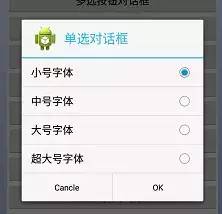
单选按钮对话框
2.实现代码如下:
    /**
     * 单选按钮对话框实现
     **/
    public void SingleChoiceDialog(View view) {
        final String font[] = { "小号字体", "中号字体", "大号字体", "超大号字体" };
        AlertDialog.Builder builder = new AlertDialog.Builder(this);
        builder.setTitle("单选对话框")
                .setIcon(R.drawable.ic_launcher)
                .setSingleChoiceItems(font, 0,
                        new DialogInterface.OnClickListener() {
                            @Override
                            public void onClick(DialogInterface dialog,
                                    int which) {
                                Toast.makeText(DiaLogMethods.this,
                                        "选择的字体为:" + font[which],
                                        Toast.LENGTH_SHORT).show();
                                dialog.dismiss();
                            }
                        }).setPositiveButton("OK", null)
                .setNegativeButton("Cancle", null).create().show();

    }
六、列表对话框
1.实现效果如下:
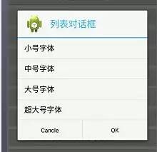
列表对话框
2.实现代码如下:
/**
     * 列表对话框实现
     **/
    public void ListItemDialog(View view) {
        final String font[] = { "小号字体", "中号字体", "大号字体", "超大号字体" };
        AlertDialog.Builder builder = new AlertDialog.Builder(this);
        builder.setIcon(R.drawable.ic_launcher)
                .setTitle(" 列表对话框")
                .setItems(font, new DialogInterface.OnClickListener() {
                    @Override
                    public void onClick(DialogInterface dialog, int which) {
                        Toast.makeText(DiaLogMethods.this,
                                "选择内容是:" + font[which], Toast.LENGTH_SHORT)
                                .show();
                    }
                }).setNegativeButton("Cancle", null)
                .setPositiveButton("OK", null).create().show();

    }
七、水平进度条对话框
1.实现效果如下:
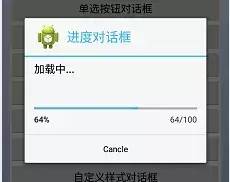
水平进度条对话框
2.实现代码如下:
    /**
     * 水平进度条对话框实现
     **/
    @SuppressWarnings("deprecation")
    public void HorProgressDialog(View view) {

        final ProgressDialog progressDialog = new ProgressDialog(
                DiaLogMethods.this);
        progressDialog.setTitle("进度对话框");
        progressDialog.setIcon(R.drawable.ic_launcher);
        progressDialog.setMessage("加载中...");
        // 水平进度条显示
        progressDialog.setProgressStyle(ProgressDialog.STYLE_HORIZONTAL);
        // 圆形进度条显示
        // progressDialog.setProgressStyle(ProgressDialog.STYLE_SPINNER);
        progressDialog.setCancelable(true);
        progressDialog.setButton("Cancle",
                new DialogInterface.OnClickListener() {
                    @Override
                    public void onClick(DialogInterface dialog, int which) {
                        Toast.makeText(DiaLogMethods.this, "取消进度条对话框",
                                Toast.LENGTH_LONG).show();
                        progressDialog.cancel();
                        count = 0;
                    }
                });
        progressDialog.setMax(100);
        progressDialog.show();
        count = 0;
        new Thread() {
            @Override
            public void run() {

                while (count <= 100) {
                    progressDialog.setProgress(count++);
                    try {
                        Thread.sleep(50);
                    } catch (InterruptedException e) {
                        progressDialog.dismiss();
                        e.printStackTrace();
                    }

                }
                progressDialog.dismiss();
            }
        }.start();

    }
八、 圆形进度条对话框
1.实现效果如下:
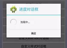
圆形进度条对话框
2.实现代码如下:
/**
     * 圆形进度条显示
     **/
    @SuppressWarnings("deprecation")
    public void SpinerProgressDialog(View view) {

        final ProgressDialog progressDialog = new ProgressDialog(
                DiaLogMethods.this);
        progressDialog.setTitle("进度对话框");
        progressDialog.setIcon(R.drawable.ic_launcher);
        progressDialog.setMessage("加载中...");
        // 水平进度条显示
        // progressDialog.setProgressStyle(ProgressDialog.STYLE_HORIZONTAL);
        // 圆形进度条显示
        progressDialog.setProgressStyle(ProgressDialog.STYLE_SPINNER);
        progressDialog.setCancelable(true);
        progressDialog.setButton("确定", new DialogInterface.OnClickListener() {
            @Override
            public void onClick(DialogInterface dialog, int which) {
                Toast.makeText(DiaLogMethods.this, "取消进度条对话框",
                        Toast.LENGTH_LONG).show();
                progressDialog.cancel();
                count = 0;
            }
        });
        progressDialog.setMax(100);
        progressDialog.show();
        count = 0;
        new Thread() {
            @Override
            public void run() {

                while (count <= 100) {
                    progressDialog.setProgress(count++);
                    try {
                        Thread.sleep(50);
                    } catch (InterruptedException e) {
                        progressDialog.dismiss();
                        e.printStackTrace();
                    }

                }
                progressDialog.dismiss();
            }
        }.start();

    }
注意 :
水平进度条,圆形进度条的区别 如下:
        // 水平进度条显示
        progressDialog.setProgressStyle(ProgressDialog.STYLE_HORIZONTAL);
        // 圆形进度条显示
        progressDialog.setProgressStyle(ProgressDialog.STYLE_SPINNER);
九、 自定义图文对话框
1.实现效果如下:
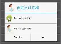
自定义图文对话框
2.实现代码如下:
    /**
     * 自定义图文对话框实现
     **/
    public void CustomImgTvDialog(View view) {

        AlertDialog.Builder builder = new AlertDialog.Builder(this);

        View contextview = getLayoutInflater().inflate(
                R.layout.dialog_custom_img_tv, null);
        LinearLayout linearLayout1 = (LinearLayout) findViewById(R.id.linlout1);
        LinearLayout linearLayout2 = (LinearLayout) findViewById(R.id.linlout2);
        ImageView img1 = (ImageView) contextview.findViewById(R.id.img1);
        TextView tv1 = (TextView) contextview.findViewById(R.id.tv1);
        // 这里可以处理一些点击事件

        builder.setIcon(R.drawable.gril).setTitle("自定义对话框")
                .setView(contextview)
                // 或者在这里处理一些事件
                .setPositiveButton("OK", null)
                .setNegativeButton("Cancle", null).create().show();
    }
注意:
3.自定义图文对话框的布局如下:
<LinearLayout xmlns:android="http://schemas.android.com/apk/res/android"
    android:layout_width="match_parent"
    android:layout_height="match_parent"
    android:orientation="vertical" >

    <LinearLayout
        android:id="@+id/linlout1"
        android:layout_width="match_parent"
        android:layout_height="wrap_content"
        android:layout_margin="5dp"
        android:orientation="horizontal" >

        <ImageView
            android:id="@+id/img1"
            android:layout_width="wrap_content"
            android:layout_height="wrap_content"
            android:src="@drawable/ic_launcher" />

        <TextView
            android:id="@+id/tv1"
            android:layout_width="match_parent"
            android:layout_height="wrap_content"
            android:layout_gravity="center_vertical"
            android:text="this is a test data" />
    LinearLayout>

    <View
        android:layout_width="match_parent"
        android:layout_height="1dp"
        android:layout_marginBottom="2dp"
        android:layout_marginTop="2dp"
        android:background="@android:color/darker_gray" />

    <LinearLayout
        android:id="@+id/linlout2"
        android:layout_width="match_parent"
        android:layout_height="wrap_content"
        android:layout_margin="5dp"
        android:orientation="horizontal" >

        <ImageView
            android:id="@+id/img2"
            android:layout_width="wrap_content"
            android:layout_height="45dp"
            android:src="@drawable/gril" />

        <TextView
            android:id="@+id/tv2"
            android:layout_width="match_parent"
            android:layout_height="wrap_content"
            android:layout_gravity="center_vertical"
            android:text="this is a test data" />
    LinearLayout>

LinearLayout>
十、自定义输入对话框
1.实现效果如下:
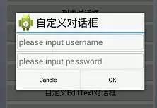
自定义输入对话框
2.实现代码如下:
    /**
     * 自定义EditText对话框
     **/
    public void CustomEditTextDialog(View view) {

        AlertDialog.Builder builder = new AlertDialog.Builder(this,
                android.R.style.Theme_Material_Light_Dialog_Alert);
        View Tittleview = getLayoutInflater().inflate(
                R.layout.dialog_custom_layout, null);
        ImageView img2 = (ImageView) Tittleview.findViewById(R.id.img2);
        TextView textView = (TextView) Tittleview.findViewById(R.id.tv2);

        textView.setText("自定义对话框");
        img2.setImageResource(R.drawable.ic_launcher);
        // 自定义tittle
        builder.setCustomTitle(Tittleview);

        View contentView = getLayoutInflater().inflate(
                R.layout.dialog_custom_et, null);
        EditText username = (EditText) contentView.findViewById(R.id.username);
        EditText passworld = (EditText) contentView
                .findViewById(R.id.passworld);

        builder.setView(contentView);
        builder.setPositiveButton("OK", null).setNegativeButton("Cancle", null)
                .create().show();

    }
3.自定义对话框 布局如下:
<LinearLayout xmlns:android="http://schemas.android.com/apk/res/android"
    android:layout_width="match_parent"
    android:layout_height="match_parent"
    android:orientation="horizontal">

    <ImageView
        android:id="@+id/img2"
        android:layout_width="wrap_content"
        android:layout_height="wrap_content"
        android:src="@drawable/ic_launcher" />

    <TextView
        android:id="@+id/tv2"
        android:layout_width="0dp"
        android:layout_height="wrap_content"
        android:layout_gravity="center_vertical"
        android:layout_weight="1"
        android:text="自定义Dialog"
        android:textColor="@android:color/black"
        android:textSize="25sp" />
LinearLayout>
4.自定义 EditText内容布局
<LinearLayout xmlns:android="http://schemas.android.com/apk/res/android"
    android:layout_width="match_parent"
    android:layout_height="match_parent"
    android:orientation="vertical" >

    <EditText
        android:id="@+id/username"
        android:layout_width="match_parent"
        android:layout_height="wrap_content"
        android:layout_margin="2dp"
        android:background="@drawable/custom_edittext_background"
        android:hint="please input username"
        android:padding="5dp"
        android:textSize="20sp" />

    <View
        android:layout_width="match_parent"
        android:layout_height="1dp"
        android:layout_marginBottom="2dp"
        android:layout_marginTop="2dp"
        android:background="@android:color/darker_gray" />

    <EditText
        android:id="@+id/passworld"
        android:layout_width="match_parent"
        android:layout_height="wrap_content"
        android:layout_margin="2dp"
        android:background="@drawable/custom_edittext_background"
        android:hint="please input password"
        android:padding="5dp"
        android:textSize="20sp" />

LinearLayout>
十一、自定义样式对话框
1.实现效果如下:
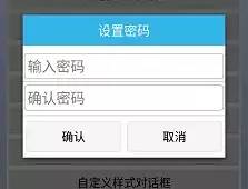
自定义样式对话框
2.实现代码如下:
    /**
     * 自定义样式对话框
     * **/
    public void CustomStyleDialog(View v) {

        // 对话框和activity绑定,所以必须传递activity对象
        Builder builder = new AlertDialog.Builder(this,
                android.R.style.Theme_Material_Light_Dialog_Alert);
        // 获取对话框对象
        final AlertDialog dialog = builder.create();
        // 修改对话框的样式(布局结构)
        View view = View.inflate(this, R.layout.dialog_custom_style, null);

        // 因为在2.3.3版本上,系统默认设置内间距,所以需要去除此内间距
        // dialog.setView(view);
        dialog.setView(view, 0, 0, 0, 0);

        // 找到对话框中所有控件
        Button bt_submit = (Button) view.findViewById(R.id.bt_submit);
        Button bt_cancel = (Button) view.findViewById(R.id.bt_cancel);

        final EditText et_set_psd = (EditText) view
                .findViewById(R.id.et_set_psd);
        final EditText et_confirm_psd = (EditText) view
                .findViewById(R.id.et_confirm_psd);

        bt_submit.setOnClickListener(new OnClickListener() {
            @Override
            public void onClick(View v) {
                // 如果用户没有输入两次密码,告知用户输入密码
                String psd = et_set_psd.getText().toString().trim();
                String confirmPsd = et_confirm_psd.getText().toString().trim();
                if (!TextUtils.isEmpty(psd) && !TextUtils.isEmpty(confirmPsd)) {
                    if (psd.equals(confirmPsd)) {
                        // 当前的对话框隐藏
                        dialog.dismiss();

                    } else {
                        Toast.makeText(getApplicationContext(), "两次输入密码不一致",
                                Toast.LENGTH_SHORT).show();
                    }
                } else {
                    Toast.makeText(getApplicationContext(), "密码不能为空",
                            Toast.LENGTH_SHORT).show();
                }
            }
        });

        bt_cancel.setOnClickListener(new OnClickListener() {
            @Override
            public void onClick(View v) {
                dialog.dismiss();
            }
        });

        // 展示对话框
        dialog.show();

    }
3.自定义样式dialog_custom_style布局如下:
dialog_custom_style 布局
<LinearLayout xmlns:android="http://schemas.android.com/apk/res/android"
    android:layout_width="match_parent"
    android:layout_height="match_parent"
    android:background="#fff"
    android:orientation="vertical" >

    <TextView
        android:layout_width="match_parent"
        android:layout_height="wrap_content"
        android:background="@android:color/holo_blue_light"
        android:gravity="center"
        android:textColor="@android:color/white"
        android:layout_marginBottom="10dp"
        android:padding="10dp"
        android:text="设置密码"
        android:textSize="20sp" />

    <EditText
        android:id="@+id/et_set_psd"
        android:layout_width="match_parent"
        android:layout_height="wrap_content"
        android:layout_margin="2dp"
        android:background="@drawable/custom_edittext_background"
        android:hint="输入密码"
        android:inputType="textPassword"
        android:padding="5dp"
        android:textSize="22sp" />

    <View
        android:layout_width="match_parent"
        android:layout_height="1dp"
        android:layout_marginBottom="2dp"
        android:layout_marginTop="2dp"
        android:background="@drawable/tittle_bg" />

    <EditText
        android:id="@+id/et_confirm_psd"
        android:layout_width="match_parent"
        android:layout_height="wrap_content"
        android:layout_margin="2dp"
        android:background="@drawable/custom_edittext_background"
        android:hint="确认密码"
        android:inputType="textPassword"
        android:padding="5dp"
        android:textSize="22sp" />

    <View
        android:layout_width="match_parent"
        android:layout_height="1dp"
        android:layout_marginTop="5dp"
        android:background="@drawable/tittle_bg" />

    <LinearLayout
        android:layout_width="match_parent"
        android:layout_height="wrap_content"
        android:layout_marginBottom="3dp"
        android:layout_marginTop="3dp"
        android:orientation="horizontal" >

        <Button
            android:id="@+id/bt_submit"
            android:layout_width="0dp"
            android:layout_height="wrap_content"
            android:layout_margin="5dp"
            android:layout_weight="1"
            android:background="@drawable/custom_btn_green_selector"
            android:text="确认" >
        Button>

        <Button
            android:id="@+id/bt_cancel"
            android:layout_width="0dp"
            android:layout_height="wrap_content"
            android:layout_margin="5dp"
            android:layout_weight="1"
            android:background="@drawable/custom_btn_green_selector"
            android:text="取消" >
        Button>
    LinearLayout>

LinearLayout>
4.EditText 的背景是画的edittext_background 圆角矩形
edittext_background 实现
<shape xmlns:android="http://schemas.android.com/apk/res/android"
    android:shape="rectangle">


    <corners android:radius="5dp" />

    <stroke
        android:width="1dp"
        android:color="@android:color/holo_blue_light" />

shape>
android.R.style.Theme_Material_Light_Dialog_Alert 是用来定义Dialog 样式。
        Builder builder = new AlertDialog.Builder(this,
                android.R.style.Theme_Material_Light_Dialog_Alert);
十二、 自定义Loading样式对话框
1.实现效果如下:
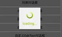
自定义Loading样式对话框
2.实现代码如下:
    /**
     * 自定义Loading样式对话框
     ***/
    public void CustomStyleProgressDialog(View view) {

        LayoutInflater inflater = LayoutInflater.from(this);
        View v = inflater.inflate(R.layout.dialog_custom_style_progress, null);
        LinearLayout layout = (LinearLayout) v.findViewById(R.id.dialog_view);

        ImageView spaceshipImage = (ImageView) v.findViewById(R.id.img);
        TextView tipTextView = (TextView) v.findViewById(R.id.tipTextView);

        Animation hyperspaceJumpAnimation = AnimationUtils.loadAnimation(this,
                R.anim.loading_animation);

        spaceshipImage.startAnimation(hyperspaceJumpAnimation);

        Dialog loadingDialog = new Dialog(this, R.style.loading_dialog);

        // loadingDialog.setCancelable(true);//“返回键”取消 不可以用
        loadingDialog.setContentView(layout, new LinearLayout.LayoutParams(
                LinearLayout.LayoutParams.MATCH_PARENT,
                LinearLayout.LayoutParams.MATCH_PARENT));
        loadingDialog.show();
    }
3.自定义Dialog Sstyle 如下:
    <style name="loading_dialog" parent="android:style/Theme.Dialog">
        <item name="android:windowFrame">@nullitem>
        <item name="android:windowNoTitle">trueitem>
        <item name="android:windowBackground">@drawable/loading_bgitem>
        <item name="android:windowIsFloating">trueitem>
        <item name="android:windowContentOverlay">@nullitem>
 style>
4.自定义Dialog 样式动画如下:
<set xmlns:android="http://schemas.android.com/apk/res/android"
    android:shareInterpolator="false" >


    <rotate
        android:duration="800"
        android:fromDegrees="0"
        android:interpolator="@android:anim/linear_interpolator"
        android:pivotX="50%"
        android:pivotY="50%"
        android:repeatCount="-1"
        android:repeatMode="restart"
        android:startOffset="-1"
        android:toDegrees="+360" />

set>
5.自定义样式的布局如下:
<LinearLayout xmlns:android="http://schemas.android.com/apk/res/android"
    android:id="@+id/dialog_view"
    android:layout_width="match_parent"
    android:layout_height="match_parent"
    android:background="@drawable/loading_bg"
    android:gravity="center"
    android:orientation="vertical" >

    <ImageView
        android:id="@+id/img"
        android:layout_width="wrap_content"
        android:layout_height="wrap_content"
        android:layout_marginLeft="20dp"
        android:layout_marginRight="20dp"
        android:layout_marginTop="20dp"
        android:gravity="center_horizontal"
        android:src="@drawable/loading" />

    <TextView
        android:id="@+id/tipTextView"
        android:layout_width="wrap_content"
        android:layout_height="wrap_content"
        android:layout_marginLeft="20dp"
        android:layout_marginRight="20dp"
        android:layout_marginBottom="20dp"
        android:layout_marginTop="10dp"
        android:gravity="center_horizontal"
        android:text="loading..."
        android:textColor="@android:color/holo_green_light"
        android:textSize="20sp" />

LinearLayout>
十三、 继承 DialogFragment 实现对话框
1.实现效果如下:
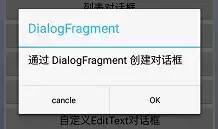
继承 DialogFragment 实现对话框
2.自定义继承DialogFragment 类
实现代码如下:
自定义继承DialogFragment 类
public class CustomDialogFragment extends DialogFragment {

    @Override
    public Dialog onCreateDialog(Bundle savedInstanceState) {
        // Use the Builder class for convenient dialog construction
        AlertDialog.Builder builder = new AlertDialog.Builder(getActivity());
        builder.setMessage("通过 DialogFragment 创建对话框")
                .setTitle("DialogFragment")
                .setPositiveButton("OK", new DialogInterface.OnClickListener() {
                    public void onClick(DialogInterface dialog, int id) {
                        Toast.makeText(getActivity(), "点击 OK",
                                Toast.LENGTH_SHORT).show();
                    }
                })
                .setNegativeButton("cancle",
                        new DialogInterface.OnClickListener() {
                            public void onClick(DialogInterface dialog, int id) {
                                // User cancelled the dialog
                            }
                        });
        // Create the AlertDialog object and return it
        return builder.create();
    }
}
3.Activity 调用显示Dialog方法
    /**
     * 继承 DialogFragment 实现对话框
     * **/
    public void CustomFragmentDialog(View view) {

        CustomDialogFragment customDialogFragment = new CustomDialogFragment();
        customDialogFragment.show(getFragmentManager(), "fragment");
    }
十四、 Activity形式的 对话框
只需创建一个Activity,并在
清单文件元素中将其主题设置为 Theme.Holo.Dialog样式即可
<activity android:theme="@android:style/Theme.Holo.Dialog" >
十五、倒计时 30s Dialog实现
1.实现效果如下:
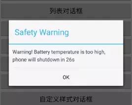
倒计时关机实现
2.实现代码如下:
    private TextView mShutDownTextView;
    private Handler mOffHandler;
    private Timer mShutdownTime;
    private Dialog mDialog;

    public void CountDownDialog(View view) {

        CreateShutDownDialog();

    }

    private Handler mNumHandler = new Handler() {
        public void handleMessage(android.os.Message msg) {
            if (msg.what > 0) {

                // //动态显示倒计时
                mShutDownTextView
                        .setText("Warning! Battery temperature°С, phone will shutdown in "
                                + msg.what + "s");

            } else {
                if (mDialog != null) {
                    mDialog.dismiss();
                }
                mShutdownTime.cancel();
                Toast.makeText(getApplicationContext(), "倒计时结束", 0).show();

            }
        }

    };

    private void CreateShutDownDialog() {

        mShutDownTextView = new TextView(this);
        mShutDownTextView.setLineSpacing(1.2f, 1.2f);
        mShutDownTextView.setText("");
        mShutDownTextView.setPadding(20, 20, 20, 20);
        mDialog = new AlertDialog.Builder(this).setTitle("Safety Warning")
                .setCancelable(false).setView(mShutDownTextView)
                .setPositiveButton("OK", new DialogInterface.OnClickListener() {
                    public void onClick(DialogInterface dialog, int id) {
                        mShutdownTime.cancel();

                    }
                }).create();
        mDialog.show();
        mDialog.setCanceledOnTouchOutside(false);
        mShutdownTime = new Timer(true);
        TimerTask timeTask = new TimerTask() {
            int countTime = 30;

            public void run() {
                if (countTime > 0) {
                    countTime--;
                }
                Message msg = new Message();
                msg.what = countTime;
                mNumHandler.sendMessage(msg);
            }
        };
        mShutdownTime.schedule(timeTask, 1000, 1000);
    }
至此,本篇已结束。转载网络的文章,小编觉得很优秀,欢迎点击阅读原文,支持原创作者,如有侵权,恳请联系小编删除。同时感谢您的阅读,期待您的关注。
点个在看,方便您使用时快速查找!