
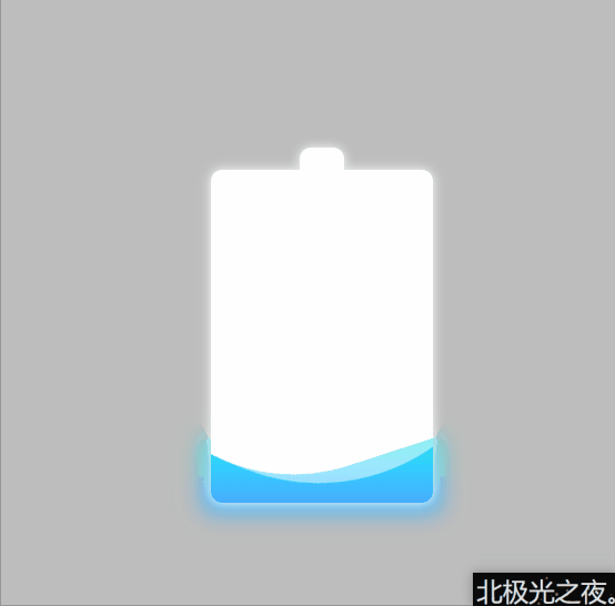
3分钟实现充电水波特效
共 20647字,需浏览 42分钟
·
2021-06-11 12:45
点击上方 前端瓶子君,关注公众号
回复算法,加入前端编程面试算法每日一题群
来源:北极光之夜
https://juejin.cn/post/6967360136926986254
效果(源码在最后):
 这个效果跟水波加载动画 html+css是异曲同工之妙的。效果不难实现,但是这个‘偷天换日’的用法是值得学习的。
实现:
1. 定义标签,.container是底层盒子也就是电池外形,.water是其中的电量多少,.shadow是背后的阴影:
 <div class="container">
        <div class="water"></div>
        <div class="shadow"></div>
    </div>
复制代码
2. 定义.container的基本样式:
.container{
            position: relative;
            width: 200px;
            height: 300px;
            background-color: rgb(255, 255, 255);
            border-radius: 10px;
            box-shadow:  0 0 10px rgb(255, 255, 255) ;
        }
复制代码
position: relative; 相对定位。background-color: rgb(255, 255, 255); 白色。border-radius: 10px; 角弧度。box-shadow: 0 0 10px rgb(255, 255, 255) ; 阴影。
3.通过双伪类定义电池的头部:
.container::after{
            content: '';
            position: absolute;
            top: -20px;
            left: 50%;
            width: 40px;
            height: 20px;
            transform: translateX(-50%);
            background-color: rgb(255, 255, 255);
            border-top-right-radius: 10px;
            border-top-left-radius: 10px;
            box-shadow:  0 0 10px rgb(255, 255, 255) ;
        }
复制代码
position: absolute; top: -20px; left: 50%; 定义位置 transform: translateX(-50%); 向左偏移自身的50%,目的是居中。4. 定义电量慢慢变多效果:
 .water{
            position: absolute;
            bottom: 0;
            width: 100%;
            background-image: linear-gradient(0deg,rgb(9, 198, 245),rgb(44, 243, 120));
            border-bottom-right-radius: 10px;
            border-bottom-left-radius: 10px;
         animation: rise 12s linear forwards;

             overflow: hidden;
        }
        @keyframes rise{
            0%{
                height: 50px;
            }

            100%{
                height: 80%;
                filter: hue-rotate(360deg);
            }
        }
复制代码
background-image: linear-gradient(0deg,rgb(9, 198, 245),rgb(44, 243, 120)); 渐变颜色。animation: rise 12s linear forwards; 定义动画,高度改变,相当于充电。forwards是指定动画结束后保留最后一步的属性。overflow: hidden; 溢出隐藏。filter: hue-rotate(360deg); 色相旋转,能使颜色改变。
5. 定义水波效果(原理是定义一个有弧度的白色盒子在转动,其覆盖掉.water的上面的一部分,.water再定义溢出隐藏,这样就‘偷天换日’得到一个白色的波浪):
.water::after{
            content: '';
            position: absolute;
            top: -370px;
            left: -100px;
            width: 400px;
            height: 400px;
            border-radius: 40%;
            background-color: rgb(255, 255, 255);
            animation: move 5s linear infinite;
        }
        @keyframes move{
            100%{
                transform: rotate(360deg);
            }
        }
复制代码
位置大小和弧度可以看效果自己设定。transform: rotate(360deg); 旋转。
6. 再定义一个水波,原理一样,不过颜色要设置透明度,免得覆盖掉另一个水波:
.water::before{
            content: '';
            position: absolute;
            top: -360px;
            left: -100px;
            width: 400px;
            height: 400px;
            border-radius: 45%;
            background-color: rgba(255, 255, 255,.5);
            animation: move2 7s linear infinite;
        }
        @keyframes move2{
            100%{
                transform: rotate(360deg);
            }
        }
复制代码
7. 定义背后的阴影,它的高度和颜色变换应该和.water是一致的:
.shadow{
            position: absolute;
            bottom: -8px;
            left: -3%;
            width: 106%;
            background-image: linear-gradient(0deg,rgb(9, 198, 245),rgb(44, 243, 120));
            z-index: -1;
         animation: bianse 12s linear forwards;
        }
        @keyframes bianse{
            0%{
                height: 50px;
                filter: hue-rotate(0deg) blur(10px);
            }

            100%{
                height: 80%;
                filter: hue-rotate(360deg) blur(10px);
            }
        }
复制代码
position: absolute; bottom: -8px; left: -3%; width: 106%;位置和大小。z-index: -1; 设置-1,显示在最后。filter: hue-rotate(0deg) blur(10px); blur是模糊度。
完整代码:
<!DOCTYPE html>
<html lang="en">
<head>
    <meta charset="UTF-8">
    <meta http-equiv="X-UA-Compatible" content="IE=edge">
    <meta name="viewport" content="width=device-width, initial-scale=1.0">
    <title>Document</title>
    <style>
        *{
            margin: 0;
            padding: 0;
            box-sizing: border-box;
        }
        body{
            height: 100vh;
            display: flex;
            justify-content: center;
            align-items: center;
            background-color: rgb(189, 189, 189);
        }
        .container{
            position: relative;
            width: 200px;
            height: 300px;
            background-color: rgb(255, 255, 255);
            border-radius: 10px;
            box-shadow:  0 0 10px rgb(255, 255, 255) ;
        }
        .container::after{
            content: '';
            position: absolute;
            top: -20px;
            left: 50%;
            width: 40px;
            height: 20px;
            transform: translateX(-50%);
            background-color: rgb(255, 255, 255);
            border-top-right-radius: 10px;
            border-top-left-radius: 10px;
            box-shadow:  0 0 10px rgb(255, 255, 255) ;


        }


        .water{
            position: absolute;
            bottom: 0;
            width: 100%;
            background-image: linear-gradient(0deg,rgb(9, 198, 245),rgb(44, 243, 120));
            border-bottom-right-radius: 10px;
            border-bottom-left-radius: 10px;
         animation: rise 12s linear forwards;

             overflow: hidden;
        }
        @keyframes rise{
            0%{
                height: 50px;
            }

            100%{
                height: 80%;
                filter: hue-rotate(360deg);
            }
        }
        .water::after{
            content: '';
            position: absolute;
            top: -370px;
            left: -100px;
            width: 400px;
            height: 400px;
            border-radius: 40%;
            background-color: rgb(255, 255, 255);
            animation: move 5s linear infinite;
        }
        @keyframes move{
            100%{
                transform: rotate(360deg);
            }
        }
        .water::before{
            content: '';
            position: absolute;
            top: -360px;
            left: -100px;
            width: 400px;
            height: 400px;
            border-radius: 45%;
            background-color: rgba(255, 255, 255,.5);
            animation: move2 7s linear infinite;
        }
        @keyframes move2{
            100%{
                transform: rotate(360deg);
            }
        }
        .shadow{
            position: absolute;
            bottom: -8px;
            left: -3%;
            width: 106%;
            background-image: linear-gradient(0deg,rgb(9, 198, 245),rgb(44, 243, 120));
            z-index: -1;
         animation: bianse 12s linear forwards;
        }
        @keyframes bianse{
            0%{
                height: 50px;
                filter: hue-rotate(0deg) blur(10px);
            }

            100%{
                height: 80%;
                filter: hue-rotate(360deg) blur(10px);
            }
        }
    </style>
</head>
<body>
    <div class="container">
        <div class="water"></div>
        <div class="shadow"></div>
    </div>
</body>
</html>
复制代码
总结:
这个效果跟水波加载动画 html+css是异曲同工之妙的。效果不难实现,但是这个‘偷天换日’的用法是值得学习的。