
8000字 | Python数据可视化,完整版实操指南 !

1. 前言

2. pandas
import pandas as pd
df = pd.read_csv('temporal.csv')
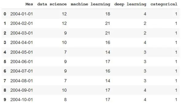
df.head(10) #View first 10 data rows
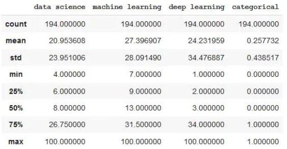
df.describe()
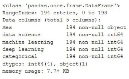
df.info()
pd.set_option('display.max_rows',500)
pd.set_option('display.max_columns',500)
pd.set_option('display.width',1000)
format_dict = {'data science':'${0:,.2f}', 'Mes':'{:%m-%Y}', 'machine learning':'{:.2%}'}
#We make sure that the Month column has datetime format
df['Mes'] = pd.to_datetime(df['Mes'])
#We apply the style to the visualization
df.head().style.format(format_dict)
format_dict = {'Mes':'{:%m-%Y}'} #Simplified format dictionary with values that do make sense for our data
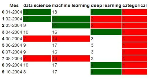
df.head().style.format(format_dict).highlight_max(color='darkgreen').highlight_min(color='#ff0000')
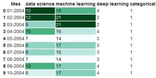
df.head(10).style.format(format_dict).background_gradient(subset=['data science', 'machine learning'], cmap='BuGn')
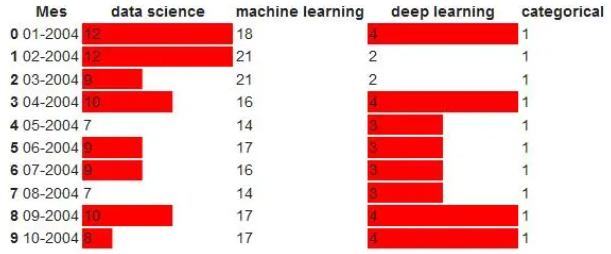
df.head().style.format(format_dict).bar(color='red', subset=['data science', 'deep learning'])
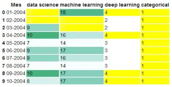
df.head(10).style.format(format_dict).background_gradient(subset = ['data science','machine learning'],cmap ='BuGn')。highlight_max(color ='yellow')
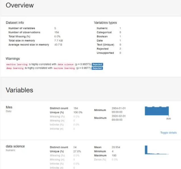
from pandas_profiling import ProfileReport
prof = ProfileReport(df)
prof.to_file(output_file='report.html')
3. matplotlib
import matplotlib.pyplot as plt
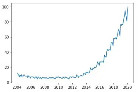
plt.plot(df['Mes'], df['data science'], label='data science')
# The parameter label is to indicate the legend. This doesn't mean that it will be shown, we'll have to use another command that I'll explain later.
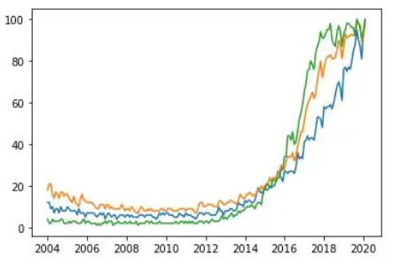
plt.plot(df ['Mes'],df ['data science'],label ='data science')
plt.plot(df ['Mes'],df ['machine learning'],label ='machine learning ')
plt.plot(df ['Mes'],df ['deep learning'],label ='deep learning')
plt.plot(df['Mes'], df['data science'], label='data science')
plt.plot(df['Mes'], df['machine learning'], label='machine learning')
plt.plot(df['Mes'], df['deep learning'], label='deep learning')
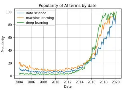
plt.xlabel('Date')
plt.ylabel('Popularity')
plt.title('Popularity of AI terms by date')
plt.grid(True)
plt.legend()
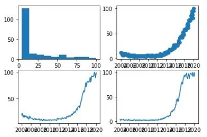
fig, axes = plt.subplots(2,2)
axes[0, 0].hist(df['data science'])
axes[0, 1].scatter(df['Mes'], df['data science'])
axes[1, 0].plot(df['Mes'], df['machine learning'])
axes[1, 1].plot(df['Mes'], df['deep learning'])
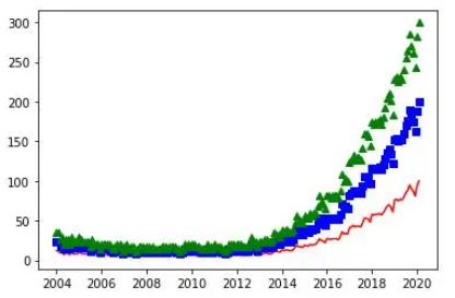
plt.plot(df ['Mes'],df ['data science'],'r-')
plt.plot(df ['Mes'],df ['data science'] * 2,'bs')
plt .plot(df ['Mes'],df ['data science'] * 3,'g ^')
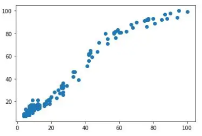
plt.scatter(df['data science'], df['machine learning'])
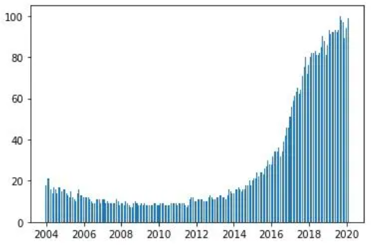
plt.bar(df ['Mes'],df ['machine learning'],width = 20)
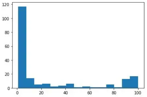
plt.hist(df ['deep learning'],bins = 15)
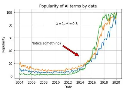
plt.plot(df['Mes'], df['data science'], label='data science')
plt.plot(df['Mes'], df['machine learning'], label='machine learning')
plt.plot(df['Mes'], df['deep learning'], label='deep learning')
plt.xlabel('Date')
plt.ylabel('Popularity')
plt.title('Popularity of AI terms by date')
plt.grid(True)
plt.text(x='2010-01-01', y=80, s=r'$\lambda=1, r^2=0.8$') #Coordinates use the same units as the graph
plt.annotate('Notice something?', xy=('2014-01-01', 30), xytext=('2006-01-01', 50), arrowprops={'facecolor':'red', 'shrink':0.05}
4. seaborn
import seaborn as sns
sns.set()
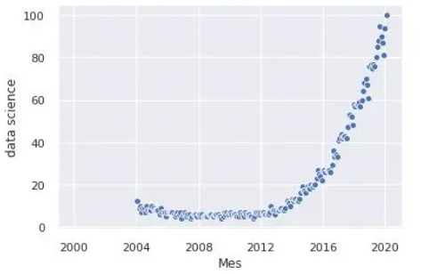
sns.scatterplot(df['Mes'], df['data science'])
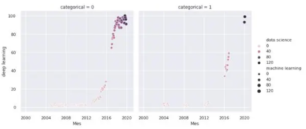
sns.relplot(x='Mes', y='deep learning', hue='data science', size='machine learning', col='categorical', data=df)
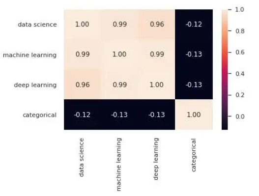
sns.heatmap(df.corr(),annot = True,fmt ='。2f')
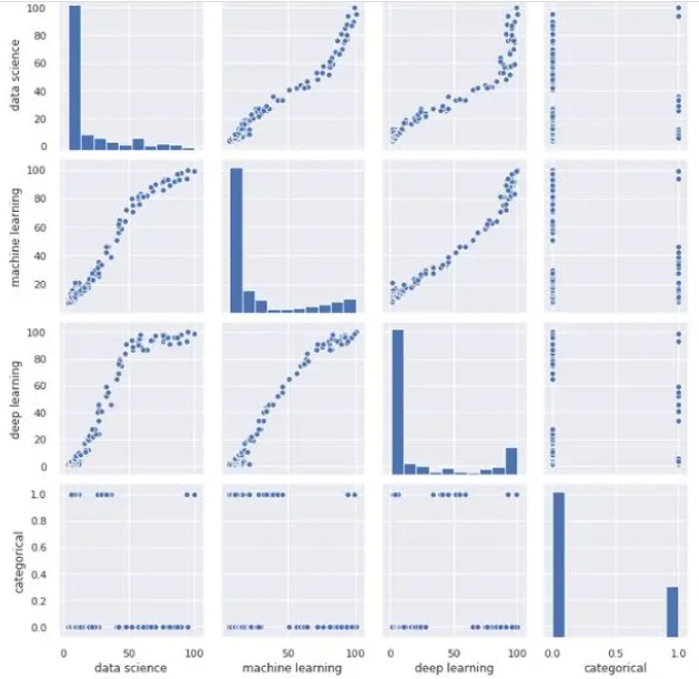
sns.pairplot(df)
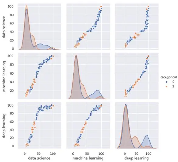
sns.pairplot(df,hue ='categorical')
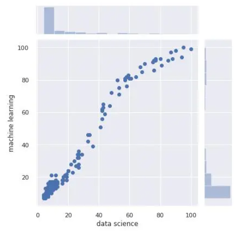
sns.jointplot(x='data science', y='machine learning', data=df)
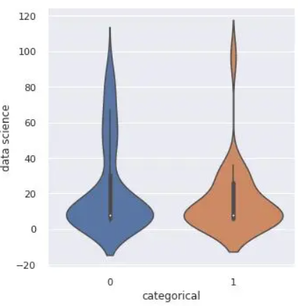
sns.catplot(x='categorical', y='data science', kind='violin', data=df)
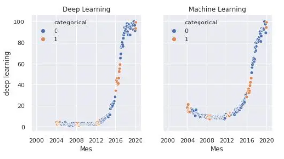
fig, axes = plt.subplots(1, 2, sharey=True, figsize=(8, 4))
sns.scatterplot(x="Mes", y="deep learning", hue="categorical", data=df, ax=axes[0])
axes[0].set_title('Deep Learning')
sns.scatterplot(x="Mes", y="machine learning", hue="categorical", data=df, ax=axes[1])
axes[1].set_title('Machine Learning')
5. Bokeh
from bokeh.plotting import figure, output_file, save
output_file('data_science_popularity.html')
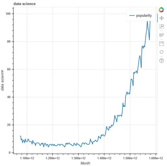
p = figure(title='data science', x_axis_label='Mes', y_axis_label='data science')
p.line(df['Mes'], df['data science'], legend='popularity', line_width=2)
save(p)
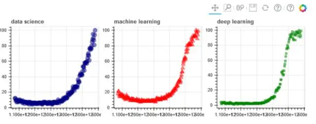
output_file('multiple_graphs.html')
s1 = figure(width=250, plot_height=250, title='data science')
s1.circle(df['Mes'], df['data science'], size=10, color='navy', alpha=0.5)
s2 = figure(width=250, height=250, x_range=s1.x_range, y_range=s1.y_range, title='machine learning') #share both axis range
s2.triangle(df['Mes'], df['machine learning'], size=10, color='red', alpha=0.5)
s3 = figure(width=250, height=250, x_range=s1.x_range, title='deep learning') #share only one axis range
s3.square(df['Mes'], df['deep learning'], size=5, color='green', alpha=0.5)
p = gridplot([[s1, s2, s3]])
save(p)
6. altair
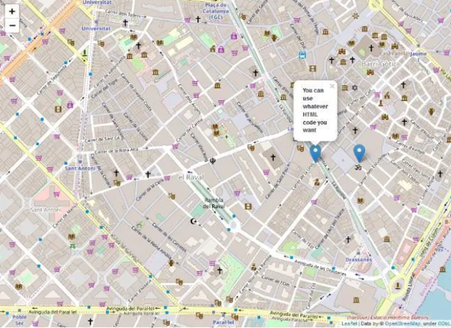
7. folium
import folium
m1 = folium.Map(location=[41.38, 2.17], tiles='openstreetmap', zoom_start=18)
m1.save('map1.html')

m2 = folium.Map(location=[41.38, 2.17], tiles='openstreetmap', zoom_start=16)
folium.Marker([41.38, 2.176], popup='<i>You can use whatever HTML code you want</i>', tooltip='click here').add_to(m2)
folium.Marker([41.38, 2.174], popup='<b>You can use whatever HTML code you want</b>', tooltip='dont click here').add_to(m2)
m2.save('map2.html')
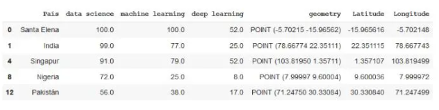
from geopandas.tools import geocode
df2 = pd.read_csv('mapa.csv')
df2.dropna(axis=0, inplace=True)
df2['geometry'] = geocode(df2['País'], provider='nominatim')['geometry'] #It may take a while because it downloads a lot of data.
df2['Latitude'] = df2['geometry'].apply(lambda l: l.y)
df2['Longitude'] = df2['geometry'].apply(lambda l: l.x)
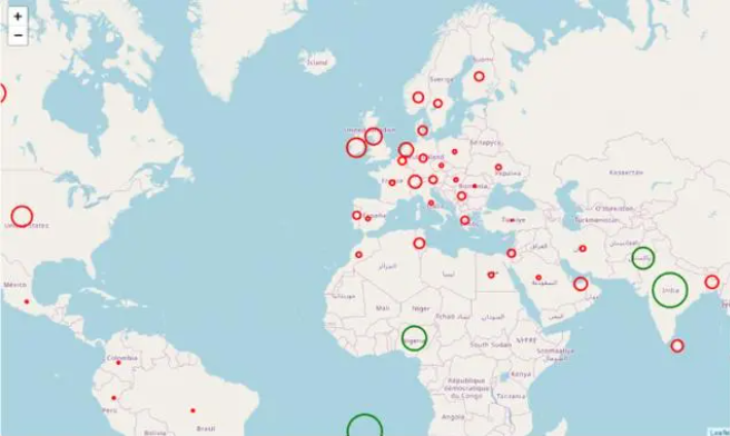
m3 = folium.Map(location=[39.326234,-4.838065], tiles='openstreetmap', zoom_start=3)
def color_producer(val):
 if val <= 50:
  return 'red'
 else:
  return 'green'
for i in range(0,len(df2)):
 folium.Circle(location=[df2.iloc[i]['Latitud'], df2.iloc[i]['Longitud']], radius=5000*df2.iloc[i]['data science'], color=color_producer(df2.iloc[i]['data science'])).add_to(m3)
m3.save('map3.html')
- EOF -
推荐阅读:
评论