
用纯 CSS 绘制一朵美丽的雪花

问:如果用css 实现转动的雪花效果
一、动态效果预览
复制跳转下方连接可以去查看动态效果
https://codepen.io/comehope/pen/LYEeRBb
二、源代码下载
https://github.com/comehope/front-end-daily-challenges
三、代码解读
定义 DOM 结构、页面背景和容器尺寸
最外层容器是一个名为 .snowflake 的 <figure> 元素,内含 6 个 <div> 元素,分别代表雪花的6个花瓣,每个 <div> 中又包含 5 个 <span> 元素,每个 <span> 代表雪花上的冰凌。
<figure class="snowflake">
    <div>
        <span></span>
        <span></span>
        <span></span>
        <span></span>
        <span></span>
    </div>
    <div>
        <span></span>
        <span></span>
        <span></span>
        <span></span>
        <span></span>
    </div>
    <div>
        <span></span>
        <span></span>
        <span></span>
        <span></span>
        <span></span>
    </div>
    <div>
        <span></span>
        <span></span>
        <span></span>
        <span></span>
        <span></span>
    </div>
    <div>
        <span></span>
        <span></span>
        <span></span>
        <span></span>
        <span></span>
    </div>
    <div>
        <span></span>
        <span></span>
        <span></span>
        <span></span>
        <span></span>
    </div>
</figure>
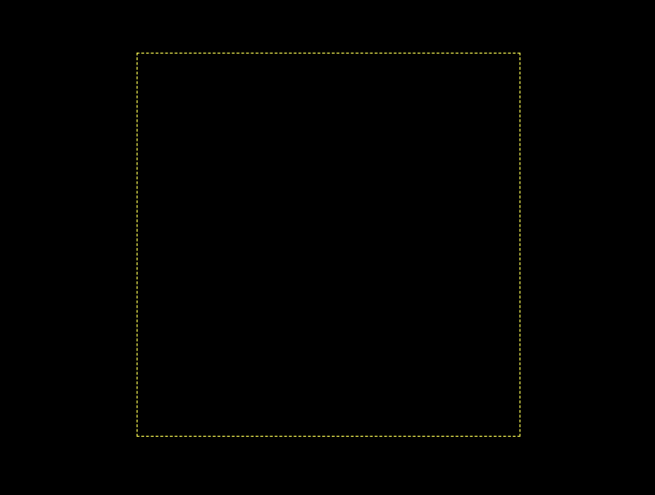
页面背景取黑色,雪花取白色,并为容器画出黄色的轮廓作为辅助线,雪花图案将绘制在这个黄色虚线框内:
body {
    margin: 0;
    height: 100vh;
    display: flex;
    align-items: center;
    justify-content: center;
    background-color: black;
    overflow: hidden;
}

.snowflake {
    font-size: 100px;
    color: snow;
    width: 4em;
    height: 4em;
    outline: 1px dashed yellow;
}
效果如下图:
绘制出6个花瓣
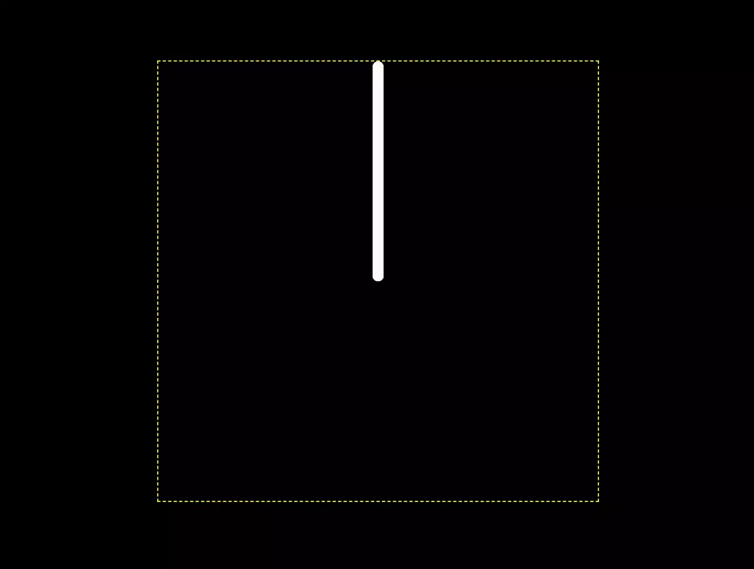
先绘制出1个花瓣中间的竖线:
div {
    width: 0.1em;
    height: 2em;
    background-color: currentColor;
    border-radius: 0.05em;
}
知识点:currentColor的值即表示color的值
效果如下图:
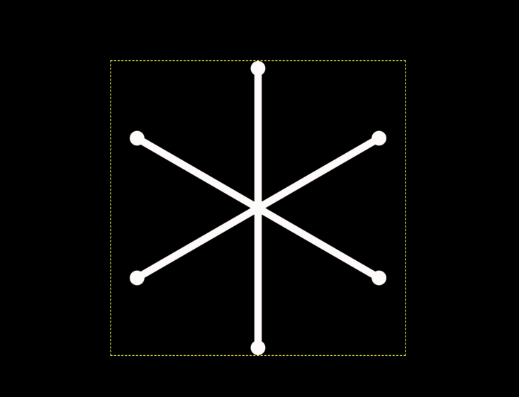
发现6个花瓣的竖线重叠在一起了,把它们合并到一起,看起来就像只有1条竖线:
div {

  position: absolute;
}
效果如下图:
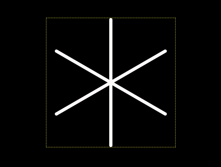
分别旋转每个花瓣,一共6个花瓣,所以各花瓣的旋转角度均相差60度:
div {
    transform-origin: bottom;
    transform: rotate(calc((var(--n)  - 1)* 60deg));
}

div:nth-child(1) {--n: 1;}
div:nth-child(2) {--n: 2;}
div:nth-child(3) {--n: 3;}
div:nth-child(4) {--n: 4;}
div:nth-child(5) {--n: 5;}
div:nth-child(6) {--n: 6;}
知识点:原来原生css也可以定义变量 效果如下图:
绘制花瓣上的冰凌
接下来修饰花瓣,绘制花瓣上的冰凌。
先来出顶端的圆点,用 <div>里的第1个 <span> 元素实现:
div {
    display: flex;
    flex-direction: column;
    align-items: center;
}

div span:nth-child(1) {
    width: 0.2em;
    height: 0.2em;
    background-color: currentColor;
    border-radius: 50%;
}
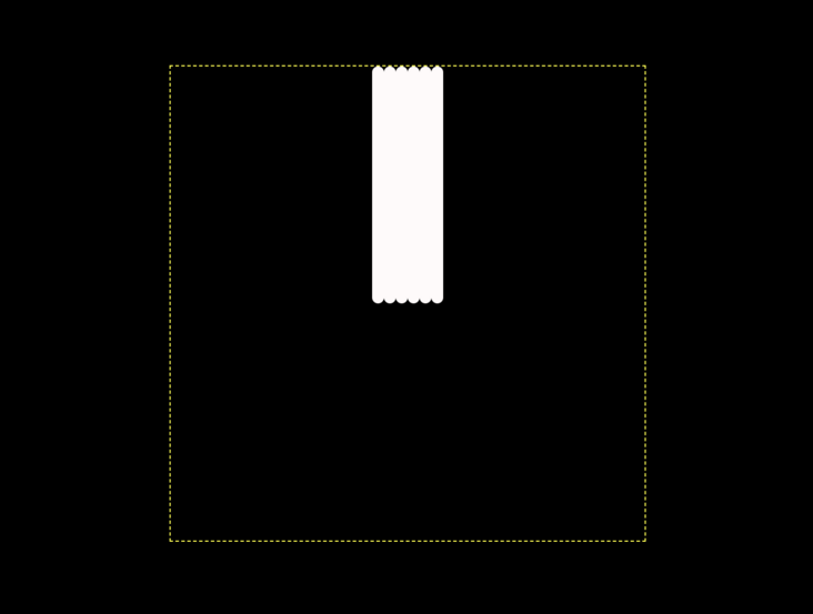
效果如下图:
然后增加离圆点最近的折线,用第 2 个 <span> 元素画出,这是用一个正方形4条边框中的2条实现的:
div span:nth-child(2) {
    width: 0.5em;
    height: 0.5em;
    border: 0.1em solid;
    border-width: 0.1em;
    border-style: none solid solid none;
    border-radius: 0.05em;
}
效果如下图:
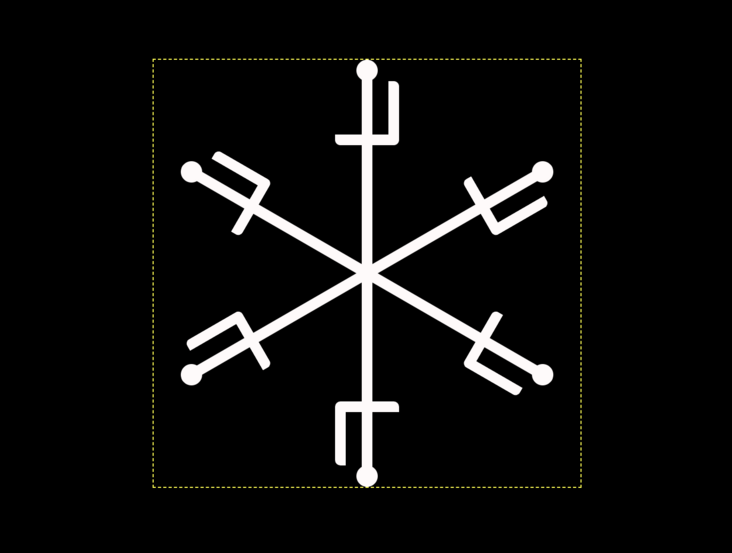
把折线旋转45度,让它的尖部和竖线重合:
div span:nth-child(2) {
    transform: rotate(45deg);
}
效果如下图:
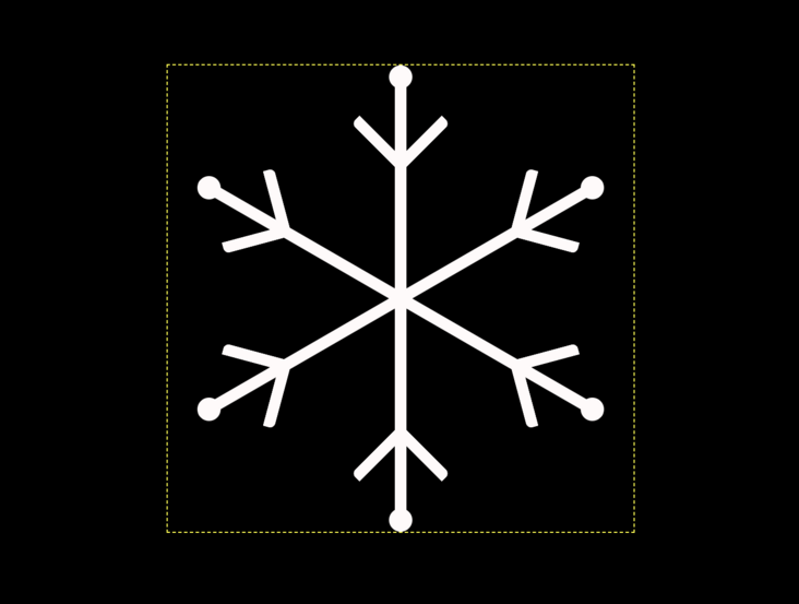
增加第2条折线,和上面的代码类似,只是正方形的边长从 0.5em 缩短到 0.4em 了:
div span:nth-child(3) {
    width: 0.4em;
    height: 0.4em;
    border: 0.1em solid;
    border-width: 0.1em;
    border-style: none solid solid none;
    border-radius: 0.05em;
    transform: rotate(45deg);
}
效果如下图:
再增加第3条折线:
div span:nth-child(4) {
    width: 0.3em;
    height: 0.3em;
    border: 0.1em solid;
    border-width: 0.1em;
    border-style: none solid solid none;
    border-radius: 0.05em;
    transform: rotate(45deg);
}
效果如下图:
再增加第4条折线:
div span:nth-child(4) {
    width: 0.3em;
    height: 0.3em;
    border: 0.1em solid;
    border-width: 0.1em;
    border-style: none solid solid none;
    border-radius: 0.05em;
    transform: rotate(45deg);
}
效果如下图:
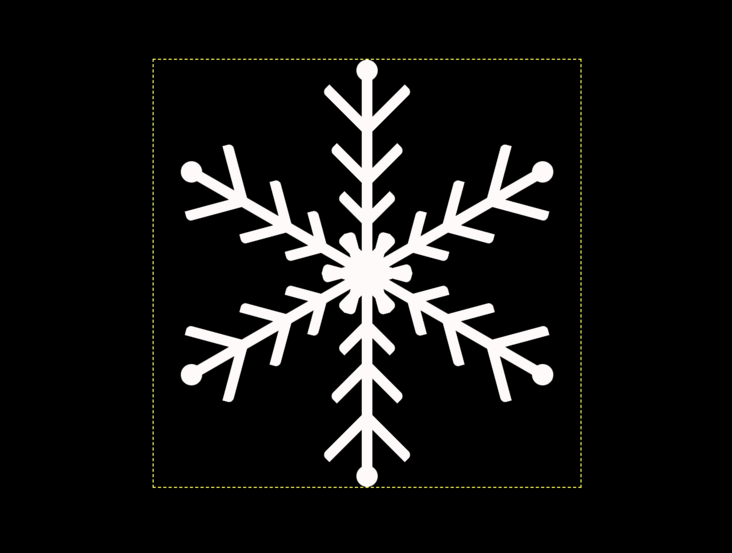
你已经发现上面 4 条折线的代码有很多重复的,坚决不能忍,来重构吧,把这 4 段代码合并起来:
div span:nth-child(2),
div span:nth-child(3),
div span:nth-child(4),
div span:nth-child(5) {
    width: var(--side-length);
    height: var(--side-length);
    border: 0.1em solid;
    border-width: 0.1em;
    border-style: none solid solid none;
    border-radius: 0.05em;
    transform: rotate(45deg);
}

div span:nth-child(2) {--side-length: 0.5em;}
div span:nth-child(3) {--side-length: 0.4em;}
div span:nth-child(4) {--side-length: 0.3em;}
div span:nth-child(5) {--side-length: 0.3em;}
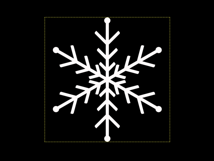
最后,让第1条折线离中心稍远点,这样还能让雪花中心更加漂亮:
div span:nth-child(2) {
    margin-top: -0.2em;
}
效果如下图:
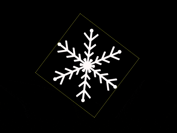
增加动画效果
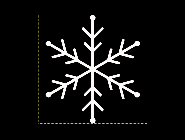
动画效果很简单,就是转啊转地,让这片雪花用10秒时间转一圈:
.snowflake {
    animation: round 10s linear infinite;
}

@keyframes round {
    to {
        transform: rotate(1turn);
    }
}
知识点:1turn表示一圈
效果如下图:
 (动图太大看不了,可以去文章开头的效果展示提供的网址看哈)
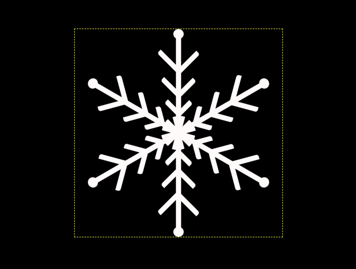
最后,删除掉辅助助线:
.snowflake {
    /* outline: 1px dashed yellow; */
}
效果如下图:
 (动图太大看不了,可以去文章开头的效果展示提供的网址看哈)
大功告成!
四、参考
flex 布局,《CSS3 艺术》第1.8.1节 边框属性 border,《CSS3 艺术》第3.1节 变量 var() 和 表达式 calc(),《CSS3 艺术》第7.1节 变换旋转函数 rotate(),《CSS3 艺术》第8.1.2节 变换原点 transform-origin,《CSS3 艺术》第8.2节 动画 animation,《CSS3 艺术》第10章
原文出处:https://segmentfault.com/a/1190000021497721
CSS真是神秘~
针对这个题目,你的解决方案又是什么呢?
不妨在下面的留言给出,学习共勉下~
码字不易,走过路过来个赞可否👍先谢谢了!
ε=ε=ε=┏(゜ロ゜;)┛
最后
❝有疑问的同学 欢迎 评论区讨论,也欢迎大家加入我的前端技术交流群 来讨论。搜索《前端阳光》公众号,回复加群吧!