这个可视化分析库,让你轻松玩转数据科学!
本期就来给大家讲讲,有数据之后,我们该怎么去做可视化分析。
同样是大佬造的轮子「Lux」,只需4行代码就能可视化数据集。
A Python API for Intelligent Visual Discovery.
GitHub:https://github.com/lux-org/lux/
文档地址:https://lux-api.readthedocs.io/
在PyCharm上是无法使用的,只能是在jupyter notebook中用。
jupyter notebook的安装就不讲了,没有装的同学,可以自行百度~
首先要在conda默认的环境「base」中安装扩展包jupyter_contrib_nbextensions。
# 在conda中安装
pip install -i https://pypi.tuna.tsinghua.edu.cn/simple jupyter_contrib_nbextensions
jupyter contrib nbextension install --user
# 启动jupyter notebook
安装成功后启动jupyter notebook,会发现多了一个Tab页,即Nbextensions(扩展插件)。
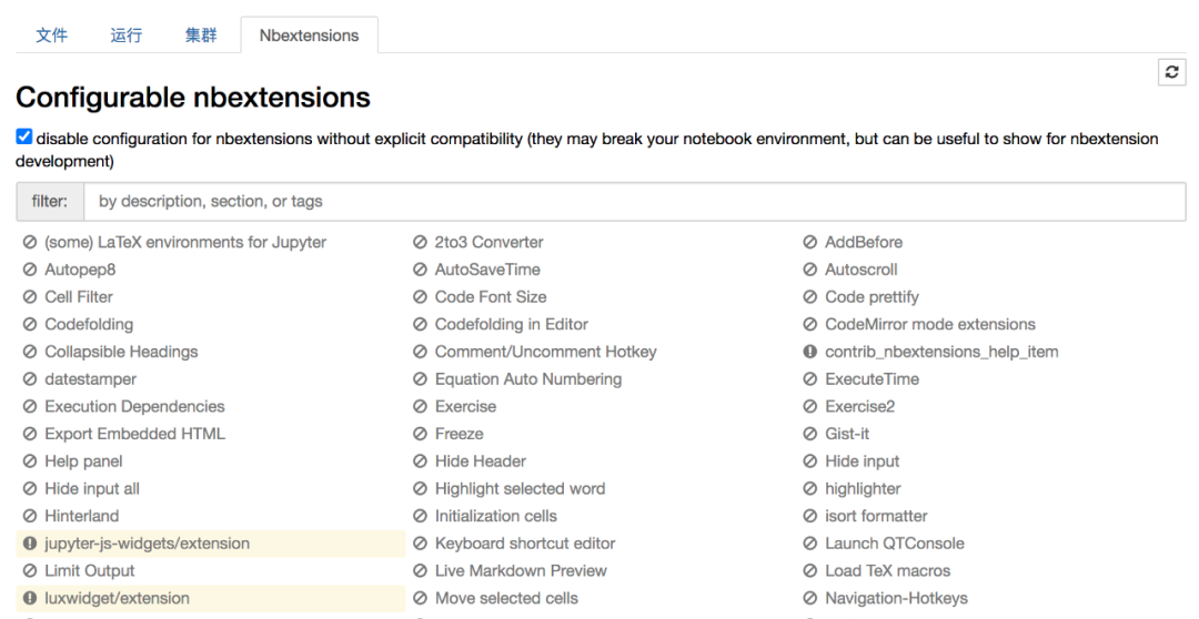
然后在conda的base环境中安装如下两个插件。
# 在conda中安装插件
jupyter nbextension install --py luxwidget
jupyter nbextension enable --py luxwidget
上图的左下角处就会有高亮出现,即插件安装成功。
如此我们就可以导入这个第三方库了。
用作者提供的数据来看一下。
import pandas as pd
import lux

# 使用作者提供的数据
df = pd.read_csv("college.csv")
df
在jupyter notebook中无需使用print()来显示信息,直接在最后一行加上变量名,就会打印结果,而且还是表格形式。
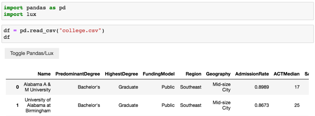
可以看到,左上角多了个按钮,可以切换Pandas结果展示和Lux结果展示。
点击按钮,得到下图。
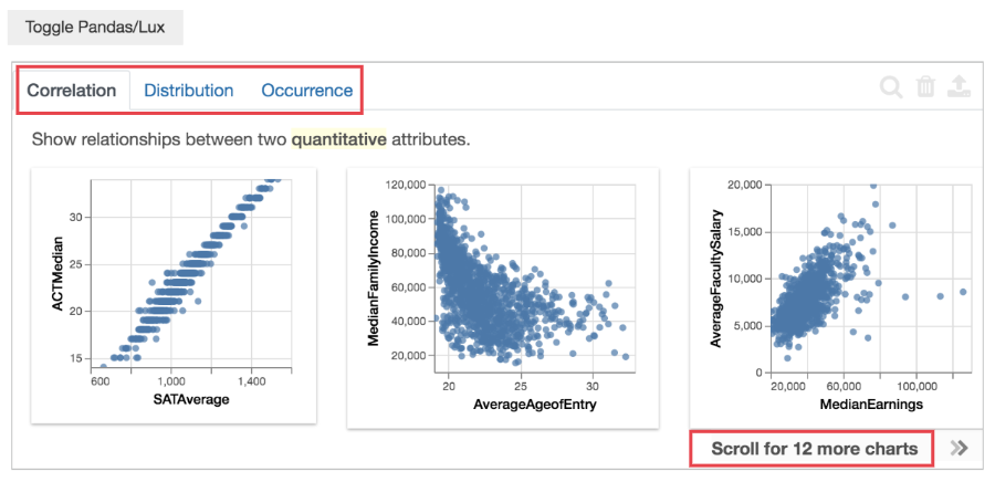
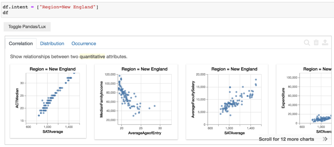
Correlation、Distribution、Occurrence,一共是有3个Tab页。
Correlation意思是两个变量的相关性,从左到右12个图表,相关性逐渐减弱。
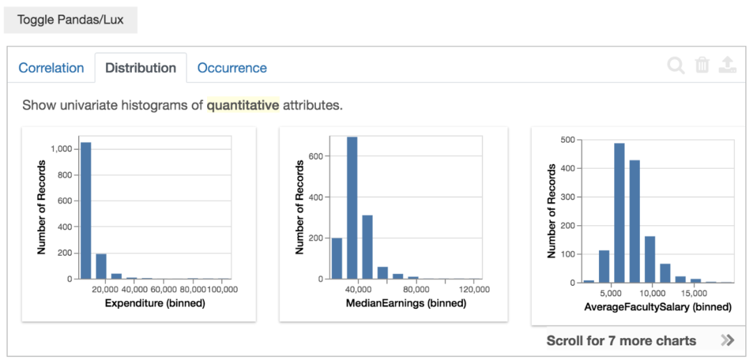
Distribution意思是单个变量(数值属性)的分布情况(直方图),从左到右7个图表,偏斜由大变小。
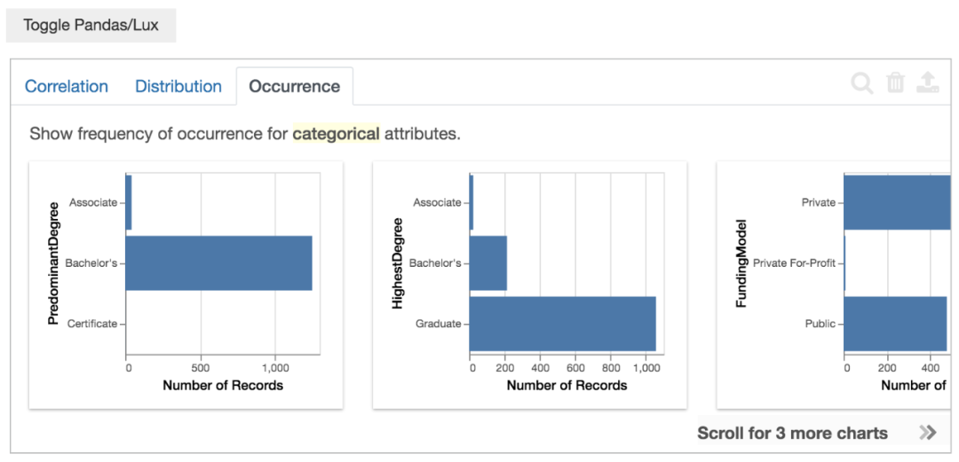
Occurrence意思是单个变量(类别属性)的分布情况(条形图),从左到右3个图表,不均匀度由高到小。
由于作者提供的数据都是英文的,不太方便看。
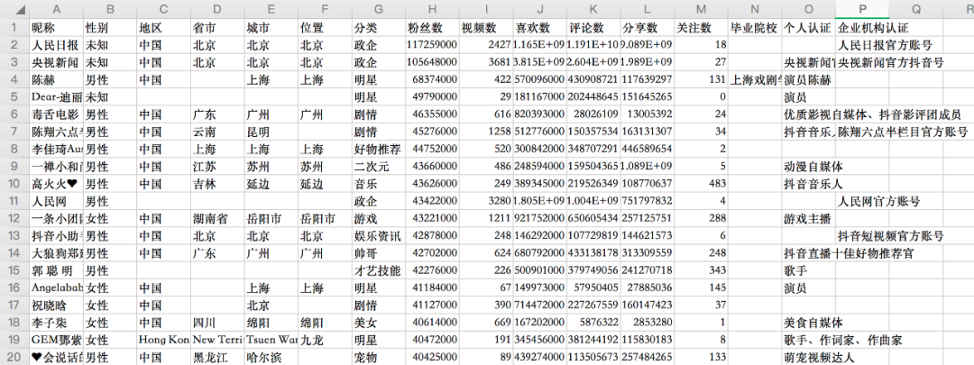
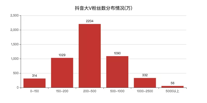
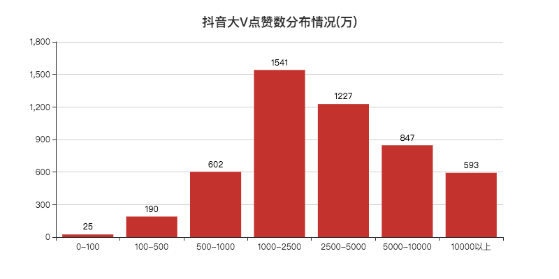
所以小F使用之前一篇文章的数据,5000个抖音大V数据。
4行Python代码读取数据,并对其进行可视化分析。
import pandas as pd
import lux

# 使用抖音数据
df = pd.read_csv("douyin.csv")
df
得到结果如下。
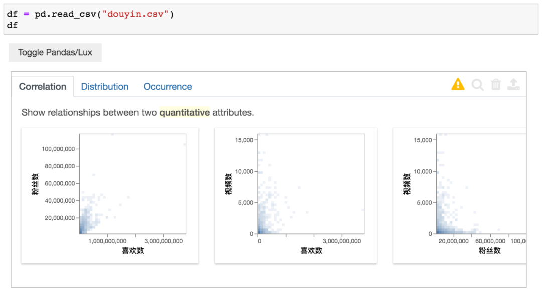
这里无需其他设置,中文自己就能显示出来。
其中喜欢数与粉丝数有着较强的相关性。这也不难理解,粉丝多,看视频的人也就多了。
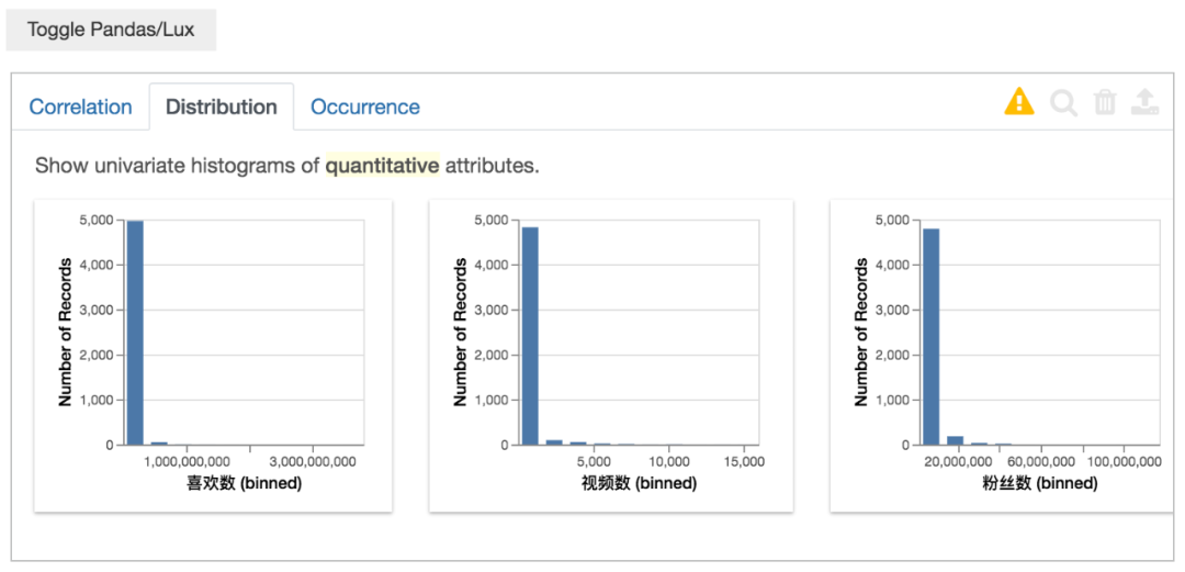
这里由于是对数据进行均分(bins)划分,所以看不太出来分布情况。
至于是否可以自定义设置bins,小F目前也还不清楚~
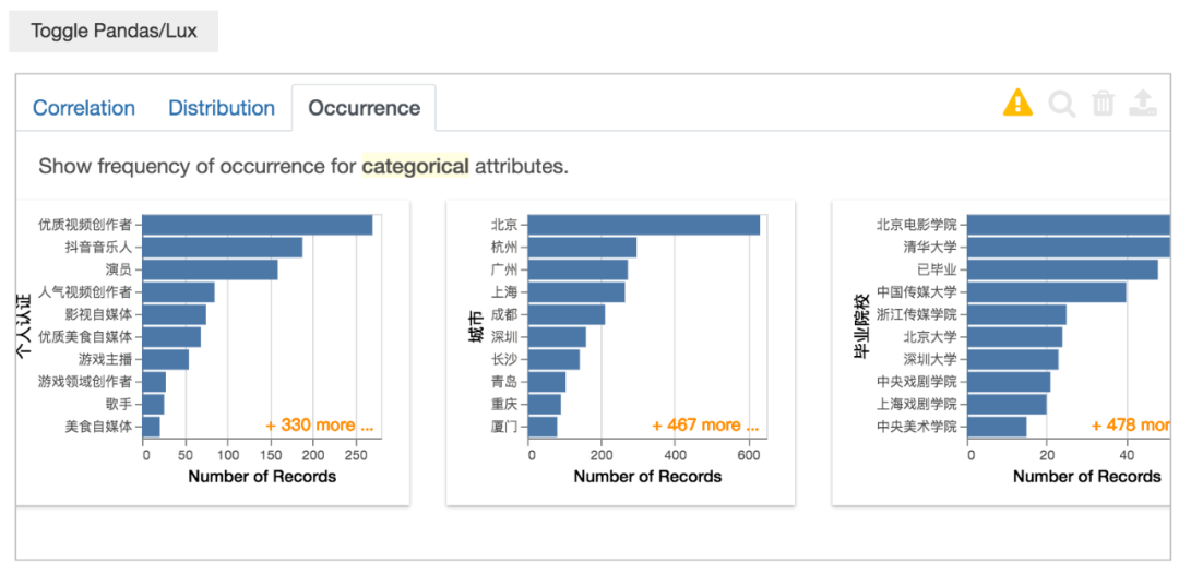
分类数据的情况,这个功能很实用,自动就给你分组汇总计数,省去不少代码。
以上就是对数据的总览,下面我们可以对你所感兴趣的数据进行可视化分析。
import pandas as pd
import lux

# 使用抖音数据
df = pd.read_csv("douyin.csv")
# 对你感兴趣的数据进行可视化分析,这里以视频数为例
df.intent = ["视频数"]
df
以视频数数据为例,得到结果如下。
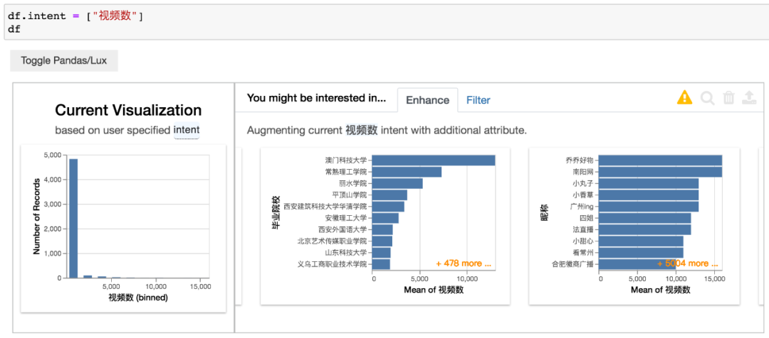
左侧图表是视频数的分布情况,右侧是视频数与其他变量的情况。
毕业院校与平均视频数的关系,应该是对毕业院校进行分组计数后,得出平均视频数。
同理,昵称也是一样的,只不过头部账号的昵称基本不会出现相同的,和毕业院校数据还是有所不同。
当然,我们还可以使用多个变量数据。
import pandas as pd
import lux

# 使用抖音数据
df = pd.read_csv("douyin.csv")
# 可以使用多个变量数据
df.intent = ["喜欢数", "分类"]
df
选择喜欢数、分类变量数据,得到结果如下。
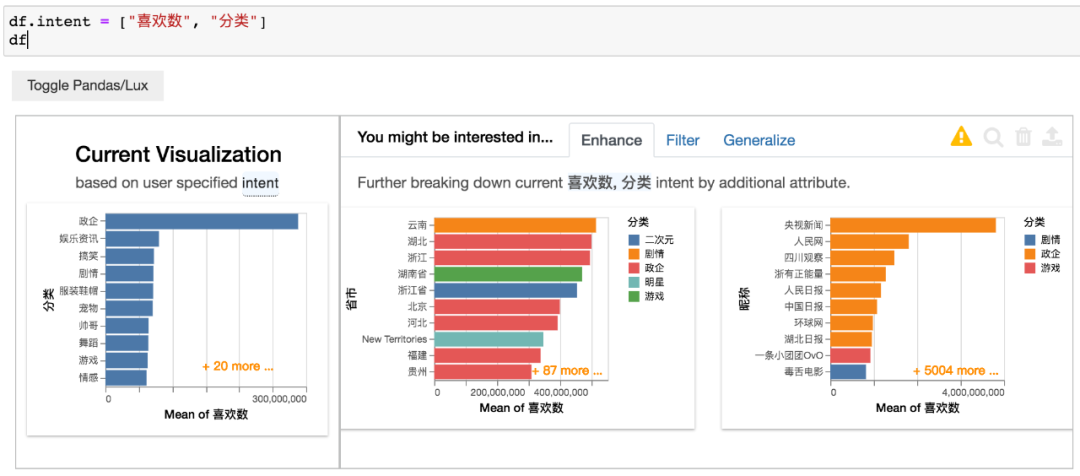
左侧图表是分类和平均喜欢数的情况,右侧图表则是省市、昵称与平均喜欢数的关系。
可以看出,最后一张图和小F之前分析的图基本差不多,而且还多了一个维度(分类)。
对变量中的特定值再进一步分析。
import pandas as pd
import lux

# 使用抖音数据
df = pd.read_csv("douyin.csv")
# 对数据的子集再进行分析
df.intent = ["分类=美女"]
df
上面的代码会报错,小F也不知道是什么原因,猜测是中文的问题。
使用作者的例子就没啥问题~
以上是基于字符串的基本描述,作者还提供了一个高级的方法,可以自定义设置参数。
lux.Clause,可以设置感兴趣的变量值(attribute)、数据类型(data_type)、数据模型(data_model)、聚合方式(aggregation)等等。
下面就来举个 🌰
import pandas as pd
import lux

# 使用抖音数据
df = pd.read_csv("douyin.csv")
# 分析分类数据与喜欢数总和之间的关系
df.intent = ["分类",lux.Clause("喜欢数",aggregation="sum")]
df
分类数据与喜欢数总和之间的关系,得到结果如下。
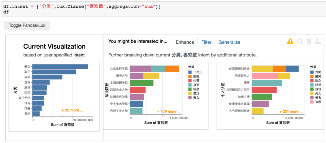
这里通过设置lux.Clause中的aggregation参数,使得将横坐标改变为总数,而不是之前的平均数。
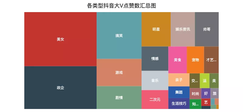
左侧图表与小F之前做的树形图类似,使用的数据一摸一样。
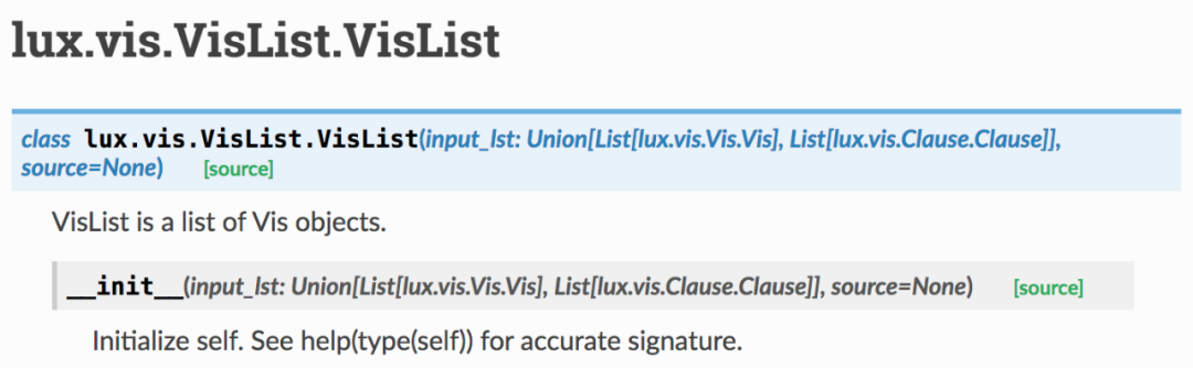
最后,再讲一下使用Vis和VisList创建可视化对象及集合。
from lux.vis.Vis import Vis
import pandas as pd
import lux

# 使用抖音数据
df = pd.read_csv("douyin.csv")
# 使用Vis进行分析
intent = ["喜欢数"]
vis = Vis(intent, df)
vis
得到结果如下。
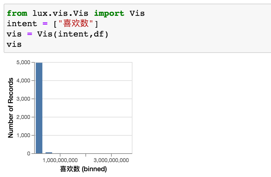
不能自定义bins,确实是有点难受,Vis可设置参数如下。
上面是单个变量的分析,使用VisList可设置多个变量。
from lux.vis.Vis import Vis
import pandas as pd
import lux

# 使用抖音数据
df = pd.read_csv("douyin.csv")
# 使用VisList进行分析
vc = VisList(["分类",lux.Clause(['粉丝数','喜欢数','评论数','分享数'],aggregation="sum")],df)
vc
结合lux.Clause一起使用,得到结果如下。
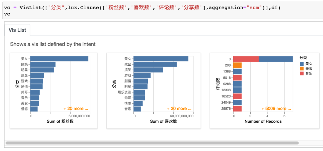
VisList可设置参数如下图。