
「HTML+CSS」自定义加载动画【035】
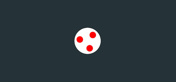
Part1效果展示
Part2Demo代码
HTML
<!DOCTYPE html>
<html lang="en">
<head>
    <meta charset="UTF-8">
    <meta http-equiv="X-UA-Compatible" content="IE=edge">
    <meta name="viewport" content="width=device-width, initial-scale=1.0">
    <link rel="stylesheet" href="style.css">
    <title>Document</title>
</head>
<body>
    <section><span></span></section>
</body>
</html>
CSS
html, body {
  margin: 0;
  height: 100%;
}

body {
  display: flex;
  justify-content: center;
  align-items: center;
  background: #263238;
}

section {
  width: 650px;
  height: 300px;
  padding: 10px;
  position: relative;
  display: flex;
  align-items: center;
  justify-content: center;
  border: 2px solid red;
}

span {
  width: 96px;
  height: 96px;
  border-radius: 50%;
  position: relative;
  background: white;
  animation: rotation 2s linear infinite;
}

span::after {
  position: absolute;
  content: '';
  top: 20px;
  left: 12px;
  width: 24px;
  height: 24px;
  color: red;
  background: currentColor;
  border-radius: 50%;
  box-shadow: 50px 4px, 20px 44px;
}

@keyframes rotation {
  0% {
    transform: rotate(0deg)
  }
  100% {
    transform: rotate(360deg)
  }
}
Part3原理详解
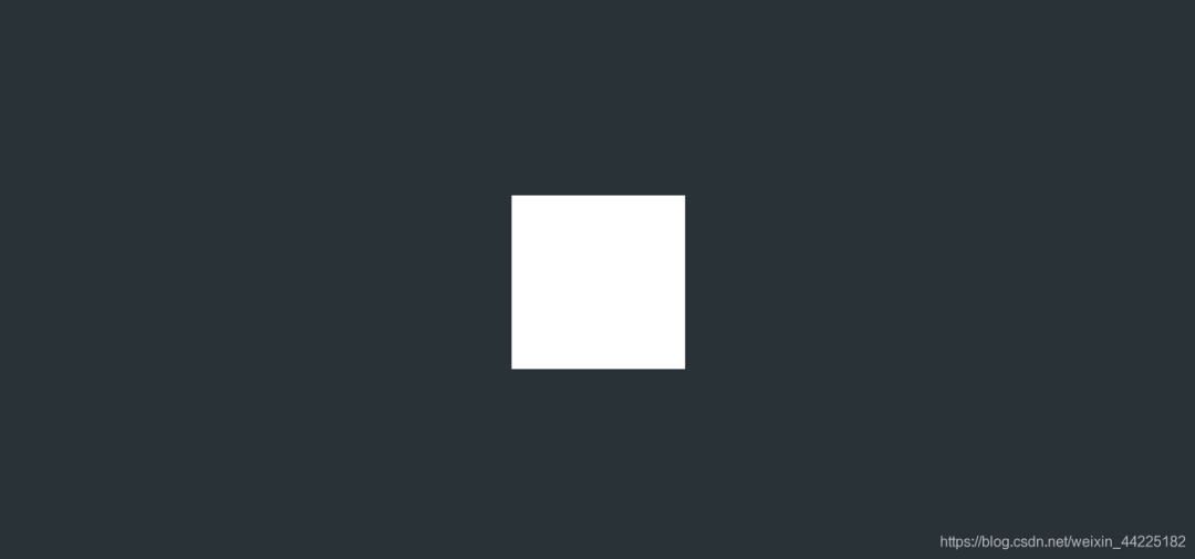
步骤1
使用span标签,设置
宽度、高度均为96px 背景色:白色
效果图如下
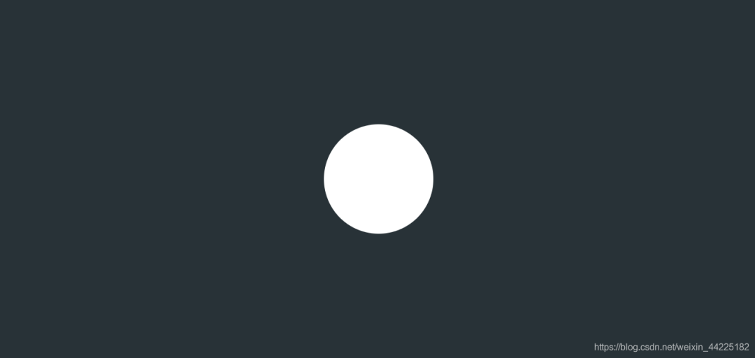
步骤2
span圆角化
border-radius: 50%;
效果图如下
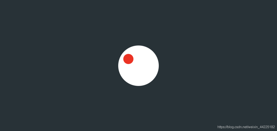
步骤3
使用span::after伪类元素,充当红色小球部分
设置为
绝对定位 (top:20px left:12px) 宽度、高度均为24px 背景色:红色 color:红色(这里设置color是为了之后阴影的颜色) 圆角化
position: absolute;
  content: '';
  top: 20px;
  left: 12px;
  width: 24px;
  height: 24px;
  color: red;
  background: red;
  border-radius: 50%;
效果图如下
步骤4
使用span::after的阴影充当另外两个小球部分
设置box-shadow
小球1:50px 4px(暂且理解为右移50px 下移4px) 小球2:20px 44px
box-shadow: 50px 4px, 20px 44px;
绿色部分就是红色小球的阴影(为了便于观察,故意设置为绿色了)
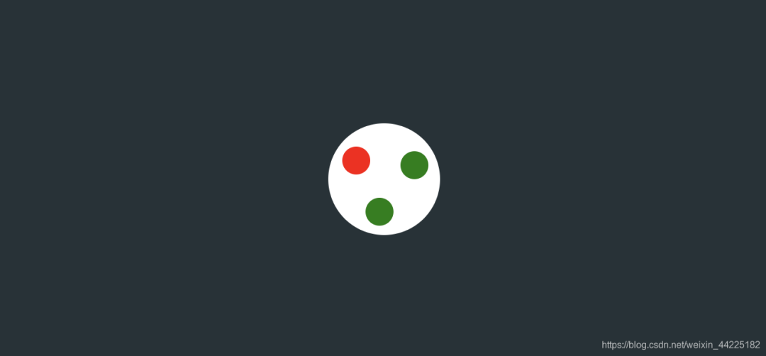
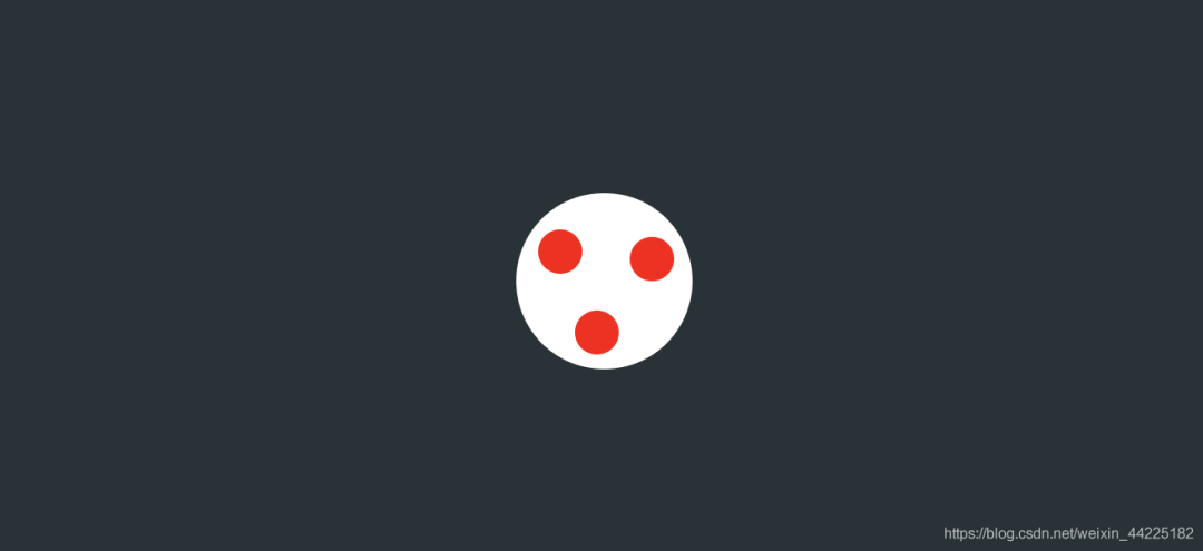
实际上效果为
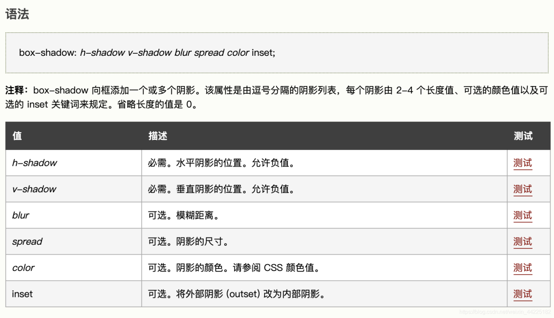
注:box-shadow
步骤5
为span添加动画
顺时针旋转(0-360度) 2s 无限循环
animation: rotation 2s linear infinite;
@keyframes rotation {
  0% {
    transform: rotate(0deg)
  }
  100% {
    transform: rotate(360deg)
  }
}
效果图如下
Part4结语
希望对您有所帮助
如有错误欢迎小伙伴指正~
我是 海轰ଘ(੭ˊᵕˋ)੭
如果您觉得写得可以的话
请点个赞吧
谢谢支持❤️
评论